Nature Photographers Network
This is the preserved archive of the original Nature Photographers Network. The community continues at naturephotographers.network.
Latourell
‹ PreviousLandscape GalleryNext ›

Latourell

by Zhoen

Gallery: LandscapePosted June 27, 2013307 views9 comments
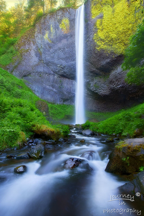
My attempt at the Latourell Falls.
Most of you know it’s pretty easy to gain access to this fall, got in the water and was able to fit the scene into a single shoot without merging.

Auto focus stacking with PS, then cleaned up manually.
2 shoot for DOF @ 18mm, 2.5 sec, F11

Comments

9 comments
Comment posted by Hamed Musharbak on June 27, 2013 at 2:27 AM
i like the composition here and i like the v shape in fornt of this image, but i think the colours are over a bit and looks unnatural in some areas even the colour of the water is blueish.
Registered on June 1, 2009, 372 Posts, 2282 Comments
Comment posted by Nick Palmieri on June 27, 2013 at 7:42 AM
Very nice comp. I am not sure if the image blend didn't work smoothly or if it over-sharpened but something looks funky in the top third of the image.
Registered on September 1, 2011, 35 Posts, 748 Comments
Comment posted by Rick Turner on June 27, 2013 at 8:21 AM
This looks to have the Orton Effect. Also the crop at top is too tight for my taste. :wavey:
Registered on February 18, 2012, 534 Posts, 2755 Comments
Comment posted by Zhoen on June 27, 2013 at 11:52 AM
Hamed, I agree the color is a bit over than most images here. I will see if I can pull the opacity back a bit. As for the blue in the water I do not find that troubling, it’s the reflection of the sky, the clarity of water and what’s below the water. I kept the water cool while the upper section warmer.

Nick, could you please elaborate what you mean by upper third of the image. If you have not seen this water fall personally, you will be amaze by the detail in the basalt columns. I can see the ULC can use a little color correction. I used a blur layer with pulling the blue curves down and painted that corner in, the yellow you see in the trees is the sun striking it

Thanks for commenting guys, always appreciated!
:toast:
Registered on May 16, 2013, 25 Posts, 188 Comments
Comment posted by Catherine Reilly on June 28, 2013 at 5:43 PM
Amazingly accurate, artistic look at Latourelle, Zhoen. The main contrast for me in this image is the artistic detail in the upper part of the landscape against the totally smoothed out flow of water in the lower part. Also..., agree that the color is overdone. Again, though, the feel of accuracy in this rendition is impressive, at least to me.
Registered on August 16, 2006, 603 Posts, 9192 Comments
Comment posted by Lon Overacker on June 29, 2013 at 5:17 PM
Zhoen,

Great job fitting this all in, a strong composition. I like the fork in the stream at the bottom. I like the glow up top and you did a pretty nice job handling the highlights up there.

Color/sat a little strong for my taste, but really not off by much; maybe it's the big patch of lichen on the rock face that's the influence here. Still, and excellent capture.

Lon
Registered on November 24, 2006, 521 Posts, 19147 Comments
Comment posted by Zhoen on June 29, 2013 at 11:25 PM
Thanks Lon and everyone else for taking the time to comment. I will keep your suggestions in mind when I re-tweak this photo and future photos.

– I just notice one the overlay layer generated from the web sharpener action gave it an additional boost to saturation. Thanks again all.
Registered on May 16, 2013, 25 Posts, 188 Comments
Comment posted by Ben Horne on June 30, 2013 at 11:35 AM
I like the composition you've chosen, but the image does feel overprocessed. The heavy orton effect makes the rocks look a bit odd. Also, the yellow sky looks a bit strange and draws a lot of attention up to that corner. My suggestion would be to forego the orton effect, and crop off the top of the photo, all the way down to just below the yellow lichen on the right. This not only avoid the sky, but the yellow lichen (as cool as it does look) takes away from the calm feeling of the waterfall. When the top of the waterfall is not shown, it extends into the imagination, and I really love the blue tones of the water when combined with the lush green foliage. Also, the 2:3 aspect raio can be a bit awkward in vertical format at times. This crop would give a more 4:5 ratio which is very calm.
Registered on August 27, 2009, 51 Posts, 959 Comments
Comment posted by Zhoen on July 2, 2013 at 12:26 AM
Here is an attempt at what Ben suggested. I gotta say this is now a totally different image and the mood has changed to calm feeling you described. This is a cleaner composition and the message is clearer, I have to keep this in mind in the future. I will continue to compares the two versions and see if I can keep one or both.
Registered on May 16, 2013, 25 Posts, 188 Comments