Comment posted by Carolyn Derstine on June 19, 2013 at 9:25 PM
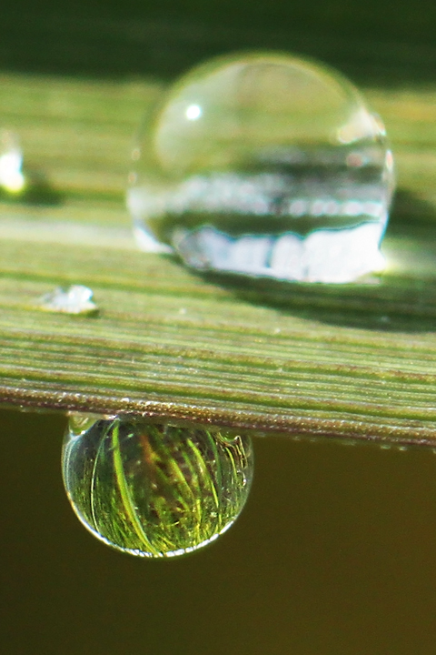
I like the vertical comp with the layout of the raindrops in your image. Yes, it would have been nice to have both drops in clear focus. However, in focus or not, the top drop is so much larger than the bottom one that it pulls the eye away from the interesting lower drop IMO. Maybe if all would be in focus, the top drop would deserve the attention , but right now it's distracting. Hope you do get a chance to try again!
Registered on February 16, 2011, 610 Posts, 3684 Comments
Comment posted by RL Potts on June 21, 2013 at 12:54 AM
The blown area does distract. Still, this catches my interest. You were very close! The patterns on the grass blade are quite impressive. The drop is nice. Yes, this one is close in every sense of the word.
Registered on November 24, 2003, 188 Posts, 985 Comments
Comment posted by Mark Seaver on June 21, 2013 at 8:50 AM
The image in the lower drop is very nice and clear. Yes, getting the upper drop sharp also would be a major bonus, but very challenging.
Registered on January 23, 2011, 1103 Posts, 17270 Comments
Comment posted by Howard Cheek on June 22, 2013 at 6:34 PM
Nice reflections within the subject droplet John, possible improvements/nits previously mentioned..
TFS
Registered on July 24, 2008, 1201 Posts, 10758 Comments
Comment posted by Scott Fricke on June 23, 2013 at 1:22 PM
I think you are right John, a focus blend to get both sharp probably would have been better, or a composition that gave more significance to the lower drop, which looks like it had the better reflection. As it is the out of focus drop is much too large in the comp and distracts from the lower drop. Hope you are able to give it another go.
Registered on January 19, 2007, 133 Posts, 1448 Comments

Comments
5 commentsTFS