Nature Photographers Network
This is the preserved archive of the original Nature Photographers Network. The community continues at naturephotographers.network.
Lago Grey Tempest & Edit
‹ PreviousLandscape GalleryNext ›

Lago Grey Tempest & Edit

by Harry Lichtman

Gallery: LandscapePosted June 18, 2013257 views17 comments
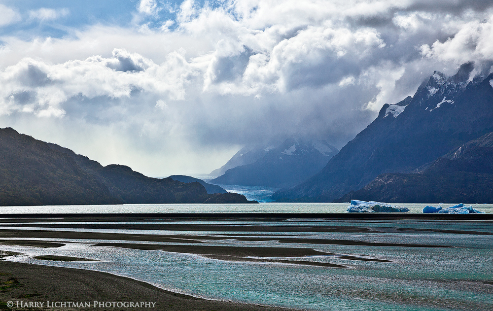
I had just finished the W trek in Torres del Paine, Chile and saw this storm developing during my boat ride across Lago Grey. Made it to shore before the lake turned into an ocean of waves and wind. Not sure what would have happened to the boat if we were caught out in the middle of it. A BW version came out pretty cool, but I like the simple color scheme of the original maybe a bit better. Any suggestions welcome.

5DII, 24-105L, CPF, f11, ISO 200

Comments

17 comments
Comment posted by Harley Goldman on June 18, 2013 at 4:39 PM
Beautiful lines, colors and drama! It looks a little over-sharpened on my screen, but it is a gorgeous image. The dark lines in the water against the aqua blues are outstanding. Excellent image.
Registered on November 19, 2003, 586 Posts, 11271 Comments
Comment posted by Harry Lichtman on June 18, 2013 at 4:42 PM
Harley - I would agree about the sharpening. All of the fine detail especially in the water was intensified by the web sharpening. I should have knocked it back some. Whoops :eek:
Registered on September 17, 2010, 304 Posts, 3507 Comments
Comment posted by Lon Overacker on June 18, 2013 at 5:37 PM
Harry,

Initially my reaction was towards a bright, mid-day image. But then I took a closer look and also took in the comments from the esteemed Mr. Harley. I too am really enjoying the contrasts, colors and patterns of the foreground as well as the terrific clouds and drama in the sky. The sharpening thing not with standing, I also think the gradation of bright highlights on the left turning to more sparkle as you go right, is very effective in this composition. Just goes to show that engaging photographs can be captured and made anytime, anywhere.

Lon
Registered on November 24, 2006, 521 Posts, 19147 Comments
Comment posted by Eva McDermott on June 18, 2013 at 7:24 PM
Wonderful light and color Harry. I am especially enjoying the clouds though.
Registered on January 4, 2009, 1015 Posts, 13229 Comments
Comment posted by John Mumaw on June 18, 2013 at 7:36 PM
Perhaps the b&w version would impart more drama necessary to hold interest. This one strikes me as OK, but not even close to the wonderful images you've posted from here earlier. That's a high bar you set for yourself. :wink:
Registered on September 9, 2005, 62 Posts, 2289 Comments
Comment posted by Harry Lichtman on June 18, 2013 at 7:55 PM
Thanks John - Here is the BW for comparison. The separation of tones in the water was difficult to convey in the BW - maybe that's why I liked the color. The BW does convey the storminess better. Sorry for the small size.
Registered on September 17, 2010, 304 Posts, 3507 Comments
Comment posted by John Mumaw on June 18, 2013 at 8:15 PM
I see your point. I'm just not sure that this particular image can stand next to your very best from this place. Just being honest with you. Tell me....what do you think?
Registered on September 9, 2005, 62 Posts, 2289 Comments
Comment posted by Harry Lichtman on June 18, 2013 at 8:38 PM
John, so this is what think. I think this is a bit different than some of my other images from Patagonia. I do like the simplicity of the forms in the image and the backlighting is just some of my favorite conditions to photograph in. So, maybe the experience during the conditions colors my objectivity :biggrin: I like the abstract qualities this has compared to some of the other images I've posted which maybe say "Patagonia" more, but are less abstract in nature. So in some ways, this image helps diversify the images I have from Patagonia. So, I'm eager to get honest opinions like yours on what works and what doesn't. I realize this might not strike a chord with everyone, but I do enjoy hearing critiques especially about what does NOT work.
Registered on September 17, 2010, 304 Posts, 3507 Comments
Comment posted by Mark Seaver on June 18, 2013 at 10:24 PM
I think all the subtle blues work wonderfully here, Harry. I especially like the contrast in the foreground between the turquoise water and the dark shore areas.
Registered on January 23, 2011, 1103 Posts, 17270 Comments
Comment posted by Joerg Bonner on June 19, 2013 at 5:38 AM
wonderful capture, harry! i tend to prefer the colour version just a little over the b&w - both are nice, though.

btw, to me this images says patagonia just as much as an image of the torres, the cuernos, fitz roy or cerro torre. it's interesting how this part of the world is often reduced to two national parks - and even then you'd need to include one of the icons to make people accept it as a shot from patagonia...
Registered on September 5, 2011, 44 Posts, 221 Comments
Comment posted by Harry Lichtman on June 19, 2013 at 5:50 AM
Joerg - When flying into El Calafate (clear weather), it was amazing to see how tiny Los Glaciares NP was in the context of the coast of South America and the ice fields down there. It appeared that the Fitz Roy Range was the only area where the peaks were not locked in glaciers. So that makes it more accessible and that it why so many people can get there as opposed to the many other areas of Patagonia. Well, the mountains there are pretty cool and distinctive too :biggrin:
Registered on September 17, 2010, 304 Posts, 3507 Comments
Comment posted by Hamed Musharbak on June 19, 2013 at 7:10 AM
I like b&w version, just love the sky & the contrast between the elements
Registered on June 1, 2009, 372 Posts, 2282 Comments
Comment posted by Morris McClung on June 19, 2013 at 11:22 AM
The b&w does have a lot of drama, and the color makes me feel like you put me right there. So. both work for me on different emotional levels. Epic landscape photo. I love the range of blues throughout this one, Harry. The water in particular looks a little over-sharpened on my monitor as Harley commented.
Registered on May 7, 2007, 670 Posts, 19650 Comments
Comment posted by Nancy Lea Sandy on June 19, 2013 at 12:14 PM
fantastic study in blue. Lots of energy and drama. The alternating water and sand in the fg is particularly nice.
Registered on January 24, 2011, 576 Posts, 6942 Comments
Comment posted by Jared Warren on June 19, 2013 at 8:23 PM
Both the color and BW versions work well for me, but I prefer the color version. To me there's more drama in the color version because there's a sense of a beautiful sunny day in one corner, but just a couple miles away there's some serious weather about to happen that makes me think "I do NOT want to get caught in that." And the variations of blues look great, IMO.
Registered on May 11, 2012, 84 Posts, 931 Comments
Comment posted by Ed Lowe on June 20, 2013 at 9:24 AM
I came back to this a couple of times because I wasn't sure this had the impact as your other images from this place, but it has grown on me the second time around. The drama in the sky really sets the scene for the approaching storm and I do like the layers of water in the FG along with the blues. My only suggestion would be for a touch more contrast on the mountains. Either way great stuff, Harry.

Ed
Registered on February 7, 2004, 414 Posts, 7115 Comments
Comment posted by Nick Bristol on June 21, 2013 at 8:55 AM
Harry, Both versions here are very nice but the color one looks and works great for me. I love the blue tones with the highlights across the water, and then those great looking clouds really finish this off. I enjoy looking at this scene, Harry.

Nick Bristol
Lone Rock, WI
Registered on February 1, 2004, 752 Posts, 14140 Comments