Nature Photographers Network
This is the preserved archive of the original Nature Photographers Network. The community continues at naturephotographers.network.
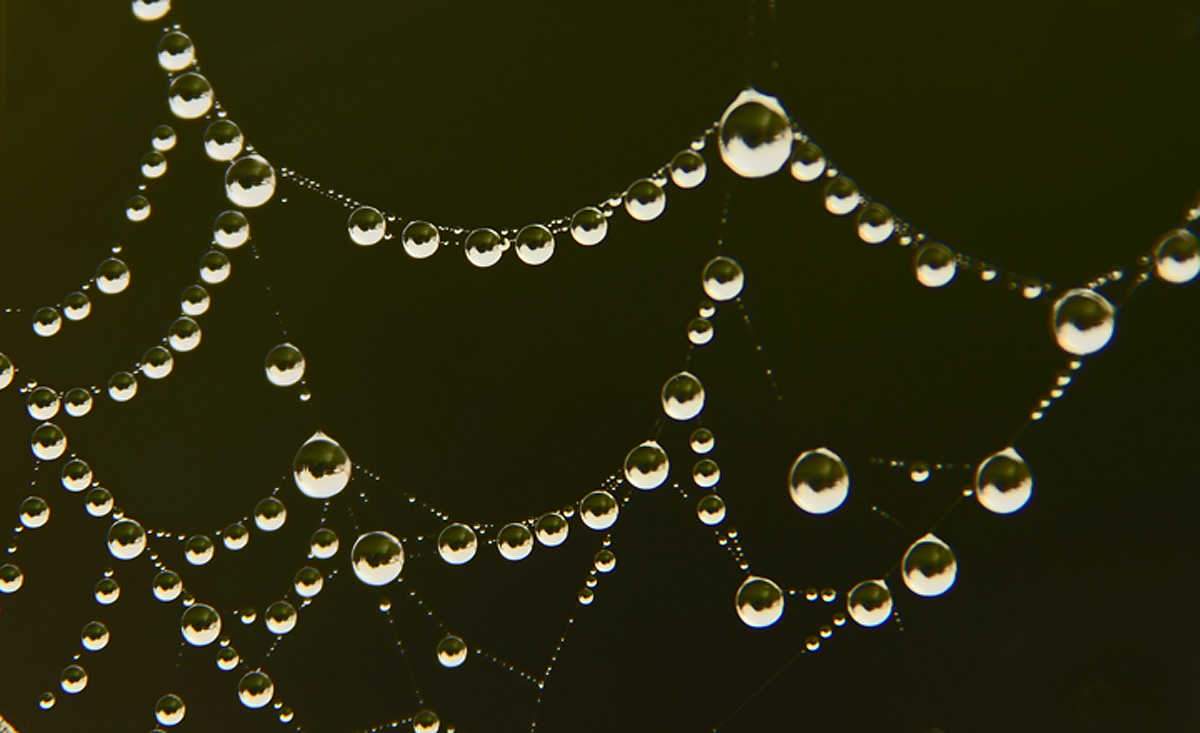
water web
‹ PreviousWeekly Challenge GalleryNext ›

water web

by John Tobias

Gallery: Weekly ChallengePosted June 11, 2013105 views4 comments
I would not have noticed this web without the water drops on it. Fun to try different compositions on it. I think I should add that there was a very slight breeze when I took this photo. Also, the web is only about 4 inches square. It was in the opening of a section of lattice on a gate.

Canon XSI
1/250 @ F-5.6 ISO200
Tamron 28-300mm @ 237mm.

Comments

4 comments
Comment posted by RL Potts on June 11, 2013 at 12:58 PM
Agreed. Water beads in webs make for optical fun. But you have to give this some thought. You can achieve sharp focus on the scene in the beads. Or you can focus on the web/ dew edges. Going somewhere in between doesn't work too well unless you back off a little and shoot at f16 or thereabouts, which would have worked with this image because of the plain background. I guess there is always focus stacking. Anyway, the contrast and pattern are striking.
Registered on November 24, 2003, 188 Posts, 985 Comments
Comment posted by Mike Ramy on June 11, 2013 at 8:58 PM
John,
You can really see the weight of the water droplets distorting the web in this image and the reflections in the droplets are all identical and very uniform, very cool. The image is a bit soft however on my monitor.
:toast:
Registered on June 16, 2012, 567 Posts, 2809 Comments
Comment posted by Carolyn Derstine on June 12, 2013 at 12:16 PM
Great "string of pearls shot", John. :smile: The raindrops on the web are such perfect little circles; I also like the varying sizes of these raindrops. Very nice comp you have found of this web. As far as softness, Robert gave some good ideas but sometimes those webs just don't hold still while shooting! Just takes the slightest breeze. . .:rolleyes: I don't know how much post-processing you do but I think this particular image could be improved by adding more contrast and sharpening as part of editing. Very cool find!
Registered on February 16, 2011, 610 Posts, 3684 Comments
Comment posted by Barbara Graham on June 14, 2013 at 5:50 PM
I do like the way this looks like pearls, as Carolyn said, especially against the dark background.
Registered on July 27, 2010, 1310 Posts, 5035 Comments