Seven Red Roses
by John Clulow
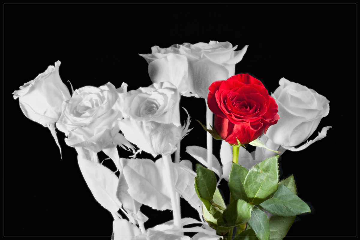
This image is an experiment which seeks to combine near infrared and normal color images to raise the question in the viewers’ minds; What is color?
I bought a bouquet labeled “Seven Red Roses”. I took one focus-stack series using a Tiffen 87 filter which blocks all visible light (about 400 – 700 nm wavelength), Xenon flash tubes emit strongly in the invisible, near infrared range (about 750 – 1050 nm), and image files were created using a Pentax K100D Super (not IR filtered) ISO 400, f/4.0, 1/160s. Then the filter was removed and a set of images taken at ISO 200, f/20.0, 1/160s. Each stack of 10 was processed with Zerene, and the PMax output files were aligned in Photoshop CS5 with the NIR as the background. An inverted layer mask was added to the natural color version, and the color detail painted in for one of the seven. .
Whereas the rose petals absorb green and reflect red and the leaves vice versa, neither absorbs much in the infrared, so they are represented as white since in the visible range, subjects that reflect all wavelengths are white.
While all critique and comments on composition, technique, etc., are welcome and will be of use if I try to do more with this technique, I would be particularly interested in knowing whether you find this of interest; i.e. how radically a relatively small shift in the illuminant wavelength range affects our perception of the photograph. For me, It seems to illustrate how while we think of things as “having color”, that perception is conditional and the result of complex processes in human perception and cognition which our cameras and photographic processing are designed to fit. The bouquet label is presumed to be accurate regardless of process to photograph it.

Comments
2 commentsI'll very much like to watch you create more of these images to see how your concept and processing evolve. Thanks for the inspiration.