Gallery: LandscapePosted June 4, 2013177 views8 comments
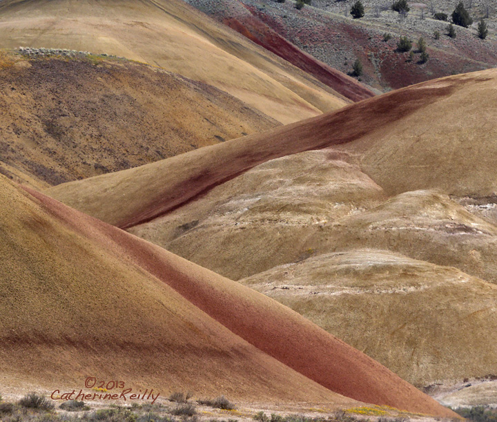
Thanks a lot for the comments on my previous post. Some of you wisely suggested a more abstracted image, so here it is. Zed.
Cropping is so subjective, I'd like to hear about how this looks to you.
Comments
8 comments
Comment posted by Nancy Lea Sandy on June 4, 2013 at 8:05 PM
the texture in these hills really comes across in this version. IMO, your original version is stronger due to the wonderful colors and excellent balance. As for a crop, I'd go truly abstract and make it a Ved, removing all of the cooler toned hills. In this crop, I find myself wishing to see more (as in your original). Any way you 'spell' it, this is a terrific scene. Great work.
Registered on January 24, 2011, 576 Posts, 6942 Comments
Comment posted by Ed Lowe on June 4, 2013 at 9:14 PM
Another lovely image, Catherine. I like the abstract quality of this even more than the original. FWIW I could see this working with an even tighter crop. Looking forward to the rest.
Ed
Registered on February 7, 2004, 414 Posts, 7115 Comments
Comment posted by Chet Dowell on June 4, 2013 at 9:25 PM
I like this version as well Catherine. I agree with Nancy and Ed that a crop to the V would be even better than this kind of in between crop. These painted hills are amazing and I think you have done good work so far. Chet
Registered on December 3, 2012, 237 Posts, 1171 Comments
Comment posted by Harley Goldman on June 4, 2013 at 10:59 PM
This is really well done. I would agree with the crop suggestions to eliminate the cooler area at the top and go more abstract.
Registered on November 19, 2003, 586 Posts, 11271 Comments
Comment posted by Paul Breitkreuz on June 5, 2013 at 10:07 AM
Catherine, I like this with only a crop at the bottom to eliminate the grass area down there. I really like the angle of view on this take. Colors and textures as the previous all are excellent. A very nice take on this scene.
Registered on February 25, 2006, 525 Posts, 8448 Comments
Comment posted by Harry Lichtman on June 6, 2013 at 11:01 AM
A bottom crop just below the darker band would be my choice. Layering and diagonals works very well. There is a flatness to the lighting, which may benefit from playing with brightness and contrast.
Registered on September 17, 2010, 304 Posts, 3507 Comments
Comment posted by Lon Overacker on June 7, 2013 at 1:15 AM
Catherine,
I didn't get a chance to comment on your previous version - and I'm torn between the two. the first felt like it had a little more room and provided a little more context, or reality. Here you've really emphasized the abstract and graphic nature, but I think still trying to hang on to the overall landscape. I like the suggestion of the bottom crop, and would add maybe trying adding back in the top a little more. I like the contrast in warm/cool colors as well as the scattering of the pines. I do like this, but I think it fits in the category of either wanting to see more top/bottom - or none at all. Hope that makes sense.
Lon
Registered on November 24, 2006, 521 Posts, 19147 Comments
Comment posted by Mark Metternich on June 8, 2013 at 7:28 PM
Love your unique composition here Catherine!
Registered on June 19, 2009, 276 Posts, 6240 Comments

Comments
8 commentsEd
I didn't get a chance to comment on your previous version - and I'm torn between the two. the first felt like it had a little more room and provided a little more context, or reality. Here you've really emphasized the abstract and graphic nature, but I think still trying to hang on to the overall landscape. I like the suggestion of the bottom crop, and would add maybe trying adding back in the top a little more. I like the contrast in warm/cool colors as well as the scattering of the pines. I do like this, but I think it fits in the category of either wanting to see more top/bottom - or none at all. Hope that makes sense.
Lon