Nature Photographers Network
This is the preserved archive of the original Nature Photographers Network. The community continues at naturephotographers.network.
Motion
‹ PreviousLandscape GalleryNext ›

Motion

by Jorne de Bruin

Gallery: LandscapePosted May 27, 2013116 views7 comments
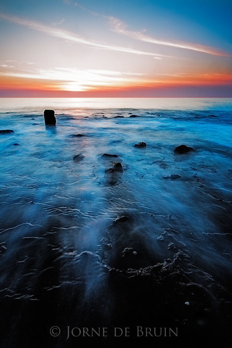
Something a little different from the dutch coast, at low tide rocky piers become exposed (used to protect the beach), so me and a friend went on to one for a change at sunset. Apperently no one ever thought to do this at this particular beach, because soon we had some guys wuth camera's following us around ;)

The rocks made for some interesting fg when the tide started to come in, so naturally a slow ss was in order. I quite like the fg and the motion of the water over it, but I am not 100% sold on the sky.

C&C welcome!

tech !dsmkII, 20mm, 4 sec

Comments

7 comments
Comment posted by John Fan on May 27, 2013 at 9:21 AM
I like the blue color under the wave. My suggestion is to crop off a little off the bottom. Seems to be too much featureless black there - or there is feature that you can bring out?
Registered on August 24, 2010, 135 Posts, 489 Comments
Comment posted by Walt Sterneman on May 27, 2013 at 9:26 AM
Jorne, wonderful colors. The blue in the water is very nice and I also like the rocks in the FG although the halo around the one near the sun is a little too noticeable. It is too bad you didn't get a few more clouds in the sky but you did well with what you were presented. I tend to agree with John that the dark part at the bottom does not add anything to the image.
Registered on March 24, 2010, 73 Posts, 1268 Comments
Comment posted by Richard Hartmann on May 27, 2013 at 11:28 AM
Although the blue seems a bit unnatural to me I like the color contrast of the cool foreground to the warm sky. I especially like the fade to black at the bottom of the comp, to me it is another nice contrast that ads to the frame.

Registered on January 15, 2009, 13 Posts, 772 Comments
Comment posted by Todd Liotine on May 27, 2013 at 1:34 PM
Jorne, Very nice overall, the composition and subject are great. I do agree with the others about the blue in the water looking a little unnatural.There appears to be a strong halo around the rock on the left side thats a little distracting.
Registered on July 1, 2008, 131 Posts, 671 Comments
Comment posted by Jorne de Bruin on May 27, 2013 at 2:24 PM
Thank you for the comments. Agree on the colour on the water, so slightyl reworked that.While I understand what you are saying, I personally like the negative space at the bottom, so I am leaving that in. Thanks! :toast:
Registered on June 26, 2008, 178 Posts, 2136 Comments
Comment posted by Lon Overacker on May 27, 2013 at 5:43 PM
Jorne,

I think this is an excellent comp, with great interest in the water flowing over the rock. Not sure what "rocky piers" are that are protecting the beach - sounds man-made, but this certainly doesn't appear to be. Just curious.

I like the proportion of sky to foreground here. The only nitpick I have would be my personal taste that this is quite saturated especially the cyan in the water and the sky URC. Just my take on it.

Enjoy the coastal seascape, just too much saturation for my taste. Thanks for posting.

Lon
Registered on November 24, 2006, 521 Posts, 19147 Comments
Comment posted by Ed Lowe on May 27, 2013 at 8:13 PM
The diagonals in the water do a fantastic job of directing the viewer into the scene, Jorne. I also like the play of warm and cool colors here. My only suggestion would be to dial back the cyan a bit as it is noticeable in the water and URC sky. Just a thought.

Ed
Registered on February 7, 2004, 414 Posts, 7115 Comments