Nature Photographers Network
This is the preserved archive of the original Nature Photographers Network. The community continues at naturephotographers.network.
Daylilycious
‹ PreviousFlora GalleryNext ›

Daylilycious

by Bill Fach

Gallery: FloraPosted May 26, 2013252 views19 comments
Sony A77
Minolta 200mm macro
ISO 640, 1/60 @ f4

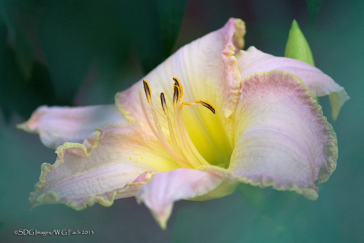
Spotted this ruffled daylily being coy under one of our butterfly bushes so I decided to cram it. I literally tossed a coin to decide which version to make the main post. The second version is the more obvious cram. It also has the subtle pink/mauve BG elements that I have no clue where they came from. All comments welcome. >=))>

Comments

19 comments
Comment posted by Bill Fach on May 26, 2013 at 9:37 PM
Version 2
Registered on November 1, 2003, 1805 Posts, 26981 Comments
Comment posted by Bruce King on May 26, 2013 at 9:44 PM
Beautiful light on this one Bill and lovely soft colors........both are difinitely keepers but I like version 2 :toast:
Registered on January 14, 2010, 276 Posts, 2212 Comments
Comment posted by Dennis Plank on May 26, 2013 at 10:13 PM
Cool image, Bill. I like the wash and the in-your-face day lily really jumps out.

:toast:
Registered on January 28, 2008, 1767 Posts, 23192 Comments
Comment posted by Ken Smith on May 26, 2013 at 10:28 PM
Excellent.. The flattened look of this and the upturned angle, b/g...many factors working so well together. The color combo of the yellow throat, pink petals an turquoise green b/g...is superb. Love the large version. This is a must-see!! I prefer version 1.
Registered on September 5, 2008, 449 Posts, 2444 Comments
Comment posted by Walt Sterneman on May 27, 2013 at 9:31 AM
Beautiful image Bill. I like version 2 because the subtle pinks in the BG add to the image in my opinion.
Registered on March 24, 2010, 73 Posts, 1268 Comments
Comment posted by John&Patty Benway on May 27, 2013 at 10:20 AM
Really like your colors Bill, I like your first post a tiny bit better for the yellow glow in the center of the flower, final decision is yours. Either way, beautiful work.
John
Registered on May 12, 2006, 626 Posts, 8700 Comments
Comment posted by Charlie Baugh on May 27, 2013 at 3:53 PM
I definitely like the more yellow 1st version. I looked this over more carefully than I usually do, as this image hits me as outstanding. Somehow I'm glad to see background, minor, noise. I have thought before and definitely feel here it is an artistic, texture, advantage at times.
Registered on April 18, 2011, 329 Posts, 1985 Comments
Comment posted by Philip Hodgkins on May 27, 2013 at 4:50 PM
The first one for me, Bill. Everything there works for the outstanding. Really superb picture!
Registered on July 24, 2006, 2741 Posts, 12349 Comments
Comment posted by Sanjay Sundaram on May 27, 2013 at 5:51 PM
Beautiful flower and well captured Bill. I like the version 1 because I felt that the light blue in the second image was a bit overwhelming.

Sanjay
Registered on April 9, 2013, 107 Posts, 725 Comments
Comment posted by Albert Darmo on May 27, 2013 at 7:27 PM
Hi Bill :wavey: Love them both, :eek: :jump: You hit a home run here :eek: :cool: Delightful color and light. wish it were mine :rolleyes: I agree with the majority. the first one wins by a hair. :toast:
Albert Darmo
Registered on November 25, 2008, 1386 Posts, 11978 Comments
Comment posted by Nancy Lea Sandy on May 27, 2013 at 11:24 PM
I'll cast another vote for version two because of the obvious cram. Nice work, both versions are lovely
Registered on January 24, 2011, 576 Posts, 6942 Comments
Comment posted by Ian Wolfenden on May 28, 2013 at 1:58 AM
A stunning image either way, Bill ! For me it's simply a question of two different approaches - the first has all the richness of texture, the second a touch more ` mood '. Just a shame we can't see both large size !!
Registered on May 18, 2007, 1108 Posts, 7647 Comments
Comment posted by Patricia Brundage on May 28, 2013 at 10:28 AM
My preference is the subtle cram of the first version. The second is a little too blotchy for my taste. You're brave to attempt these.
Registered on March 23, 2006, 1111 Posts, 6531 Comments
Comment posted by Larry Lynch on May 28, 2013 at 3:56 PM
Wonderful colors and comp. First rate image!!
Registered on September 16, 2006, 773 Posts, 9940 Comments
Comment posted by Barb Pflaum on May 28, 2013 at 4:00 PM
Both images are beautiful, but I prefer the first one because of the bright yellow in the center and the beautiful turquoise bg.
Registered on January 14, 2009, 316 Posts, 2724 Comments
Comment posted by Nathan Buck on May 29, 2013 at 1:22 AM
The second one works best for me Bill. Great photo with very nice colors and lines.

Nathan
Registered on November 1, 2003, 1101 Posts, 13589 Comments
Comment posted by Giuseppe Guadagno on May 29, 2013 at 2:06 PM
Your daylilies never betray you, Bill. A splendid cram-it that will make Nathan jealous. Beautiful both, the first version more than beautiful.
Cheers.
Registered on February 3, 2007, 827 Posts, 5052 Comments
Comment posted by Gary Yeoh on May 29, 2013 at 8:11 PM
Bill:

Both are fabulous and over the top. I find more interest in #2 but would be happy to receive the digital file of the one you 'discard' ;-)
Registered on September 1, 2009, 588 Posts, 8184 Comments
Comment posted by Howard Cheek on May 30, 2013 at 5:44 PM
Heavenly light and the yellow center surely glows, very nice Bill.
My choice is the one from 'above' of course :wink:
Beautiful work :toast: :toast:
Registered on July 24, 2008, 1201 Posts, 10758 Comments