Comment posted by Brian Schrayer on April 14, 2013 at 2:45 PM
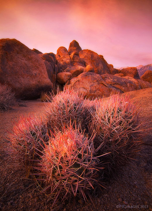
Very nice work, Peter. I like the simple composition but the light is obviously the star of the show. That red glow is superb. Kudos for another original composition from this location.
Registered on May 28, 2004, 114 Posts, 2890 Comments
Comment posted by Bill Reid on April 14, 2013 at 2:50 PM
Beautiful earthy tone to this Peter. Nice composition and I really like the simplicity here. Very nice indeed.
Registered on January 27, 2013, 65 Posts, 2460 Comments
Comment posted by Oleg Kuchorenko on April 14, 2013 at 5:49 PM
Looks so artistic ! Composition and presentation is great !
Registered on July 2, 2012, 9 Posts, 111 Comments
Comment posted by Richard Teller on April 14, 2013 at 6:54 PM
Nice and simple composition. I like the way the cactus and the mound of rocks compliment each other, plus sweet light.
Registered on August 23, 2010, 1162 Posts, 6692 Comments
Comment posted by John Mumaw on April 14, 2013 at 8:08 PM
I love close up compositions like this one, especially with such fearsome looking cacti!
The light and landscape are also quite beautiful. My one nit is with the amount of Orton that you've been using with your work lately.
I think that it's a bit too heavy handed and obvious. Backing off just a bit and/or using it more selectively would really be an asset, IMO.
Registered on September 9, 2005, 62 Posts, 2289 Comments
Comment posted by Peter Coskun on April 14, 2013 at 8:43 PM
Thanks everyone!
John, I've been using almost the exact Orton settings for all of my work. This one I made the effect stronger in the sky and pulled back a bit on the landscape. It was windy the entire time I was here which made the area quite dusty and sorta made things a little soft to begin with. I'll try to hold off a bit more in the future though.
Registered on October 31, 2011, 170 Posts, 1240 Comments
Comment posted by Nancy Lea Sandy on April 14, 2013 at 8:48 PM
Absolutely beautiful. Great subject, composition and lovely, lovely light.
Registered on January 24, 2011, 576 Posts, 6942 Comments
Comment posted by Mark Metternich on April 14, 2013 at 9:05 PM
Nice shot man. I don't think the overall highlight glow is too much. It is a taste thing IMO. Some may like it some not... I do think the upper 1/2 of the image could be reduced slightly in saturation and still sing and maybe the indications of the Highlight glow on the ridgeline reduced. That is just my 2 cents.
Registered on June 19, 2009, 276 Posts, 6240 Comments
Comment posted by Daniel Rappaport on April 14, 2013 at 11:39 PM
Great cacti portrait. Like the composition including the background rocks, but glow effect didn't translate well to the web - looks like a bit of halo.
Registered on September 9, 2009, 294 Posts, 2006 Comments
Comment posted by Kah Kit Yoong on April 15, 2013 at 7:42 AM
I like this a lot but the strong overall redness seems the weak link to me. Wonder about trying to bring out some of the other colours in the scene, such as the hints of blue in the sky and the greens in the cacti.
Registered on September 27, 2006, 636 Posts, 10682 Comments
Comment posted by Marco Presi on April 15, 2013 at 9:34 AM
Hi, I like a lot the composition.. but I find it a little bit to red (on my screen). Incredible sharpness
Registered on February 21, 2012, 5 Posts, 18 Comments
Comment posted by Rick Turner on April 15, 2013 at 1:07 PM
Peter,
Just simple and stunning. Heavy handed comments should be taken with a minute grain of salt.
Keep doing it the way you have
Registered on February 18, 2012, 534 Posts, 2755 Comments
Comment posted by Peter Coskun on April 15, 2013 at 3:36 PM
Here is a repost with the warm colors toned down.
Registered on October 31, 2011, 170 Posts, 1240 Comments
Comment posted by Phil Pogledich on April 15, 2013 at 3:57 PM
I really like both of the versions posted and, you guessed it, might prefer something in between...perhaps weighted a bit more toward the original post. The second version doesn't have quite the same visual impact. Usually such a strong element in the immediate foreground doesn't work well for me, but I think this composition is superb.
In all candor I'm with John on the use of the Orton effect. It's not my thing and I find it a bit strong here. That said, it may render completely differently in print than it does in a web resolution image, so it's up to your judgment and taste.
Registered on August 24, 2009, 123 Posts, 3099 Comments
Comment posted by John Mumaw on April 15, 2013 at 7:23 PM
"Heavy handed comments should be taken with a minute grain of salt."
Nonsense. How else will we learn?
Your repost is much better! The truer blue skies especially complement the wonderful light. Like Phil, I think that you could reintroduce a bit more saturation to the landscape. I'm glad you take the 'heavy handed comments' to heart. Your work is much better for them!
P.S. Adding '+Repost' or some such to your title might get more viewers for a second round. Glad I returned!
Registered on September 9, 2005, 62 Posts, 2289 Comments
Comment posted by Thomas Haney on April 15, 2013 at 10:49 PM
Great shot Peter. I love the color, Orton, and sky darkening. The only thing bad I can say about them is that I can clearly see them, while ideally I guess I wouldn't notice.
Registered on April 7, 2013, 138 Posts, 537 Comments
Comment posted by Paul Breitkreuz on April 16, 2013 at 10:46 AM
Peter,
Nice job with this composition, I like it a lot and really enjoy the second version here. The closeup shows wonderful detail here.
Just a word of caution on these little devils, don't ever back your vehicle into one. There is a cotton-top or clustered barrel cactus in the Alabama Hills with my rear tire imprinted on it. Lost a tire to the darn thing.
I looked at this image a couple of times based more on the subject then anything else. I've shot A LOT of clustered barrel cactus over the years especially in the Alabama Hills area.
I was glad to see the adjustments you've made to the second version here. John was right about making a caption about the repost too, it caught my attention.
Not sure what or how you arrived at the second version but the changes that brought down the red cast made a world of difference IMO. As a long time user of Velvia I know all about red cast images. They can be real eye catchers, but for me personally, I found mine to be too strong and unbelievable. So, I now find toning that down is more appealing to my taste overall.
Registered on February 25, 2006, 525 Posts, 8448 Comments
Comment posted by Peter Coskun on April 16, 2013 at 12:59 PM
Thanks Paul, all I did was adjust the red curves layer to reduce the reds, and then adjust the blue curves layer to introduce a little more of the cool tones.
Registered on October 31, 2011, 170 Posts, 1240 Comments
Comment posted by Doug Koepsel on April 16, 2013 at 7:58 PM
Peter, my preference is for the repost. The red still shows nicely in the cactus needles and boulders. The vignette in the sky gives an unnatural burnt appearance to those colors though. How did you add the vignette?
Registered on April 1, 2010, 196 Posts, 1592 Comments
Comment posted by Peter Coskun on April 16, 2013 at 8:26 PM
Thank you Doug, the vignette was done in the RAW conversion. Probably too heavy handed there to begin with.
Registered on October 31, 2011, 170 Posts, 1240 Comments
Comment posted by Youssef Ismail on April 16, 2013 at 10:20 PM
Fantastic. I like the repost colors best.
Registered on November 1, 2003, 474 Posts, 5555 Comments
Comment posted by John Williams on April 19, 2013 at 10:23 AM
Lots of interesting comments above. That's a good thing, because it usually means you have a winner that just needs some tweaking to make almost everyone happy. I much prefer the second version, as Kah noted the other colors sing more there. The Orton seems to be a personal choice. I tend to like it more than many; I like the way it softens sharpening. But, saturation and sharpening are like album covers, it's such a fine line between stupid and clever (Spinal Tap reference).
Registered on September 6, 2007, 221 Posts, 5985 Comments
Comment posted by Mark Metternich on April 19, 2013 at 8:34 PM
Re post is fabulous!
Registered on June 19, 2009, 276 Posts, 6240 Comments

Comments
23 commentsThe light and landscape are also quite beautiful. My one nit is with the amount of Orton that you've been using with your work lately.
I think that it's a bit too heavy handed and obvious. Backing off just a bit and/or using it more selectively would really be an asset, IMO.
John, I've been using almost the exact Orton settings for all of my work. This one I made the effect stronger in the sky and pulled back a bit on the landscape. It was windy the entire time I was here which made the area quite dusty and sorta made things a little soft to begin with. I'll try to hold off a bit more in the future though.
Just simple and stunning. Heavy handed comments should be taken with a minute grain of salt.
Keep doing it the way you have
In all candor I'm with John on the use of the Orton effect. It's not my thing and I find it a bit strong here. That said, it may render completely differently in print than it does in a web resolution image, so it's up to your judgment and taste.
Your repost is much better! The truer blue skies especially complement the wonderful light. Like Phil, I think that you could reintroduce a bit more saturation to the landscape. I'm glad you take the 'heavy handed comments' to heart. Your work is much better for them!
P.S. Adding '+Repost' or some such to your title might get more viewers for a second round. Glad I returned!
Nice job with this composition, I like it a lot and really enjoy the second version here. The closeup shows wonderful detail here.
Just a word of caution on these little devils, don't ever back your vehicle into one. There is a cotton-top or clustered barrel cactus in the Alabama Hills with my rear tire imprinted on it. Lost a tire to the darn thing.
I looked at this image a couple of times based more on the subject then anything else. I've shot A LOT of clustered barrel cactus over the years especially in the Alabama Hills area.
I was glad to see the adjustments you've made to the second version here. John was right about making a caption about the repost too, it caught my attention.
Not sure what or how you arrived at the second version but the changes that brought down the red cast made a world of difference IMO. As a long time user of Velvia I know all about red cast images. They can be real eye catchers, but for me personally, I found mine to be too strong and unbelievable. So, I now find toning that down is more appealing to my taste overall.