Gallery: LandscapePosted March 21, 2013295 views6 comments
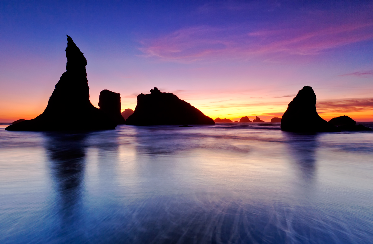
Famous sea stacks of Bandon in the well-known ambiance of an Oregon sunset.
Canon 5D Mark II, Canon 16-35 Mark II at 18mm, Singh-Ray's Daryl Benson Reverse ND, F8, 5 sec, ISO 200.
Comments
6 comments
Comment posted by Brad Clinch on March 21, 2013 at 7:29 PM
Great colors and exposure. The clouds and water really add to this one. How would it look with the foreground cropped to remove those individual water tracers?
Registered on January 5, 2013, 37 Posts, 261 Comments
Comment posted by Eva McDermott on March 22, 2013 at 6:24 AM
Gorgeous color and very tranquil mood Serkan. I also like that you let the stacks go into silhouette. Looks very natural.
Registered on January 4, 2009, 1015 Posts, 13229 Comments
Comment posted by Phil Pogledich on March 22, 2013 at 2:26 PM
Very nice shot from Bandon. I personally like the water patterns in the foreground and agree with Eva that the silhouette of the rocks is very natural and appealing.
Registered on August 24, 2009, 123 Posts, 3099 Comments
Comment posted by Stan Rose on March 22, 2013 at 5:49 PM
I normally charge a $20 tax for any post of Bandon beach (or Antelope canyon) but i'll waive it in this case since you're new here.
Seriously, Bandon is the most photographed seascape out there, for good reason, so i have a lot of photos to compare this to. Here's what works fro me: I like your comp, the 50/50 is good, the broad view is good, the balance left to right is good. The swirls in the water are fantastic--best part of the photo IMO and what makes this a bit different from many other similar photos. The sky/sunset is ok (by Bandon standards). I get the impression (just my take) that you've tried to compensate for the ok sunset by boosting the saturation. The warm colors look good but the blues feel oversaturated to me--you can see a bit of color noise showing up in the sky in the large version. FWIW--i think the comp is more important here than the color, i'd probably prefer a B&W conversion since that would really highlight the surf patterns and the nice silhouettes. But color is king on the internet, so take that FWIW.
Registered on September 15, 2005, 836 Posts, 17099 Comments
Comment posted by Mae on March 23, 2013 at 7:11 PM
The water abounds with glorious rich color and artistic symmetry in the water lines which highlight this image for my eye. However, I have a pet peeve for crisp rock silhoulettes of which this image is somewhat borderline.
Registered on March 22, 2013, 13 Posts, 58 Comments
Comment posted by Lucy Aron on March 24, 2013 at 12:12 PM
Gorgeous shot of one of my favorite beaches. I love the foreground strand-like lines and silhouette effect.
lucy
Registered on February 25, 2011, 189 Posts, 1160 Comments

Comments
6 commentsSeriously, Bandon is the most photographed seascape out there, for good reason, so i have a lot of photos to compare this to. Here's what works fro me: I like your comp, the 50/50 is good, the broad view is good, the balance left to right is good. The swirls in the water are fantastic--best part of the photo IMO and what makes this a bit different from many other similar photos. The sky/sunset is ok (by Bandon standards). I get the impression (just my take) that you've tried to compensate for the ok sunset by boosting the saturation. The warm colors look good but the blues feel oversaturated to me--you can see a bit of color noise showing up in the sky in the large version. FWIW--i think the comp is more important here than the color, i'd probably prefer a B&W conversion since that would really highlight the surf patterns and the nice silhouettes. But color is king on the internet, so take that FWIW.
lucy