Nature Photographers Network
This is the preserved archive of the original Nature Photographers Network. The community continues at naturephotographers.network.
Life in the Rocks + REPOST
‹ PreviousFlora GalleryNext ›

Life in the Rocks + REPOST

by Eirini Pajak

Gallery: FloraPosted March 16, 201399 views10 comments
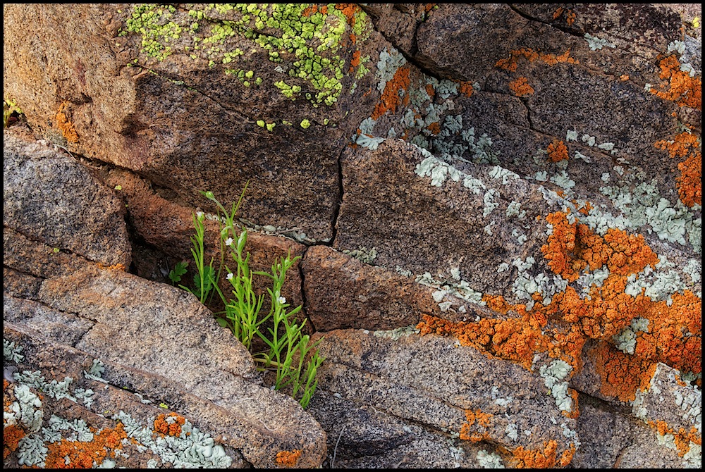
I am impressed by the enormous amount of lichen growing on rocks on a small hill despite our harsh climate!

5D2, 100mm macro, f14

Stack of 29.

There were several artifacts from the wind blowing the flowers but I tried to clean them up.

Honest feedback welcome!

Comments

10 comments
Comment posted by John Clulow on March 16, 2013 at 3:06 PM
Nice sharpness throughout; especially so in the larger view. A few of the elements I like about it: First the diagonals in terms of form. I think that makes it much more interesting than if you had shot or presented it horizontally with respect to the rock stratification.

I like the diffuse lighting and subtle contrast which brings out the texture and forms of the rock substrate.

There is a wonderful degree of vibrance in the orange and green lichens particularly, and interesting color contrasts between reds and greens, blues and yellow tones.

But most of all, I like what this image says about how life finds opportunity not just to survive, but to flourish, even in seemingly forbidding environments. And in particular in this regard, I most love the little green plants that have found their niche in crevice and the tiny whte flowers that celebrate their success.

I also like the thin, black stroke frame you have around this because it seems to match well with the fractures in the rock.


Registered on November 1, 2012, 155 Posts, 1079 Comments
Comment posted by Bill Fach on March 16, 2013 at 6:58 PM
Eirini: Love the scene, comp and overall capture. I'm curious about stacking what looks like a relatively flat focal plane. Without actually knowing the scale it looks like a simple well managed f11 or f16 shot would render similar results. Did you shoot any like that to compare? No matter the capture technique I love the textures and colors. Most excellent. >=))>
Registered on November 1, 2003, 1805 Posts, 26981 Comments
Comment posted by Eirini Pajak on March 16, 2013 at 7:06 PM
Bill, here is one of the shots by itself, at f14. If you email me I will send you additional shots for you to see. I really wanted the entire rock surface to be sharp, and in my opinion every frame was necessary. Perhaps the sense of it being a flat plane is an illusion created by the stacking?

This is obviously unedited...before sharpening, color & contrast were applied.
Registered on December 13, 2011, 216 Posts, 1671 Comments
Comment posted by Philip Hodgkins on March 16, 2013 at 7:21 PM
Eirini, I like the uniform detail very much, even though it gives the impression of a flat plane. Also, very skillful work on the colors. I do think that somewhere around f/22 would have netted the same results, but you used the tools that produced the excellent results, so who am I to second guess it? Good work! :toast:
Registered on July 24, 2006, 2741 Posts, 12349 Comments
Comment posted by Tony Kuyper on March 16, 2013 at 8:35 PM
Definitely like the original best/just fine. The repost looks a little washed out. Nice eye for the unusual comp. This would be easy to walk by and miss.
Registered on November 1, 2003, 364 Posts, 22328 Comments
Comment posted by Carolyn Derstine on March 16, 2013 at 9:03 PM
Love all the variety of colors and textures in this image, Eirini! Very nicely composed and great details from your stacking. My only thought was to crop just a bit more off the left, but also great as is. Nice find!
Registered on February 16, 2011, 610 Posts, 3684 Comments
Comment posted by scott lanz on March 16, 2013 at 10:12 PM
Superb, Eirini. Very well composed with the greenery/flowers in the perfect place. The stack resulted is excellent detail, and the overall processing is spot on. My thoughts echoed Bill's, and I am surprised by the shallow dof from the f14. Must be some sort of optical illusion as the original post looks to occupy a pretty narrow plane.
Registered on November 14, 2003, 840 Posts, 12902 Comments
Comment posted by Ken Smith on March 17, 2013 at 1:23 PM
I like the rich textures and colors of this. Always prefer a deep fissured appearance where the sculptured rocks are accented by shadows and pop when in light...give depth. Well composed Prefer the original. Orange...my fav digital color in flowers...and now in lichen...
Registered on September 5, 2008, 449 Posts, 2444 Comments
Comment posted by Catherine Reilly on March 17, 2013 at 8:28 PM
This is amazing! Super fine detail throughout and excellent processing overall. Just love the comp and the fact that you found this scene and studied it.
Thanks for putting up a single shot to compare with the stack. In the discussion about whether to stack or not, i.e., keeping the look of the scene with it's depth of field, I think there are some visual tricks to use in post-processing that would convey a deeper depth of field. However, accurate representation isn't always necessary. Artist's choice.
Registered on August 16, 2006, 603 Posts, 9192 Comments
Comment posted by Howard Cheek on April 14, 2013 at 7:56 AM
'Life in the rocks' is good :smile:
Really like the green veg FG with its tiny white flowers, & it's right where it should be.
Between the rocks inherent textures/colors, and the multi-colored lichen it's..
Very well done Eirini! :toast:
Registered on July 24, 2008, 1201 Posts, 10758 Comments