Nature Photographers Network
This is the preserved archive of the original Nature Photographers Network. The community continues at naturephotographers.network.
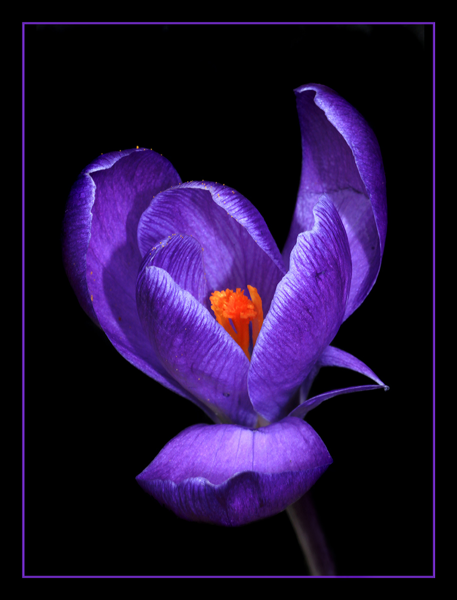
Purple Crocus
‹ PreviousFlora GalleryNext ›

Purple Crocus

by Carolyn Derstine

Gallery: FloraPosted March 16, 2013155 views13 comments
Another shot of one of my blooming crocuses. I have a few more images too so I guess I'm doing a crocus series. :smile: There is a dusting of pollen along the tops of the petals. Does the yellow pollen spot on the top left petal add or detract from this image? I kind of like the quirky touch it adds to this photo but curious what others think. Very easily removed if a problem.

Canon Rebel T1i. 90mm macro lens. F/22 for 1/3 sec. ISO 200. Tripod mounted, on-camera flash fired. Black velvet behind the flower, white diffuser used to block direct sunlight.

Comments

13 comments
Comment posted by John Clulow on March 16, 2013 at 1:32 PM
Another lovely crocus image, Carolyn Derstine.

Personally, I would dispense with the pollen grain in question. The reason is that the imiage itself is like listening to a symphony, and the pollen grain is like someone in the audience sneezing.

However, one could look at it differently; the pollen grains, and there are several with the one in question only being the most obvious example, tell a story about what the flower is and why it is. So maybe it is better seen as a few pizzicato notes coming from the violin section. :smile:
Registered on November 1, 2012, 155 Posts, 1079 Comments
Comment posted by Eirini Pajak on March 16, 2013 at 1:34 PM
Hmmm...I actually like the pollen grain. Although I have to say the fact it reminded John of sneezing made me smile :smile: I think it adds to the depth...awesome shot! Your DOF is superb!
Registered on December 13, 2011, 216 Posts, 1671 Comments
Comment posted by Ken Smith on March 16, 2013 at 2:10 PM
OOzzzing with colors and delicate lighting ... the white edges of petals makes this pop... Superb...keep the pollen...maybe tone it down just a smidge because it looks over sharpened w/jagged edges. OK this comment is because I love this.. and I get nit-picky when I love something....I would make the purple trim narrower... keep it delicate. A wall-hanging beauty!
Registered on September 5, 2008, 449 Posts, 2444 Comments
Comment posted by Michael Cothran on March 16, 2013 at 2:15 PM
Nice image. I like the composition, your processing mostly, and the vividness of the purples. I would do away with the yellow pollen - it may be little and insignificant, but it is surely distracting, as is the bright purple pinstripe. You shouldn't want anything distracting the eye away from the beautiful subject matter.
Registered on December 5, 2012, 31 Posts, 730 Comments
Comment posted by Carolyn Derstine on March 16, 2013 at 4:18 PM
John, I love your analogy! --
the image itself is like listening to a symphony, and the pollen grain is like someone in the audience sneezing.
Very descriptive and creative. . . had a big grin on my face after reading your comments. :biggrin:
Registered on February 16, 2011, 610 Posts, 3684 Comments
Comment posted by Bill Fach on March 16, 2013 at 7:00 PM
Carolyn: Southeast Texas is very unfriendly to crocus so I always look forward to the early spring shots of them from up north. This is really outstanding. 2 thumbs up! >=))>
Registered on November 1, 2003, 1805 Posts, 26981 Comments
Comment posted by Philip Hodgkins on March 16, 2013 at 7:24 PM
Good work, Caroline. The crocus itself, the colors and detail work wonderfully with the dark background.
Registered on July 24, 2006, 2741 Posts, 12349 Comments
Comment posted by scott lanz on March 16, 2013 at 10:14 PM
Even better than the last one, Carolyn. Fantastic control of the light. :toast: :jump:
Registered on November 14, 2003, 840 Posts, 12902 Comments
Comment posted by William Gillis on March 17, 2013 at 2:19 PM
Superb image Carolyn. I think I would have removed the pollen only to compare it to this image.If removal of the pollen improved it then maybe I would select it over the one posted. The pollen makes the image more realistic to me. I like the DOF, BG, color and comp.Well done. :toast: :toast:

William Gillis
Registered on November 28, 2011, 17 Posts, 204 Comments
Comment posted by Catherine Reilly on March 17, 2013 at 8:31 PM
Brilliant portrait, Carolyn! I'd favor cloning the brightest pollen speck on the left. The clarity and lighting make this image of crocus startling-- a real eye-catcher.
Registered on August 16, 2006, 603 Posts, 9192 Comments
Comment posted by Albert Darmo on March 20, 2013 at 10:09 PM
Hi Carolyn :wavey: Pollen is a natural phenomenon. and small amounts add to the reality of the image. the detail and color are stunning :toast:
Albert Darmo
Registered on November 25, 2008, 1386 Posts, 11978 Comments
Comment posted by Krunal Janani on March 23, 2013 at 1:07 AM
Lovely image Carolyn, just ooozing with color
the pollen thing as we can see from the comments is very very subjective thing but i m not a fan of the same color border (but that is also an subjective thing)
Registered on September 16, 2010, 60 Posts, 1370 Comments
Comment posted by Larry Lynch on March 26, 2013 at 11:33 AM
I like it as is... Beautiful color, light and comp. A terrific capture!!
Registered on September 16, 2006, 773 Posts, 9940 Comments