Nature Photographers Network
This is the preserved archive of the original Nature Photographers Network. The community continues at naturephotographers.network.
Portage Lake Morning
‹ PreviousLandscape GalleryNext ›

Portage Lake Morning

by Vance Gese

Gallery: LandscapePosted March 6, 2013807 views35 comments
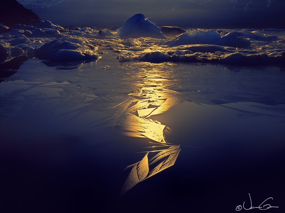
These backlit ice feathers were photographed the same cold June morning several years ago as the image "Portage Lake" posted a few weeks ago. Exposed a single sheet of Velvia 4x5, which as one would expect had a bit of trouble handling the contrast; many of the highlights were quite bright. In processing this scan, I have tried to retain some detail of the highlights in the ice with Tony Kuyper's Triple Play masks and a lot of burning through other masks but not sure if the result is all that great. Seems to have lost some of the luminous quality I was hoping for. Light falloff in the corners is an issue as well. Would appreciate your thoughts on this image, and any suggestions for improvement.
4x5, 120mm, Velvia, no filters. M1 scan, Tony Kuyper's luminosity masks and others

Large image posted as well.

Thanks.

Comments

35 comments
Comment posted by Rick Turner on March 6, 2013 at 4:20 PM
Very interesting composition. :wink:
Beautiful as is :toast:
Registered on February 18, 2012, 534 Posts, 2755 Comments
Comment posted by Charlie Baugh on March 6, 2013 at 5:11 PM
That beam of light with the varying fall off of light and colors are stupendous. Pattern? Stupendous also.
Registered on April 18, 2011, 329 Posts, 1985 Comments
Comment posted by Nick Bristol on March 6, 2013 at 5:12 PM
Vance, I'm really enjoying this! I love the light and color then the reflections on the ice that look like feathers are fantastic! It is different and really nice. Very cool!... :toast:

Nick Bristol
Lone Rock, WI
Registered on February 1, 2004, 752 Posts, 14140 Comments
Comment posted by Richard Teller on March 6, 2013 at 6:48 PM
The unique lighting makes this image. It is unusual and that is what makes it for me.
Registered on August 23, 2010, 1162 Posts, 6692 Comments
Comment posted by Michael Cothran on March 6, 2013 at 7:40 PM
If your subject is the ice designs in the foreground, I'd say you were successful in your presentation. They resemble glass etchings, and are certainly the star of this stage.
Registered on December 5, 2012, 31 Posts, 730 Comments
Comment posted by Bill Reid on March 6, 2013 at 8:11 PM
Very beautiful ice feathers and blues in the ice Vance. Very different and very nice.
Registered on January 27, 2013, 65 Posts, 2460 Comments
Comment posted by Nick Palmieri on March 6, 2013 at 8:33 PM
Very different but really neat! Breaks a lot of rules and that makes it even stronger. Thanks for sharing.
Registered on September 1, 2011, 35 Posts, 748 Comments
Comment posted by Eva McDermott on March 6, 2013 at 8:41 PM
I think this is all about the stream of light in the center and the highlighted ice patterns. The highlights on the background icebergs are a bonus. I am not sure how to improve this Vance but I certainly like the moodiness of the scene.
Registered on January 4, 2009, 1015 Posts, 13229 Comments
Comment posted by Charlie Baugh on March 6, 2013 at 9:47 PM
Back to look again, Vance. This is the most beautiful winter scene in memory.
Registered on April 18, 2011, 329 Posts, 1985 Comments
Comment posted by Vance Gese on March 6, 2013 at 10:31 PM
Hey, thanks everyone for the great comments. Really appreciate it.
Registered on November 13, 2008, 298 Posts, 6629 Comments
Comment posted by Marylynne Diggs on March 6, 2013 at 11:05 PM
Fantastic. I love the composition and the cold blue/warm yellow colors.
Registered on December 14, 2010, 122 Posts, 1034 Comments
Comment posted by Youssef Ismail on March 6, 2013 at 11:41 PM
Are you kidding me! Man how did you capture that moment. Amazing work Vance. The light and pattern on the FG ice feather is just over the top. Well done.
Registered on November 1, 2003, 474 Posts, 5555 Comments
Comment posted by Mark Seaver on March 7, 2013 at 9:43 AM
Those ice feathers are spectacular! The sun streak and the ice hump at the horizon are also great. I think this could be improved by cropping from both sides to a vertical (that would help with the fall off problem also).
Registered on January 23, 2011, 1103 Posts, 17270 Comments
Comment posted by Paul Breitkreuz on March 7, 2013 at 10:39 AM
Vance, having been to this area years ago I enjoy seeing these images you've posted from there. This looks like a very tough exposure and you've worked it out extremely well. I like this a lot.

To improve the light fall off in the corners did you try using the vignetting adjustment in lens correction? I find with my 4x5 I have to correct that a lot with stopped down captures, lots of lens shift, and or a combination of also using a square filter holder. Admittedly I only adjust to the lighten side not more then a +20 depending upon the degree of corner darkness, but it usually helps a lot for me. Just a thought.
I would also mention that I do not use a LF lens center filter. Many times they can aid with scenes like this, but they are too costly for me. :cool:
Registered on February 25, 2006, 525 Posts, 8448 Comments
Comment posted by Morris McClung on March 7, 2013 at 11:51 AM
The blue and gold color combo is fantastic in this one, Vance! And, the light streaking across the ice creating those patterns is just as great. I could see a crop to vertical to really bring the focus in on that and eliminating the light fall off, too. And, today one would want to carry a digital for isolating abstracts of those ice "feathers." I sure wish there was a huge coffee table book by someone of his Alaska images. :biggrin:
Registered on May 7, 2007, 670 Posts, 19650 Comments
Comment posted by Mark Metternich on March 7, 2013 at 1:49 PM
Great use of light! Very interesting.
Registered on June 19, 2009, 276 Posts, 6240 Comments
Comment posted by Gary McGhee on March 7, 2013 at 3:14 PM
The light hitting and highlighting the foreground ice looks great Vance. Nice contrasting colours too.

Gary.
Registered on April 15, 2010, 142 Posts, 2416 Comments
Comment posted by Matt Anderson on March 7, 2013 at 6:56 PM
Vance, that selective lighting is spectacular! :toast:
Registered on September 6, 2007, 346 Posts, 2696 Comments
Comment posted by Scott Smorra on March 7, 2013 at 7:44 PM
Now that's what I call gold and blue! The patterns and textures in the ice feathers are stunning. I think the light falloff adds to the moody feel of the image. Very well done Vance!
Registered on November 2, 2009, 161 Posts, 2143 Comments
Comment posted by John&Patty Benway on March 8, 2013 at 5:38 AM
Pretty amazing shot Vance, I like this very much, very different, and very appealing.
John
Registered on May 12, 2006, 626 Posts, 8700 Comments
Comment posted by Stan Rose on March 8, 2013 at 12:04 PM
Huh, well as usual i'll be all by my lonesome in my assessment :frown: I love the subject, just not sold on the comp--the centering feels too static and there's a lot of empty space especially lhs. I would have preferred a vertical with 1/3 left of the line, 2/3 to the right. It would be an easy crop, but since im outnumbered 20-1, you can probably safely ignore my idea... :wink:
Registered on September 15, 2005, 836 Posts, 17099 Comments
Comment posted by Lon Overacker on March 8, 2013 at 12:56 PM
Vance,

The light and graphics of the ice through the middle and most especially at the bottom is just spectacular! So much so, I'd even consider a strong vertical pano crop. what makes the ice patterns so striking near the bottom is the extreme contrast and darkness at the bottom. This is just wonderful!

Lon
Registered on November 24, 2006, 521 Posts, 19147 Comments
Comment posted by Kah Kit Yoong on March 8, 2013 at 9:58 PM
Great presentation. Can't say I've ever seen anything quite like this captured.
Registered on September 27, 2006, 636 Posts, 10682 Comments
Comment posted by Tony Kuyper on March 9, 2013 at 8:56 AM
The brilliance of the ice pattern totally captivates me. Some of the other elements make the image feel a bit "messy" but since they're darker, they're not all that distracting. Still, just wondering if a strong vertical might be worth considering here.
Registered on November 1, 2003, 364 Posts, 22328 Comments
Comment posted by Stuart Williams on March 11, 2013 at 1:52 AM
vance, i'm drawn to the fabulous colour and forms in the FG. And standing on my head. I've taken liberties (forgive me please) - see the image. stuart.
Registered on December 7, 2007, 247 Posts, 4792 Comments
Comment posted by Marc Adamus on March 11, 2013 at 12:21 PM
Absolutely magical light here! WOW!!! This is the type of shot that shows the photographer's art, talent and vision.
Registered on September 17, 2005, 780 Posts, 8091 Comments
Comment posted by Floris van Breugel on March 11, 2013 at 7:47 PM
Fascinating shapes and colors! Very well seen and presented. Beautiful work, as usual from you!
Registered on December 19, 2008, 306 Posts, 4840 Comments
Comment posted by Dietrich Gloger on March 12, 2013 at 1:57 PM
I know I am super late to the party, but wanted to let you know that this one was noticed by me and I dig it tremendously. A magical image.
A shot that seems impossible to pull off with LF and Velvia, yet you managed. :toast:
Registered on January 26, 2007, 360 Posts, 9876 Comments
Comment posted by Paul Breitkreuz on March 13, 2013 at 4:28 PM
:toast:
Congratulations on this very fine image being selected for this weeks WP / EP in the Landscape Gallery, Vance. :wavey:
Registered on February 25, 2006, 525 Posts, 8448 Comments
Comment posted by Mike Ramy on March 13, 2013 at 9:50 PM
Vance,
Not much I can add to what has already been said, Well Done.
Congratulations on the WP . . . :toast:
Registered on June 16, 2012, 567 Posts, 2809 Comments
Comment posted by Morris McClung on March 13, 2013 at 10:10 PM
Congrats on the WP! :toast: A completely deserving image, Vance! :toast:
Registered on May 7, 2007, 670 Posts, 19650 Comments
Comment posted by Catherine Reilly on March 14, 2013 at 12:29 AM
I'd say a WP is pretty darn good feedback about this amazing image! Well done in every way. Congratulations, Vance.
Registered on August 16, 2006, 603 Posts, 9192 Comments
Comment posted by SandyRichardsBrown on March 15, 2013 at 2:34 PM
very unique and interesting - congrats on the WP!
Sandy
Registered on November 24, 2003, 3937 Posts, 12909 Comments
Comment posted by Anil Rao on March 17, 2013 at 1:41 PM
This is fabulous. Congratulations on the WP Vance. :toast:
Registered on November 15, 2003, 234 Posts, 4923 Comments
Comment posted by Doug Koepsel on March 17, 2013 at 3:58 PM
Striking. The bottom golden ice pattern in itself could make a fine image, as would a vertical comp.
Registered on April 1, 2010, 196 Posts, 1592 Comments