Nature Photographers Network
This is the preserved archive of the original Nature Photographers Network. The community continues at naturephotographers.network.
Point Cabrillo
‹ PreviousMan & Nature GalleryNext ›

Point Cabrillo

by Bill Sinkovich

Gallery: Man & NaturePosted February 2, 2013147 views8 comments
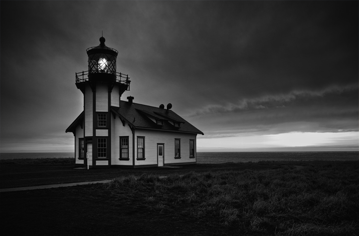
Greetings, I left NPN in 2008 because my images were not quite up to par to work on technique and subject matter. I re-joined the network because I now have images that I believe are worthy of the NPN forum. I am a serious amateur looking to improve so, your honest critique/suggestions are greatly appreciated. I took this image in January, 2013 at Point Cabrillo, Mendocino County, Northern California.

Canon 5D, 1/30 sec, f-4.0, ISO 100 @ 28mm. Converted to grayscale in Nik Silver Efex Pro 2 and I used Photoshop to remove two picnic benches and one visitor who I patiently waited to move out of the scene.

I look forward to learning from the best nature photographers on the net. Thank you!

Comments

8 comments
Comment posted by Gary Reed on February 2, 2013 at 7:56 AM
Bill, I like the feeling of solitude here and the dark skies. I think you need to bring the levels up on the white in the building. It is a little too shadowed and starts to melt into that forbidding background. The white sky behind draws more attention than your main subject and my eye goes to that spot instead of your intended target. Tough conditions to balance for sure. :toast:
Registered on September 19, 2009, 198 Posts, 1074 Comments
Comment posted by Cristina Strudthof on February 2, 2013 at 8:52 AM
Hey Bill, glad to see you've rejoined the group. I really like the comp of this image. The solitude of the light house nicely sets off the mood. However, I do think it a tad too dark. It is good to see a little more detail in the building but even in the foreground. It looks like there might be some great detail in the grass but it is just hard to see it. I'm not sure about Nik Silver, but I know in Photoshop, a graduated mask on an exposure adjustment would allow you to keep the nice dark detail of the sky while adjusting the lower part of the image, and then you could add the lighthouse to that mask as well to keep it from being so dark.
Registered on January 14, 2011, 53 Posts, 363 Comments
Comment posted by John Clulow on February 2, 2013 at 10:32 AM
I like this. I would only suggest flipping it horizontally. Otherwise perfect.
Registered on November 1, 2012, 155 Posts, 1079 Comments
Comment posted by Michael Cothran on February 2, 2013 at 10:37 AM
I see nothing to criticize here. Nice moody image, well processed.
Registered on December 5, 2012, 31 Posts, 730 Comments
Comment posted by Basil Greber on February 3, 2013 at 7:21 AM
I like the darkish mood of the scene, and the feeling of isolation it conveys. I think the composition is good, too, with the "light bulb" in the 1/3-1/3 position. Nice!
Registered on November 8, 2005, 219 Posts, 1340 Comments
Comment posted by Kah Kit Yoong on February 4, 2013 at 3:14 AM
Beautifully moody.
Registered on September 27, 2006, 636 Posts, 10682 Comments
Comment posted by Nick Bristol on February 6, 2013 at 6:53 PM
Fantastic mood! I like this and think your b/w conversion looks very cool. :smile:

Nick Bristol
Lone Rock, WI
Registered on February 1, 2004, 752 Posts, 14140 Comments
Comment posted by Mae on March 22, 2013 at 11:22 PM
Bill, I love that this image is far more about the light than the house which really presents a foundation and stage for such a lovely star! And so it must be...as you make it so. :smile:
Registered on March 22, 2013, 13 Posts, 58 Comments