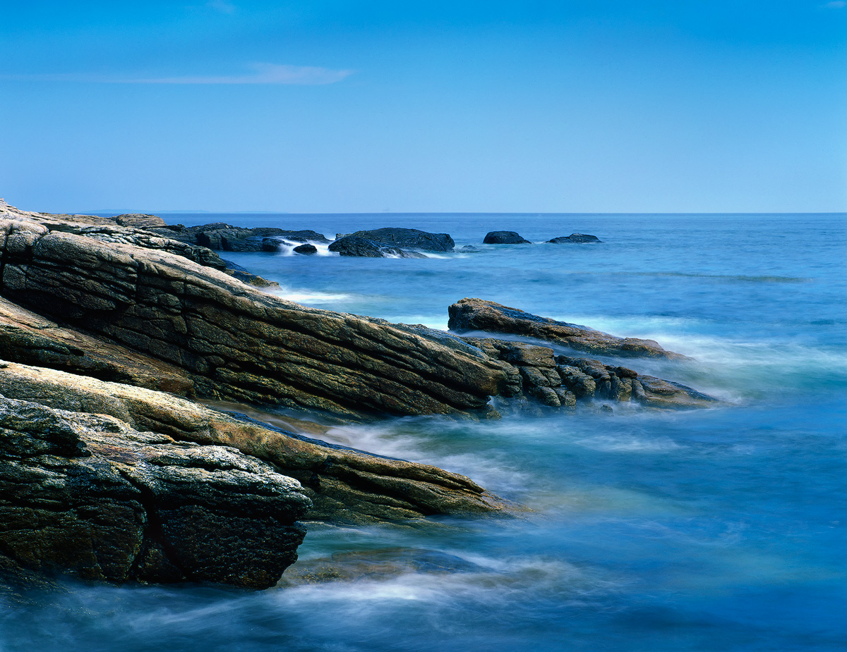
Pentax 67II
Pentax 67 55-100mm
Velvia 50
Lee 1.5-Stop HE Gradient + Hitech 4-Stop ND
Thanks for having a look.
Comments
17 comments
Comment posted by Bob&Charly Nelson on January 30, 2013 at 9:27 PM
Great blues and detail captured Eva, this is a very relaxing image to sit and look at.
Bob
Registered on October 27, 2005, 289 Posts, 4202 Comments
Comment posted by Luke Ormand on January 30, 2013 at 9:39 PM
I like the slower shutter speed which adds a nice painted feeling to the water while the rocks remain sharp - I would like a few more clouds in the sky but that's minor
Registered on February 4, 2009, 1093 Posts, 7035 Comments
Comment posted by Tony Kuyper on January 30, 2013 at 11:00 PM
I like this. It nicely captures the color and feel of the coast.
Registered on November 1, 2003, 364 Posts, 22328 Comments
Comment posted by Charlie Baugh on January 30, 2013 at 11:38 PM
Wonderful contrasts, slant of the rocks and SS for the water is just right IMO. Beautiful image.
Registered on April 18, 2011, 329 Posts, 1985 Comments
Comment posted by Marsel van Oosten on January 31, 2013 at 6:07 AM
Nice color contrast and diagonals. I too would prefer some more clouds in that sky, and as it is, I'd probably crop half of the sky off to lose that pseudo cloud and that darker blue stroke above it. Hope that makes sense.
Marsel
Registered on March 9, 2004, 285 Posts, 2277 Comments
Comment posted by Morris McClung on January 31, 2013 at 11:03 AM
The colors make this one sing, Eva! Gorgeous image!
Registered on May 7, 2007, 670 Posts, 19650 Comments
Comment posted by Peter Richter on January 31, 2013 at 11:08 AM
Eva, I do like the freshness of the blues here. Your choice of shutter speed is very interesting for me and adds a kind of calmness to this seascape. You also captured nice textures of the rocks.
I think cropping about half of the sky and also the tiny clouds might still enhance the impact of the strong diagonals. But that might be purely a matter of opinion.
Peter
Registered on November 10, 2010, 218 Posts, 2723 Comments
Comment posted by Richard Teller on January 31, 2013 at 11:14 AM
I like the colors and detail in this image. You have created a very nice feeling here.
Registered on August 23, 2010, 1162 Posts, 6692 Comments
Comment posted by Kurt Budliger on January 31, 2013 at 11:21 AM
Great comp, classic Maine coast. For a second I thought it might be from Schoodic Penn.
Registered on June 11, 2006, 113 Posts, 2116 Comments
Comment posted by Stan Rose on January 31, 2013 at 2:19 PM
Swweet! Love the rich colors, great thirds, great diagonals--just perfect!
Registered on September 15, 2005, 836 Posts, 17099 Comments
Comment posted by Gary McGhee on January 31, 2013 at 4:17 PM
You've captured a really nice chunk of coastline here Eva, I think the white surf breaks up the blue nicely between the sea and the rocks.
Gary.
Registered on April 15, 2010, 142 Posts, 2416 Comments
Comment posted by Lon Overacker on January 31, 2013 at 6:43 PM
Eva,
This is excellent. I love the blues throughout - almost to pretty of a blue, but I love colors here anyway. I like the balance with the included sky as is and personally wouldn't crop. What you might want to do is selectively brighten/dodge that cloud and try to bring out some more white and make that little guy more of presence than it is now. No biggie, just a thought.
Lon
Registered on November 24, 2006, 521 Posts, 19147 Comments
Comment posted by Albert Darmo on January 31, 2013 at 7:06 PM
Hi Eva It's like being there beautifully composed with mesmerizing color and detail. agree with lon on the idea of brightening the cloud
Albert Darmo
Registered on November 25, 2008, 1386 Posts, 11978 Comments
Comment posted by Nick Bristol on February 1, 2013 at 9:58 AM
Eva, I really enjoy this image. It seems to give me a nice feelng just looking at at. Love the blues you captured and then there is all the detail in the rocks that is quite interesting. I feel like I just want to sit there for awhile... well, I will just sit here and enjoy it...
Nick Bristol
Lone Rock, WI
Registered on February 1, 2004, 752 Posts, 14140 Comments
Comment posted by Zack Clothier on February 2, 2013 at 2:13 AM
Looks like paradise to me, wonderful shot Eva. I love the detail in those rocks and the wave action too! You might try cropping to just above that cloud, there seems to be some uneveness in the sky above it, not sure if that's from the scan or not.
Registered on January 28, 2010, 343 Posts, 2257 Comments
Comment posted by John&Patty Benway on February 2, 2013 at 8:08 AM
Very appealing Eva, really like the color, detail and comp. Beautiful work.
John
Registered on May 12, 2006, 626 Posts, 8700 Comments
Comment posted by Kah Kit Yoong on February 2, 2013 at 7:05 PM
Some very nice abstract qualities to this. I'm curious about BW. Great use of the contrasts and shuttered water.
Registered on September 27, 2006, 636 Posts, 10682 Comments

Comments
17 commentsBob
Marsel
I think cropping about half of the sky and also the tiny clouds might still enhance the impact of the strong diagonals. But that might be purely a matter of opinion.
Peter
Gary.
This is excellent. I love the blues throughout - almost to pretty of a blue, but I love colors here anyway. I like the balance with the included sky as is and personally wouldn't crop. What you might want to do is selectively brighten/dodge that cloud and try to bring out some more white and make that little guy more of presence than it is now. No biggie, just a thought.
Lon
Albert Darmo
Nick Bristol
Lone Rock, WI
John