Gallery: LandscapePosted January 28, 2013309 views15 comments
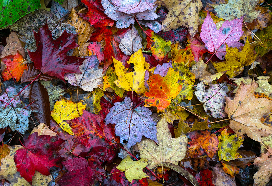
This photo was taken about 3 months ago near Spruce Knob, WV. I mostly like it for the amazing variety of color. Your comments and critique are welcome. Thanks, Chet
Comments
15 comments
Comment posted by Navin Sarma on January 28, 2013 at 4:17 PM
Nice one, Chet. I recall the floors of the WV forests having much interest as well. I like the varied colors here, but it feels a little heavy on the blues. Might try to warm it up a bit. Nice cap.
Registered on July 17, 2011, 233 Posts, 1373 Comments
Comment posted by Gary Reed on January 28, 2013 at 4:47 PM
Chet, nice forest floor grab. I love looking for these myself. I like the colour as is.
Registered on September 19, 2009, 198 Posts, 1074 Comments
Comment posted by Harry Lichtman on January 28, 2013 at 5:17 PM
Those are some vibrant leaves Chet. The moisture on them really makes them pop. Looks fine as is - though a tighter shot of that center clump might reduce the inherent chaos of this kind of shot and simplify it a bit more. Really nice find.
Registered on September 17, 2010, 304 Posts, 3507 Comments
Comment posted by Morris McClung on January 28, 2013 at 5:48 PM
The large version has excellent detail. Love the variety of colors, and shapes. Excellent image!
Registered on May 7, 2007, 670 Posts, 19650 Comments
Comment posted by Ben Horne on January 28, 2013 at 5:51 PM
I like the imperfect nature of the leaves here Chet. The spots and holes make this look very interesting. Something about the color seems perhaps too saturated though. I'm not sure if it's the reds, yellows, or blues, but it feels a bit too strong in that regard. Perhaps the high contrast is having an impact on the colors? I think you have so much wonderful texture and shape here that I think less saturation would make the image stronger. Also, I wouldn't mind an ever so slight vignette to keep the eye within the composition. Very nice work.
Registered on August 27, 2009, 51 Posts, 959 Comments
Comment posted by Nick Bristol on January 28, 2013 at 6:33 PM
Hi Chet, This is a very cool looking image. The larger version is especially nice to enjoy. Wonderful details and texture. Since the leaves are wet I would guess they were close to these colors but I do feel that the saturation could be brought back just a little and it would still look great..
Nick Bristol
Lone Rock, WI
Registered on February 1, 2004, 752 Posts, 14140 Comments
Comment posted by SandyRichardsBrown on January 28, 2013 at 7:08 PM
exceptional array of colours and really nice detail.
Sandy
Registered on November 24, 2003, 3937 Posts, 12909 Comments
Comment posted by Tony Kuyper on January 28, 2013 at 9:43 PM
Neat variety of color for sure. The contrast seems a bit extreme, but with this subject it sort of heightens the abstract quality Overall I like this a lot.
Registered on November 1, 2003, 364 Posts, 22328 Comments
Comment posted by scott lanz on January 29, 2013 at 12:48 PM
Beautiful leaf shot. I also find the color/contrast high, but if you are after striking, you certainly got it here.
Registered on November 14, 2003, 840 Posts, 12902 Comments
Comment posted by Harley Goldman on January 29, 2013 at 3:17 PM
Nice array of leaves. The saturation is kind of off the charts for my tastes, but that is a matter of personal preference.
Registered on November 19, 2003, 586 Posts, 11271 Comments
Comment posted by Kory Lidstrom on January 29, 2013 at 3:23 PM
Love everything about this. The color does seem a tad oversaturated, but that could just be because the leaves really were that colorful.
Registered on November 19, 2008, 49 Posts, 1035 Comments
Comment posted by Eirini Pajak on January 29, 2013 at 5:40 PM
What a beautiful array of leaves! It does seem a bit over saturated to me, and I think I might like a tighter crop to focus in on the center leaves more...but seriously a gorgeous find!
Registered on December 13, 2011, 216 Posts, 1671 Comments
Comment posted by David E Lester on January 29, 2013 at 8:00 PM
Love it as is, it keeps your eyes moving..thats me thou!!
Registered on March 24, 2010, 155 Posts, 793 Comments
Comment posted by Albert Darmo on February 1, 2013 at 11:38 AM
Hi Chet What a riot of saturated color the abstractness works well for me
Albert Darmo
Registered on November 25, 2008, 1386 Posts, 11978 Comments
Comment posted by Lorna Taylor on February 1, 2013 at 3:41 PM
Beautiful pop of autumn colours !
Registered on November 12, 2010, 254 Posts, 3083 Comments

Comments
15 commentsNick Bristol
Lone Rock, WI
Sandy
Albert Darmo