Nature Photographers Network
This is the preserved archive of the original Nature Photographers Network. The community continues at naturephotographers.network.
Camp Wit-so-nah-pah
‹ PreviousLandscape GalleryNext ›

Camp Wit-so-nah-pah

by Rudy Ruberti

Gallery: LandscapePosted January 10, 20131,815 views7 comments
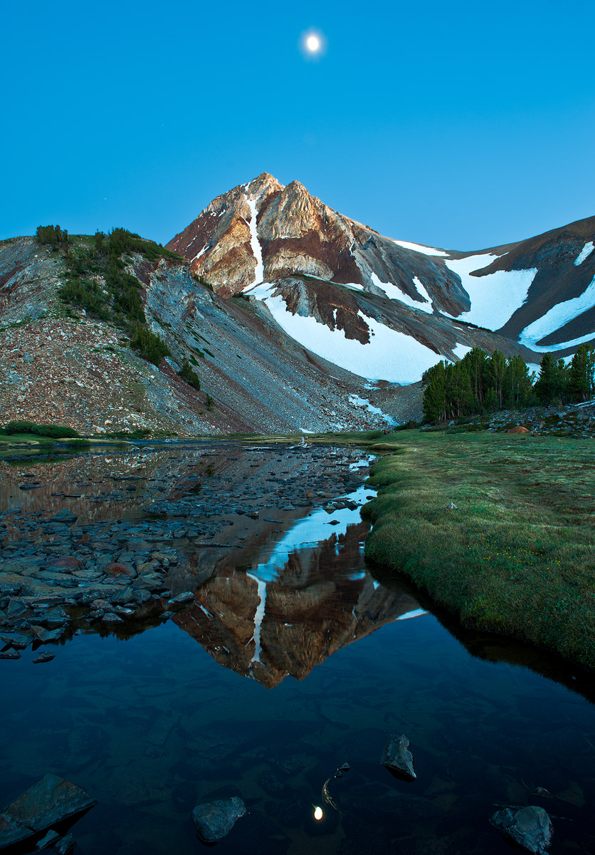
I took my daughter and two of her friends backpacking in the Eastern Sierra last summer and this was taken near our second nights camp at Wit-so-nah-pah Lake. Wit-so-nah-pah is kind of a hard place to get to and required some cross-country hiking, but it was worth it and the girls had a great time.

I'm particularly interested in what you think about the centered comp and blown out moon. Although I bracketed for a properly exposed moon, I needed up liking this better. The blown out moon is larger and I like the slight star effect. I also have a comp without the moon and lower rocks.
Thanks and comments welcome,

D700, 24-70mm
f10 @ 15s

Comments

7 comments
Comment posted by Peter Coskun on January 10, 2013 at 9:10 PM
I like the inclusion of the moon in the sky here, but find the reflection of the moon to be a bit distracting. I think it just feels too close to the bottom and that rock edge just next to it. Otherwise, I really like the comp and it looks like a beautiful place. Everything else is spot on.
Registered on October 31, 2011, 170 Posts, 1240 Comments
Comment posted by Nick Bristol on January 11, 2013 at 10:28 AM
Rudy, This is a beautiful scene and I very much enjoy the peaceful feel it has. I like the moon but agree with peter about it's reflection. The clarity of this is wonderful along with the color. I think your other comp sounds like it would work really well too. Nice work! Looks like you would have had a great campsite. :smile:

Nick Bristol
Lone Rock, WI
Registered on February 1, 2004, 752 Posts, 14140 Comments
Comment posted by Brad Clinch on January 11, 2013 at 6:58 PM
Great exposure of a beautiful location. I'd be curious what the image would look like without the moon in the sky. It feels like there is too much sky and not enough foreground. The FG details could produce an interesting shot. :toast:
Registered on January 5, 2013, 37 Posts, 261 Comments
Comment posted by Brian Schrayer on January 11, 2013 at 10:34 PM
This works for me, Rudy. The subtle color and lighting evokes a calm feel to this image. One minor nit / suggestion - the reflection of the moon in the lower half of the image tends to draw my eye too much. I actually like a crop just below the reflection of the peak. Well as I scroll down and read through the other comments I guess someone else mentioned the same thing. At least we are consistent!! :biggrin:
Registered on May 28, 2004, 114 Posts, 2890 Comments
Comment posted by Lon Overacker on January 12, 2013 at 3:51 PM
Rudy,

Excellent alpine landscape and reflection image. The moon is fine and I think the little star effect really helps.

To me this looks like it's a little bit cyan; mostly seen in the talus slope and the snow on the right. Personally, I would go with a crop eliminating the moon and few rocks at the bottom. Just a thought.

Otherwise, just a quiet and lovely mountain landscape.

Lon
Registered on November 24, 2006, 521 Posts, 19147 Comments
Comment posted by Mark Metternich on January 12, 2013 at 8:38 PM
Great shot Rudy! :toast:
Registered on June 19, 2009, 276 Posts, 6240 Comments
Comment posted by Marc Adamus on January 14, 2013 at 11:10 AM
I think that will happen on almost all moon exposures, Rudy. I do workshops and tours all the time and frequently see people trying to properly expose and blend the moon, and like you, almost always preferring this. I love the pre-glow (or after glow, should the case be sunset) on the peak. I agree with comments suggesting the foreground is a little bit busy but on the other hand, I don't think I'd crop it. Sure looks like a wonderful spot for a tent.
Registered on September 17, 2005, 780 Posts, 8091 Comments