Gallery: LandscapePosted December 27, 201275 views4 comments
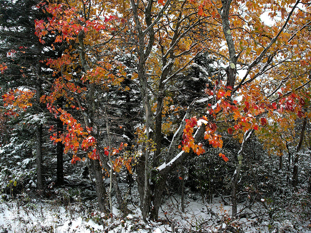
This is another image from my Dolly Sods trip in early October. Comments
are welcome. Thanks. Chet
Comments
4 comments
Comment posted by Dan Baumbach on December 27, 2012 at 2:38 PM
Wonderful color and I like the way the branches extend from the center.
- Dan
Registered on November 1, 2003, 473 Posts, 7980 Comments
Comment posted by Chet Dowell on December 27, 2012 at 2:39 PM
This image is showing darker here than on my monitor. Chet
Registered on December 3, 2012, 237 Posts, 1171 Comments
Comment posted by Pat Sampson on December 27, 2012 at 8:36 PM
Great color against the monochrome bg Chet.
No nits on my part and I like the mood of the image even if it is darker than you intended.
pat
Registered on May 19, 2007, 953 Posts, 15989 Comments
Comment posted by Lon Overacker on December 28, 2012 at 2:53 PM
Chet,
Great mix of color with the dusting of snow. I can't say this is too dark really - at least with nothing to compare it too or a reference, but I think the overall brightness looks good to me.
This is certainly an image/scene where bigger is better. The smaller version, stuff is kinda lost, or not noticed, but the larger view is much better to be able to enjoy all the details throughout. I'd hate to go so far as to say this is too busy, but I am wondering if simplifying this with a square crop might make a stronger statement. I see both/either a square crop of the left half or a square crop of the right half. I think both areas have some nice combination of elements. The left half I would enjoy without the patches of sky, but then if you just had the right half, then the patches of sky are more a part of the overall scene - if that makes sense. Anyway, just thinking out loud. Still, a very nice seasonal transition image.
Lon
Registered on November 24, 2006, 521 Posts, 19147 Comments

Comments
4 comments- Dan
No nits on my part and I like the mood of the image even if it is darker than you intended.
pat
Great mix of color with the dusting of snow. I can't say this is too dark really - at least with nothing to compare it too or a reference, but I think the overall brightness looks good to me.
This is certainly an image/scene where bigger is better. The smaller version, stuff is kinda lost, or not noticed, but the larger view is much better to be able to enjoy all the details throughout. I'd hate to go so far as to say this is too busy, but I am wondering if simplifying this with a square crop might make a stronger statement. I see both/either a square crop of the left half or a square crop of the right half. I think both areas have some nice combination of elements. The left half I would enjoy without the patches of sky, but then if you just had the right half, then the patches of sky are more a part of the overall scene - if that makes sense. Anyway, just thinking out loud. Still, a very nice seasonal transition image.
Lon