Babcock Pond
by Matthew Goldsmith
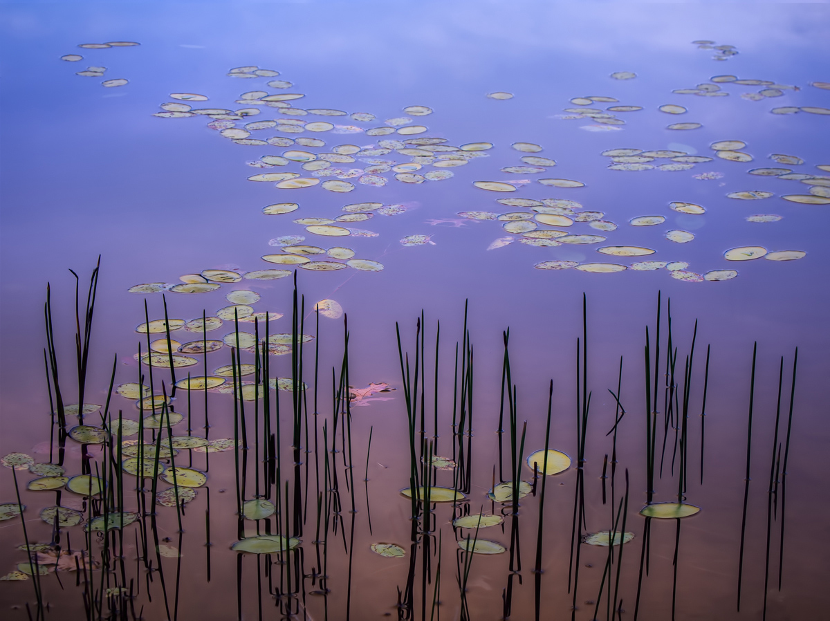
Taken early one morning this fall at Babcock State Park in WV. I've been on the fence about this one for a while. I have both a horizontal and a vertical version. Although I didn't quite hold focus in the distant lily pads in this version, the vertical suffered a similar fate in the foreground reeds, which I think is more problematic. Thank you for looking. Feedback appreciated as always. Large version also posted.
D700. Two image stack for DOF.

Comments
24 commentsLike: Mood, colors, water color and reflection
dislike: the far lilies have soft edges
Nick Bristol
Lone Rock, WI
Lovely!
Sandy
aF
- Dan
Simply gorgeous! The color gradation in this is just wonderful. I don't mind the softer leaves up top either because that keeps the emphasis on color and the reeds at the bottom.
My observation and not meant as a critique, but was a little Orton or glow used? Of course it doesn't matter, it's the result that matters, but just checking to see about my own observations. No biggie, this is a beautiful image.
Lon
Lon, I believe you are correct about a little bit of glow. I have not been in the habit of saving layered files, so I cannot check to be certain, but I do use it for some landscapes. My recollection is that I used it for the water. Okay with me if this pushes the image to Photo Art instead of landscape.
No problem, no biggie. I use the Orton technique all the time; not necessarily for any glow effect, but I think it's a great tool for color, contrast, etc. It's a fine line, or actually more like a very gray area between what might be considered Photo Art and traditional landscape. Just my opinion and not representing the other mods, but determining when something leaves "reality" is of course subjective. While I thought I noticed a glow, I personally don't think it took it to an altered state - if that makes sense.
If anything, I bring this stuff up sometimes just so others may read and think about these choices too.
Lon
This has such an elegance beauty to it. I love the rich colors and the contrast of the reeds against the water. The same with the luminance in those leaves, really grabs the attention. I also love the subtle glow you have in it whether it was applied or not, it works wonderfully. Like the others, I do not mind the softness of the BG leaves, in this case total front to back sharpness is not essential for the photo to affect the viewer. Really well done and a photo that I am sure most would love in their portfolio, I know I would.