Nature Photographers Network
This is the preserved archive of the original Nature Photographers Network. The community continues at naturephotographers.network.
Ice, Bubbles + Vert. Repost
‹ PreviousLandscape GalleryNext ›

Ice, Bubbles + Vert. Repost

by Nick Bristol

Gallery: LandscapePosted December 4, 2012287 views27 comments
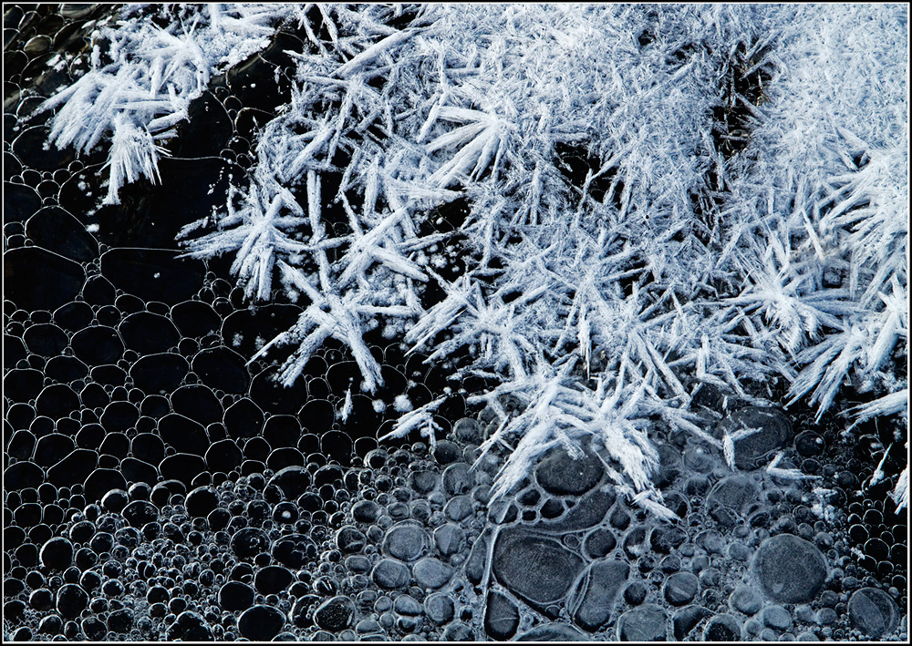
This is another comp I did of this little scene I found in Jan 2011. Some of you may remember the other comp I posted of this back then. I was looking for a few past winter scenes when I came across this series again. Decided to process this raw file and see how it looked to me. Kind of liked it so thought I would post it and get any thoughts you might have on it. The frost is on top of a very thin sheet of ice and the bubbles are floating past under the ice. With frozen fingers and all I had a great time shooting a few different comps of this. I posted a different one yesterday but after it was up and I went back to look at it I didn't really care for the processing so I deleted it before any comments were made... Sorry.
7D, 24-105 @105, iso 400, f/11 and 1/100 sec.

Comments

27 comments
Comment posted by John Clulow on December 4, 2012 at 4:09 PM
I really love the concept of this compositions; viz., two contrasts of form and dynamic range; probably a bimodal histogram, but the key one, for me, is that of form with the circular forms of the bubbles reminding me of cells and the nodular form of the ice crystals with their arrangement in star-shaped clusters.

In a sense, one could see the invasion of one "life-form" into another, and in term of the forms of matter, this is just what is happening; the ordered arrangement of water molecules in the linear, hexagonal forms of the solid ice crystals, against the liquid form of water with gaseous water vapor mixed with air forming the inside of the bubbles to give shape to the liquid water surrounding it and the sheet of solid ice pressing against it making it appear as it does.

As I looked closer at it, and the larger view, I did have the impression that the ice is very white and perhaps blown out a bit in places. So, unfortunately I can't say exactly what I'd do with this reaction without playing with it; sometimes I just try things and in doing those experiments, I learn what it is I would like more or less.

You may like this exactly as it is, but if you also feel that maybe it would be nice if there were less luminosity and more detail in the ice part, since you have the RAW file, I think you are in good shape to play with it.

So, if this were my image, I'd use Bridge to open it in Adobe Camera Raw. First thing I would do is to hold down the Alt key and move the Exposure slider to see where I could go with minimal blown out highlights. Then same thing with the black slider. Then I'd look at the recovery slider, if necessary to try to recover highlights that were left blown out. And then she what the fill slider might do.

I think this might look best with zero saturation. The clarity slider will operate on midrange, I think, I'd try increasing that, and then I'd try setting the Detail tab in the top bar of icons, select amount 60 with a radius of 0.5, detail 65 and masking 45 with luminance at 20. These settings often are a good starting point for me; not exactly sure how they will work on your image.

But a key thing is that this is fundamentally an abstract; not clear at all what we are looking at until you described it. So I'm not sure how important it is to have "the snow be white". When it represents snow, it needs to be white in many instances. Here, if it were possible to bring out more sharp detail in the crystals and they are lower in luminance overall, I think that might be fine, and even could be magnificant in an extreme case where the dynamic contrast takes a back seat to formal contrasts.

So, in summary, I really this, yet there is something about it that kind of would make me seek for improvement were it my image. The thing is, there is clearly no one "right" or "true" reaction to an image, but rather a broad spectrum of reactions, and mine is merely one of them. Thanks for posting; very interesting to see and think about.
Registered on November 1, 2012, 155 Posts, 1079 Comments
Comment posted by Eva McDermott on December 4, 2012 at 4:10 PM
I love these kind of images Nick. Excellent graphic qualities and contrasts. Reminds me of Kodak's graphic arts film that I fooled around with in the past. Stunning image.
Registered on January 4, 2009, 1015 Posts, 13229 Comments
Comment posted by Robert Dayton on December 4, 2012 at 4:45 PM
A well composed astract, Nick! I like the color, shapes, and textures.
Registered on November 11, 2008, 281 Posts, 3958 Comments
Comment posted by Nick Palmieri on December 4, 2012 at 8:41 PM
Hi Nick, really like it. I love the shapes, textures, and although it may not be for everyone, the contrast, in my opinion, works well. May like to see a B&W version...TFS
Registered on September 1, 2011, 35 Posts, 748 Comments
Comment posted by Ed Lowe on December 4, 2012 at 8:52 PM
This is a very well conceived miniature landscape, Nick. The diagonal placement of the frost and the ice bubbles works perfectly and I like the visual tension of the round bubbles verses the straight lines of the frost. What do you think of a small crop from the left side to eliminate most of the empty space in the URC? Either way this is still beautifully done. :toast:

Ed
Registered on February 7, 2004, 414 Posts, 7115 Comments
Comment posted by Nick Bristol on December 4, 2012 at 8:56 PM
Thanks for your thoughts on this!
John, I very much appreciate your thoughts on this. I do use ACR so will be able to give your suggestions a try. I might come up with something that works really well. Thank you!
Nick, I thought about doing a b/w conversion and now will probably give that a try too. Thanks!
Registered on February 1, 2004, 752 Posts, 14140 Comments
Comment posted by Nick Bristol on December 4, 2012 at 9:01 PM
Hi Ed, Thanks for your thoughts! Glad you liked this. Yes, I can see a small crop off the right working on this too. I appreciate the suggestion...Nick
Registered on February 1, 2004, 752 Posts, 14140 Comments
Comment posted by Tony Kuyper on December 4, 2012 at 9:33 PM
Very nice, Nick. Just love how you see the natural world.
Registered on November 1, 2003, 364 Posts, 22328 Comments
Comment posted by Tom Haxby on December 4, 2012 at 9:46 PM
Nick: Just simply amazing. Great tonal range in the black and white, and on my monitor there is just a hint of blue, which I like too. Keep posting great images. Maybe someday soon we will get some ice here in the north country.
Registered on July 6, 2006, 126 Posts, 647 Comments
Comment posted by Rudy Ruberti on December 4, 2012 at 11:26 PM
Great image Nick. Nice contrast between the bubbles and ice. I like this one a lot.
Registered on October 28, 2008, 179 Posts, 1875 Comments
Comment posted by Stuart Williams on December 5, 2012 at 7:28 AM
great textures and forms. perhaps not 100% convinced by the composition - to my eye doesn't quite have the harmony that it might?!? but still i like very much!
Registered on December 7, 2007, 247 Posts, 4792 Comments
Comment posted by John&Patty Benway on December 5, 2012 at 9:31 AM
I find this very interesting, different to say the least, really like all the detail, and you composed it beautifully, good eye Nick, like this very much.
John
Registered on May 12, 2006, 626 Posts, 8700 Comments
Comment posted by Harley Goldman on December 5, 2012 at 10:15 AM
This is great, Nick! It almost looks like something seen in a microscope. Excellent and mysterious abstract. Wonderful shapes and tones.
Registered on November 19, 2003, 586 Posts, 11271 Comments
Comment posted by Nancy Lea Sandy on December 5, 2012 at 10:20 AM
Hard to resist scenes like this. I love this intimate take on a "winter wonderfland" Nicely seen and captured
Registered on January 24, 2011, 576 Posts, 6942 Comments
Comment posted by Morris McClung on December 5, 2012 at 12:10 PM
The contrast in tones and patterns make this one fascinating abstract. Very, very cool, and artistic.
Registered on May 7, 2007, 670 Posts, 19650 Comments
Comment posted by Peter Richter on December 5, 2012 at 12:51 PM
Most interesting variety of shapes and textures here for me, Nick. Your crop works perfectly to me, especially taking into account that the upper right part certainly would not appear as "empty space" in a large print, I think it is full of delightful details.

Peter
Registered on November 10, 2010, 218 Posts, 2723 Comments
Comment posted by Nick Bristol on December 5, 2012 at 2:38 PM
I Really appreciate all of your comments on this so far. Thank you! Nick
Registered on February 1, 2004, 752 Posts, 14140 Comments
Comment posted by Michael Cothran on December 5, 2012 at 6:05 PM
Very well composed, and excellent crafting.
Registered on December 5, 2012, 31 Posts, 730 Comments
Comment posted by Zack Clothier on December 6, 2012 at 11:57 AM
Nick, I remember your other post well, and this one is no different (quality-wise, that is:biggrin:), excellent work! :toast:
Registered on January 28, 2010, 343 Posts, 2257 Comments
Comment posted by Lon Overacker on December 6, 2012 at 1:13 PM
Nick,

Loved this scene the first go around. Just a wonderful combo of bubbles and crystal frost. No nits from me, although how about a 90 deg cw rotation? I think that's the ticket. I love the contrast and the tonal range - you've got your black, white and gray. Excellent image!

Lon
Registered on November 24, 2006, 521 Posts, 19147 Comments
Comment posted by Nick Bristol on December 6, 2012 at 1:51 PM
Thanks guys!
Lon, I never even thought about doing that. Cool idea!... and here it is. :smile: Thanks, Nick
Registered on February 1, 2004, 752 Posts, 14140 Comments
Comment posted by Lon Overacker on December 6, 2012 at 7:26 PM
Thanks Nick! Works very well for me. Of course I don't think one is better than the other necessarily, but fun some times to think about not restricting oneself to how they pointed the camera. I think it makes a good vertical presentation. thanks for considering it!

Lon
Registered on November 24, 2006, 521 Posts, 19147 Comments
Comment posted by Nick Bristol on December 6, 2012 at 7:34 PM
Thanks Lon, Yes, I thought it was interesting to try this...and I think it works quite well this way... :smile: Nick
Registered on February 1, 2004, 752 Posts, 14140 Comments
Comment posted by John Clulow on December 7, 2012 at 1:23 PM
Much better with the rotation !! Amazing.
Registered on November 1, 2012, 155 Posts, 1079 Comments
Comment posted by Nick Bristol on December 11, 2012 at 3:58 PM
Thanks John! Nick
Registered on February 1, 2004, 752 Posts, 14140 Comments
Comment posted by Navin Sarma on December 11, 2012 at 9:00 PM
This is stunning, Nick. I think I like the first orientation. It feels more like a struggle of elements -- like two sides of a battlefield colliding. :toast:
Registered on July 17, 2011, 233 Posts, 1373 Comments
Comment posted by Nick Bristol on December 13, 2012 at 4:14 PM
Hi Navin, Thanks much! I appreciate your thoughts. Nick
Registered on February 1, 2004, 752 Posts, 14140 Comments