Nature Photographers Network
This is the preserved archive of the original Nature Photographers Network. The community continues at naturephotographers.network.
Rockscape 3
‹ PreviousLandscape GalleryNext ›

Rockscape 3

by Bill Chambers

Gallery: LandscapePosted December 4, 2012223 views14 comments
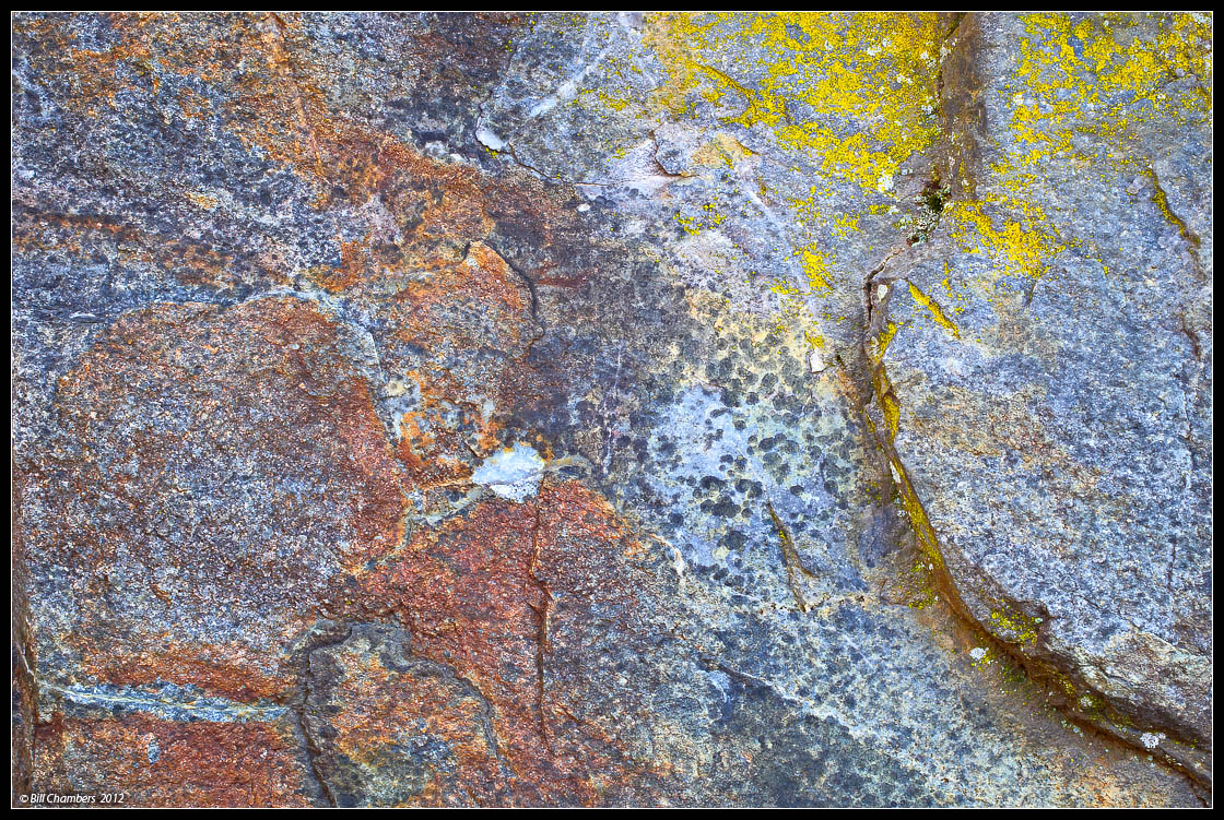
Number 3 in this series. Thanks for your comments on my last image!

Comments are appreciated, especially concerning sharpening. In my last image someone mentioned they thought it was oversharpened. On my monitor it wasn't oversharpened at all, so that has me concerned. Please let me know if you think this image is oversharpened. Thanks!!

Large version available.

D2x w/ 35-70 @ 45mm
.6 sec @ f/16 - MLU and remote release
100 ISO
Singh Ray Polarizer
Tripod
Capture One 6, CS4

Your thoughts and critiques are always appreciated. Thanks for looking.

Comments

14 comments
Comment posted by Chris Chamberlain on December 4, 2012 at 9:43 AM
I think it's very sharp, but not overly so. I like this a lot, possibly my favorite of the three so far. Beautiful colors and textures in the rock, and added by the lichen.

Chris
Registered on March 13, 2007, 500 Posts, 8365 Comments
Comment posted by Harley Goldman on December 4, 2012 at 10:23 AM
The sharpening looks fine on my monitor. Another good addition to the series. Funny how opinions vary, but I would probably put this one in third place of the three you have posted so far. I am thoroughly enjoying the series. I hope you have more.
Registered on November 19, 2003, 586 Posts, 11271 Comments
Comment posted by Morris McClung on December 4, 2012 at 11:43 AM
Another one with a fine mix of colors and textures.
Registered on May 7, 2007, 670 Posts, 19650 Comments
Comment posted by Nick Bristol on December 4, 2012 at 11:52 AM
This comp looks really nice! The color and detail are wonderful. Very pretty to look at and I just want to reach out and feel the stone. Looks sharp but not overly done to me Bill. Very Nice!

Nick Bristol
Lone Rock, WI
Registered on February 1, 2004, 752 Posts, 14140 Comments
Comment posted by Philip Hodgkins on December 4, 2012 at 2:12 PM
Not over sharpened. Just a lot of wonderful texture!
Registered on July 24, 2006, 2741 Posts, 12349 Comments
Comment posted by Ed Lowe on December 4, 2012 at 9:12 PM
The sharpness looks fine to me, Bill. I really like the textures and colors here. I will have to back track and check out #'s 1 and 2. Great eye to spot this.

Ed
Registered on February 7, 2004, 414 Posts, 7115 Comments
Comment posted by Tony Kuyper on December 4, 2012 at 9:37 PM
I really like the colors and textures of these. Larger version doesn't look oversharpened. Maybe it the exposure and detail. Lots of detail and a bit over-exposed looking --> a sense of being oversharpened. Just a guess. The larger version looks more righter.
Registered on November 1, 2003, 364 Posts, 22328 Comments
Comment posted by Rudy Ruberti on December 4, 2012 at 11:31 PM
I like the natural colors here and the sharpening looks fine to me. I find the small dot in the near center a little distracting, but I like this series of images.
Registered on October 28, 2008, 179 Posts, 1875 Comments
Comment posted by John&Patty Benway on December 5, 2012 at 9:46 AM
Beautiful colors and textures, also like the green patch of lichen, excellent work Bill, another beauty, as for over sharp, looks perfect to me.
John
Registered on May 12, 2006, 626 Posts, 8700 Comments
Comment posted by Nancy Lea Sandy on December 5, 2012 at 10:25 AM
Great color and detail. The golden lichen on the right seem like the star of this show. I'd like to see a crop from the left to emphasize them. Great series. I''m really enjoying it
Registered on January 24, 2011, 576 Posts, 6942 Comments
Comment posted by Peter Richter on December 5, 2012 at 12:43 PM
Another really interesting part of your variations of rockscapes for me. Again I enjoy exploring all the textures and details. To my eye, sharpening is spot on, as well as in your last image.

Peter
Registered on November 10, 2010, 218 Posts, 2723 Comments
Comment posted by Lon Overacker on December 5, 2012 at 2:07 PM
Bill,

Really enjoying these rock abstracts. The color and texture here are wonderful. Over-sharpened? That's a tough one - I think the details in the LL quadrant look/feel like it might be over-sharpened, but then again, the texture and tiny details might just be exactly like that, so hard to judge on these little web images. But in general, I would say this looks very good.

I don't know why I always want to do this with some abstracts, but have you considered a 90deg cw rotation? Putting the large crack horizontal across the bottom, serving as an anchor to the abstract? Just thinking out loud. Of course this works beautifully as presented.

Lon
Registered on November 24, 2006, 521 Posts, 19147 Comments
Comment posted by Wayne Willison on December 5, 2012 at 6:11 PM
Sharpeneing is right on imo. Allows the eye to rove freely around the image, while being steeped in color and texture.
Registered on April 10, 2009, 292 Posts, 3967 Comments
Comment posted by Stan Rose on December 5, 2012 at 11:16 PM
Not oversharpened--just as TK said, detail+glare+compression. 1&3 are outside your control, but #2 might be controllable with a CP and/or better light. Love the color mix here though, very nice balance.
Registered on September 15, 2005, 836 Posts, 17099 Comments