Gallery: LandscapePosted December 2, 201261 views6 comments
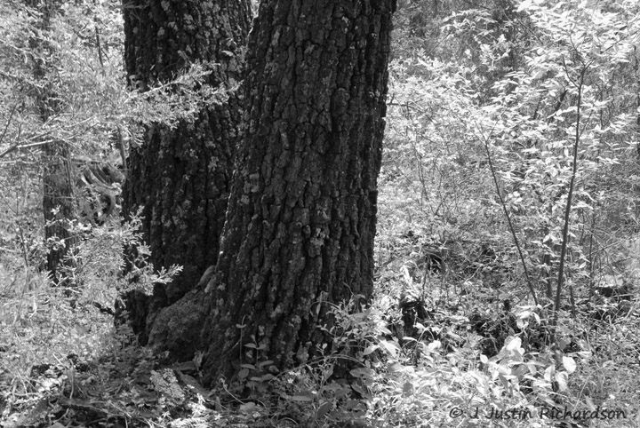
I saw this and realized a great opportunity for a b&w. Everything around was glowing with backlight..the shaded trunk drew me in.
Comments
6 comments
Comment posted by Lon Overacker on December 2, 2012 at 2:39 PM
Justin,
You did a good job retaining detail in the tree trunks and I like what you saw here. To me though, the brightness of the leaves almost make this look IR which if this was a summer image with green leaves, might just be how this might look as IR. What that means for me is that I think the leaves are too bright. B&W usually does a good job of simplifying an image in to just shapes, tones, lines, etc., but for some reason it doesn't seem to be doing that here. Maybe I'll revisit and see if this grows on me. I'm sure someone else will have a different opinion.
Lon
Registered on November 24, 2006, 521 Posts, 19147 Comments
Comment posted by Tony Kuyper on December 2, 2012 at 2:45 PM
Very effective. Feels a bit IR-ish.
Registered on November 1, 2003, 364 Posts, 22328 Comments
Comment posted by Mark Seaver on December 2, 2012 at 4:04 PM
I like all the textures and find that the high contrast between the leaves and the trunks feels very "artsy" (maybe another way of saying IR-ish). I do think it works well and focuses attention on the main trunks. I would suggest looking at cropping from the right to remove that slender "V".
Registered on January 23, 2011, 1103 Posts, 17270 Comments
Comment posted by Mark Metternich on December 2, 2012 at 4:25 PM
Nice shot. I agree, it looks IR'ish.
Registered on June 19, 2009, 276 Posts, 6240 Comments
Comment posted by John Clulow on December 3, 2012 at 8:18 AM
I initially thought NIR also, but then the green moss/lichens on the bark said it's not. And that very subtle color emerging out of the B&W, kind of hidden in the deep shadow of the trunk is what I immediately liked about it. And for me personally, the strong luminance of the brush around the trunks functions in reverse of how brightness usually does, because it surrounds the trunks, instead of my eye being drawn to the brightest areas, it actually goes away from that an towards the shadow -- because the brightnes is so intense -- and in that shadow, then, it finds the cool green and realizes that this is not totally B&W.
I think it a very interesting concept.
Registered on November 1, 2012, 155 Posts, 1079 Comments
Comment posted by Morris McClung on December 3, 2012 at 12:21 PM
Looks like an ir shot. Interesting look and the strong contrast and textures make for cool and different shot.
Registered on May 7, 2007, 670 Posts, 19650 Comments

Comments
6 commentsYou did a good job retaining detail in the tree trunks and I like what you saw here. To me though, the brightness of the leaves almost make this look IR which if this was a summer image with green leaves, might just be how this might look as IR. What that means for me is that I think the leaves are too bright. B&W usually does a good job of simplifying an image in to just shapes, tones, lines, etc., but for some reason it doesn't seem to be doing that here. Maybe I'll revisit and see if this grows on me. I'm sure someone else will have a different opinion.
Lon
I think it a very interesting concept.