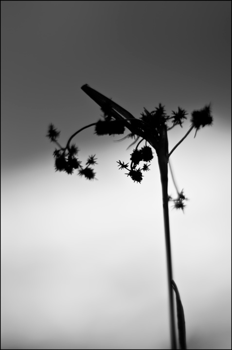
switchgrass
by John Clulow
Pentax K-5, Pentax 50 mm f/1.4 at f/1.4, ISO 100, 1/160. Handheld.
I had seen someone who took a number of nature photos "wide open", the concept being, rather than trying to seek out a subject and decide how to best photograph it technically, rather to just take the widest aperature you have and seek out a subject based upon that.
So, after I'd had a few pops, I put the 1.4 on my K-5 and stumbled around in my yard (which the neighbors are used to, by the way) [and I put this in parentheses because I realize it is technically off-topic} {which is why I noted that in brackets}... etc.
Anyway, I wound up taking four pictures of which this is one, not necessarily the best one in my opinion. But I was looking for a third picture to post on NPN, and sort of used the dartboard approach in chosing this one.
I should also mention that I planted like 500 plugs of switchgrass in this area in our yard at the end of May three years ago to try to deal with a natural spring on our property that was impossible to mow.
All of that said, here are my questions if you chose to accept the mission...
(1) Just right off the bat, how do you react to it not knowing any of the above. Pluses, minuses, suggestions, etc.
(2) Did I post this in the right forum? Or should I have posted it in the Flora forum where I would have been hit by a barrage of out of focus comments in all probability?
(3) Would you like to see one of the remaining three I took that day?
(4) Would this be better desaturated?
(5) What do you think of the absence of the oppressive, thick frame that characterizes so many images on NPN?
(6) Should I add a "larger view"?

Comments
4 comments1- Its a melancholy image. Looking up from light to dark, unresolved endings.
2- I don't think most people here want to deal with this image so this is as good a place as any.
3- Images like this are usually better in context with similar images. Its less likely to look like missed focus when your thematic intent is clearer.
4-Is there any color now?
5-What thick oppressive frame?
6-Since there is really no detail lost to the smaller size I don't think it would add much.
Excellent reply, mi chavo.
We are simpatico.
I really like this image... love the simplicity and form. That said, this is an image not really meant for this gallery. I'm not going to move it as I understand why you placed it here. But, in the future, images like this should be uploaded to the POP gallery (people, objects, and places) or better yet, this should be placed in the Flora Gallery. Below is the criteria for the Photo Art Gallery:
The Photo Art and Series photo critique gallery is intended for digitally manipulated or multiple exposure photos that are intended as obvious artistic renditions of nature. It is also intended for a series of nature photos taken in succession.
Thank you for your acknowledgement of its simplicity and form, however.