Nature Photographers Network
This is the preserved archive of the original Nature Photographers Network. The community continues at naturephotographers.network.
Yosemite Moments #2
‹ PreviousLandscape GalleryNext ›

Yosemite Moments #2

by Lon Overacker

Gallery: LandscapePosted November 16, 2012327 views25 comments
First of all, thank you very much for the response and comments on my previous image and first of this series. I may have just let all the air out of the balloon on my first post. ;-)

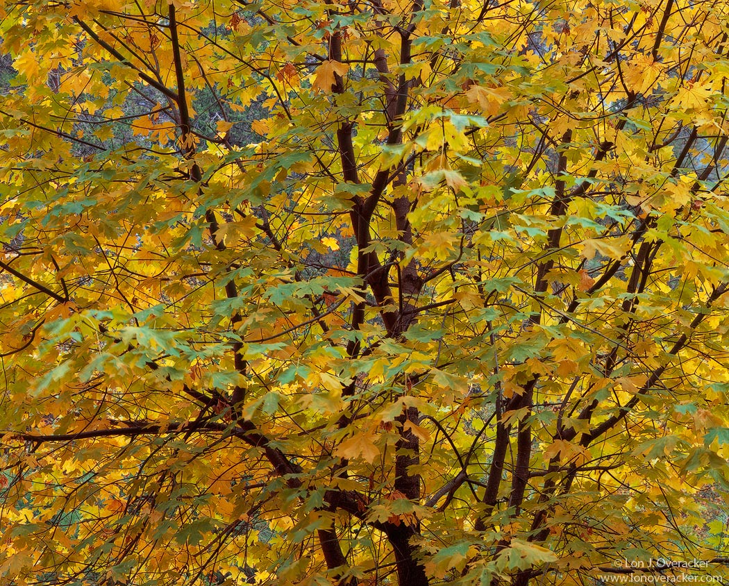
This one is literally the second image and exposure from this autumn trip to Yosemite Valley a couple weeks ago. This big leaf maple was maybe 50yds from the previous image. These guys were at peak color in the valley and richer in color than I've seen before.

A bit more standard fare here and something I always seem to be on the lookout for - frame filling trees. Tons of leaves of course and there are many that moved during the 2 second exposure. I don't expect this to have the same impact as the previous image, but I told myself I was going to post these in order, so here's #2.

thanks for any comments or feedback.

4x5, Nikkor 300mm, V100F, f/45 @2s.
TK's stuff always.

Lon

Comments

25 comments
Comment posted by Dietrich Gloger on November 16, 2012 at 2:40 PM
Maybe I am a pervert, but I happen to like this more. Not much more, but it simply appeals more to me. Ok, yes, perhaps indeed more of your standard fare, and perhaps it tells a bit less of a story than the previous, but it is just a beautiful arrangement and I can "feel" it.
Registered on January 26, 2007, 360 Posts, 9876 Comments
Comment posted by Bill Chambers on November 16, 2012 at 3:00 PM
This is a real beauty! There's a softness in the presentation (not optically) that is almost seductive in nature. I really like the fact that contrast is kind of low and the composition so well balanced. The blues peeking through the leaves add a great color contrast too. Top notch Lon!
Registered on April 10, 2005, 753 Posts, 21216 Comments
Comment posted by Phil Pogledich on November 16, 2012 at 3:30 PM
Rather than compare it to your last post (which was exceptional in every way), I'll compare it to the other similar foliage shots in your Gallery and on your website, which I perused a few of weeks ago to get inspiration for my own fall trip to Yosemite. For most folks this would be a very successful image and it's certainly quite strong. The motion blur does bother me just a bit though, to be honest, but more importantly for me it just doesn't quite match the remarkable quality of the other similar work in your portfolio. Not to say it isn't very, very good...the composition works well and the color is quite pleasing.
Registered on August 24, 2009, 123 Posts, 3099 Comments
Comment posted by Chris Chamberlain on November 16, 2012 at 3:37 PM
Well, I try these, but can't come away with a good one. I think this is pretty good, but am mostly in agreement with Phil. I think you have others with the same approach that have more impact. If it were mine, the motion blur would bug me. I have a few from the last trip that have some movement in them as well. It was a bit breezy that weekend.

A couple of suggestions. Since the color was so sweet in the maples, I would boost the saturation in the yelloows and oranges to give it a little more pop. Also, I wouldn't mind seeing a little more blue in the granite background that shows through here and there.
Registered on March 13, 2007, 500 Posts, 8365 Comments
Comment posted by Nick Bristol on November 16, 2012 at 4:31 PM
This is a wonderful composition, and there is a very nice feel that goes with this. The color also looks very good to me. I do think the motion blur bothers me a bit, but not to where I don't enjoy this. It is an excellent image Lon and I quite enjoy the large version.

Nick Bristol
Lone Rock, WI
Registered on February 1, 2004, 752 Posts, 14140 Comments
Comment posted by Nick Palmieri on November 16, 2012 at 4:52 PM
Simple but very effective. Love the subtle tones and the composition. I am okay with the motion blur in some of leaves as, in my opinion, they are not a distraction, rather add some interest.
Registered on September 1, 2011, 35 Posts, 748 Comments
Comment posted by Peter Richter on November 16, 2012 at 4:52 PM
Lon, your image immediately gives me the feel of standing just in front of that tree. Interestingly the slight motion blur even adds to this, making for a kind of spontaneity to me. I also appreciate the vivid and natural colors, embedded in the framework of the branches.

Peter
Registered on November 10, 2010, 218 Posts, 2723 Comments
Comment posted by John&Patty Benway on November 16, 2012 at 4:55 PM
I agree with Nick on this, anyone who knows me knows I am all about reality in my photography, try to keep it like I see it, sometimes it doesn't work for others, but it works for me, and that's what counts. This is very nice, natural colors, great comp, and like Nick said it has a very nice feel, and it's just the kind of photography I love.
John
Registered on May 12, 2006, 626 Posts, 8700 Comments
Comment posted by Lon Overacker on November 16, 2012 at 5:16 PM
Thanks for the comments so far and the honest critiques.

Phil/Chris - appreciate the straight forward honesty and frankly, I don't disagree at all. Not my best tree image... but then again, good enough to show I think. I'm glad too to have a mixed and even response with color and saturation which means it's just about right. I think most of us strive for good color and saturation, but believable. That's what I'm after. And in full disclosure, this even has a little Orton influence - just a bit.

There just might be a few more trees upcoming.... but I don't think any more frame filling ones.

Thanks folks!

Lon
Registered on November 24, 2006, 521 Posts, 19147 Comments
Comment posted by David Chauvin on November 16, 2012 at 5:43 PM
It would be tough to top #1, Lon. But this is very nice. The branching provides enough structure to hold the image together.
Registered on August 5, 2004, 1007 Posts, 5595 Comments
Comment posted by Stan Rose on November 16, 2012 at 7:22 PM
This is real nice, Lon--feels like i cold reach out and grab some of those leaves! :toast:
Registered on September 15, 2005, 836 Posts, 17099 Comments
Comment posted by Brian Schrayer on November 16, 2012 at 7:47 PM
I like your composition and the mixture of green and gold leaves. Too bad the leaves were moving, but it doesn't detract from the image too much. I think this is still a very strong image.
Registered on May 28, 2004, 114 Posts, 2890 Comments
Comment posted by Brian Schrayer on November 16, 2012 at 7:52 PM
I like your composition and the mixture of green and gold leaves. Ideally I would prefer the image without the motion in the leaves, but it doesn't detract from the image too much. I think this is still a very compelling image.
Registered on May 28, 2004, 114 Posts, 2890 Comments
Comment posted by Eva McDermott on November 16, 2012 at 8:04 PM
Gorgeous autumn color and light Lon. Minor nit is the motion blurred leaves top center but I still like the upbeat color and light.
Registered on January 4, 2009, 1015 Posts, 13229 Comments
Comment posted by Morris McClung on November 16, 2012 at 9:51 PM
Well, you already know it doesn't have the impact of so much of the rest of your work, but it's still a fine piece. A well composed and structured comp with natural color and light. So, it's still a keeper imo.
Registered on May 7, 2007, 670 Posts, 19650 Comments
Comment posted by Russell Colletta on November 16, 2012 at 9:58 PM
Really rich image Lon. It has wonderful depth and detail. Sweet!
Registered on October 31, 2009, 114 Posts, 1008 Comments
Comment posted by Nancy Lea Sandy on November 16, 2012 at 10:24 PM
I like the framework provided by the branches and the nice balance of colors. There is some motion blur in individual leaves but it seems a natural part of this image. Not quite as stunning as you last post but still a lovely image.
Registered on January 24, 2011, 576 Posts, 6942 Comments
Comment posted by Tony Kuyper on November 16, 2012 at 10:38 PM
I find this very appealing, Lon. Nice contrast here that lets the leaves separate very nicely, even in the smaller version. Whenever I try images like this I get light reflections that come out pure white, which don't look right and I'm forever cloning in some color. How do you avoid that?
Registered on November 1, 2003, 364 Posts, 22328 Comments
Comment posted by Robert Dayton on November 16, 2012 at 10:57 PM
I always look forward to your tree images, particularly those in Yosemite, and this is no exception.
I have no suggestions for changes.
Registered on November 11, 2008, 281 Posts, 3958 Comments
Comment posted by Bill Fach on November 16, 2012 at 11:09 PM
Lon: Not a bad Flora shot :wink:. Marvelous color and I like the graphic impact of the larger branches especially. Most excellent.>=))>
Registered on November 1, 2003, 1805 Posts, 26981 Comments
Comment posted by Youssef Ismail on November 17, 2012 at 2:24 AM
Movement or not, this one just glows Lon. It has my approval. Got my films back today and sorting through them right now. I have several months of work to share, not sure if I should go in order or in reverse, with Yosemite being at the end.
Registered on November 1, 2003, 474 Posts, 5555 Comments
Comment posted by Paul Breitkreuz on November 17, 2012 at 12:51 PM
I always seem to be on the lookout for - frame filling trees.


Seems like a darn good idea to me if they come out looking this great. Another truly wonderful capture and post processed image, Lon. :toast:
Registered on February 25, 2006, 525 Posts, 8448 Comments
Comment posted by Lon Overacker on November 17, 2012 at 2:16 PM
Thanks again for the comments folks!

Bill Fach - one of these days I'll shock you and post an image in Flora! You hint and repeat something often enough, one begins to believe it! (there's a saying along those lines...) :wink:

Tony: "Whenever I try images like this I get light reflections that come out pure white, which don't look right and I'm forever cloning in some color. How do you avoid that?"

Heck, I don't know Tony.... avoid shooting a scene like this when sun is present anywhere. Seek out background that don't include sky and high, overcast days are ideal. I dunno... but I can understand in your part of the country when you have sun 600 days a year.... I can see having trouble with highlights on leaves. :biggrin:

Thanks folks! A little bit different next time....
Registered on November 24, 2006, 521 Posts, 19147 Comments
Comment posted by Harley Goldman on November 17, 2012 at 4:57 PM
Real pretty image, but not up there with my all-time favorite Lon Yosemite tree images. Some of your others have a stronger graphic design with bolder trunks. But real nice, nonetheless.
Registered on November 19, 2003, 586 Posts, 11271 Comments
Comment posted by Ben Horne on November 18, 2012 at 1:26 PM
Perhaps it's a combination of color and lighting here, but the image has a very 3D feel to it. The foreground leaves feel like they are extending through my monitor. I enjoy photos like this because they are a feast for the eyes. The detail, texture, and mood are all there.
Registered on August 27, 2009, 51 Posts, 959 Comments