Nature Photographers Network
This is the preserved archive of the original Nature Photographers Network. The community continues at naturephotographers.network.
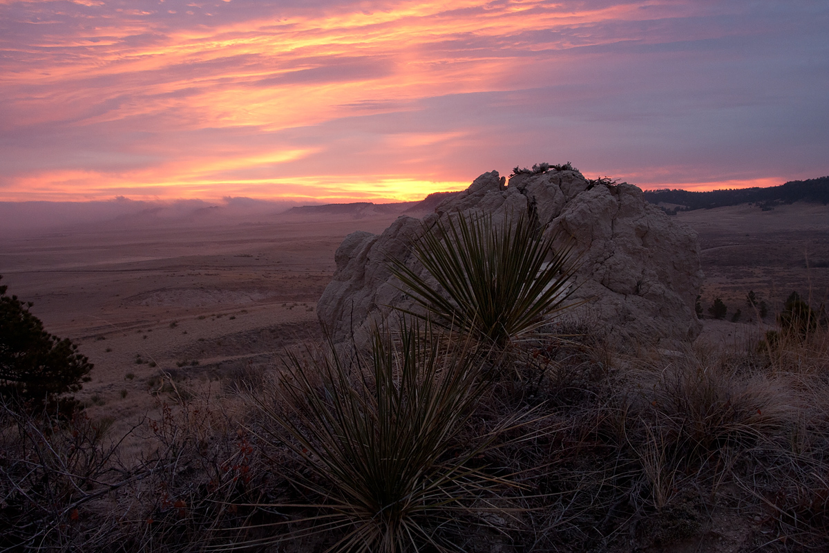
Buffalo Creek Sunrise
‹ PreviousLandscape GalleryNext ›

Buffalo Creek Sunrise

by Richard Teller

Gallery: LandscapePosted November 11, 2012181 views12 comments
This image taken last Friday Morning. Clouds and fog in the low places and just enough brake in the clouds to add color. I am trying to find some different compositions in this area. One thing I would like and opinion on is if the foreground is to busy, especially the tree on the left. Thanks for your comments and critiques.

Canon 40D
Sigma 17-70
All settings on manual
Shutter 0.6
Aperture f18
ISO 800
17mm
Polarizer
Tripod and shutter release
Noise reduction and sharpening in PSE9

Comments

12 comments
Comment posted by Richard Teller on November 11, 2012 at 5:36 PM
Attached is the image with cropped a little from the right and on the left. Thanks for your input.
Registered on August 23, 2010, 1162 Posts, 6692 Comments
Comment posted by Scott Smorra on November 11, 2012 at 6:53 PM
I prefer the foreground in the 2nd image and the sky in the 1st.
Registered on November 2, 2009, 161 Posts, 2143 Comments
Comment posted by Brian Schrayer on November 11, 2012 at 7:26 PM
You had some beautiful light to work with, Richard. I do think that the foreground is a bit too busy. I like the yucca and the rock but the limbs on the left between the yucca and the tree detract from the overall image. I know from experience that it is often hard to avoid these elements, but this scene is definitely worth exploring in the right light.

EDIT: I think the repost is an improvement both with the crop and the slightly lighter foreground.
Registered on May 28, 2004, 114 Posts, 2890 Comments
Comment posted by Tony Kuyper on November 11, 2012 at 7:30 PM
Lovely light and clouds. Foreground maybe seems a bit busy.
Registered on November 1, 2003, 364 Posts, 22328 Comments
Comment posted by Bill Fach on November 11, 2012 at 7:58 PM
Richard: I much prefer the cropped version. Love the color palette and on the second version the FG works well for me. >=))>
Registered on November 1, 2003, 1805 Posts, 26981 Comments
Comment posted by Lon Overacker on November 11, 2012 at 9:04 PM
Richard,

I think you've already realized what may be an issue with this comp. I think the foreground isn't necessarily busy, but it occupies a bit of space and I think blocks what is the real story here and that is the expansive landscape (now hidden) AND that terrific sky. The LLC is a bit untidy as well with the partial pine and brush. Sometimes I think it's ok, and I would encourage to look at the landscape for that expansive view and not try to include a foreground element. I think too many folks get caught up in trying so hard to find that perfect foreground - when often the story is just about the sky, or the distant landscape. Just my .02.

Really Richard, I'd love to see more of that sky! And I'm guessing you have a few other frames? ;-)

Lon

edit: Richard, I didn't see the repost first go'round. Much improved! The lighter foreground and more open left side works so much better. At least now there is a path and a more visible look at the expansive landscape. Works much better now.
Registered on November 24, 2006, 521 Posts, 19147 Comments
Comment posted by Vance Gese on November 11, 2012 at 11:38 PM
Your second post works much better in my opinion, with the foreground simplified somewhat as well as a touch brighter. Perhaps having the sky of the first post with the foreground of the second.
Registered on November 13, 2008, 298 Posts, 6629 Comments
Comment posted by Peter Cross on November 11, 2012 at 11:52 PM
Richard, I much prefer the lighting and exposure in the 1st image and the comp in the 2nd. Also, wondering if a change in your POV by moving a bit left might help with the comp. Nevertheless a very pretty image that well portrays this area.
Registered on April 3, 2010, 271 Posts, 1342 Comments
Comment posted by Mark Seaver on November 12, 2012 at 10:01 AM
Richard, the sky is spectacular. As for the landscape, I'll take some of both. :biggrin: I like the brightness and cleaner foreground in the second version but like the long viewing arc to the left into the distance of the original post.
Registered on January 23, 2011, 1103 Posts, 17270 Comments
Comment posted by Morris McClung on November 12, 2012 at 10:17 AM
I like the repost better. I also agree with Lon's comments about the show being the expansiveness and the great sky.
Registered on May 7, 2007, 670 Posts, 19650 Comments
Comment posted by Youssef Ismail on November 12, 2012 at 2:27 PM
I like the cropped version better, not so much for the crop but for the lighter foreground.
Registered on November 1, 2003, 474 Posts, 5555 Comments
Comment posted by John Williams on November 13, 2012 at 12:41 AM
Second post is much better Richard. I really like Lon's thoughts. That's a fantastic distant landscape and sky, and the foreground need to lead into it a bit more.
Registered on September 6, 2007, 221 Posts, 5985 Comments