Nature Photographers Network
This is the preserved archive of the original Nature Photographers Network. The community continues at naturephotographers.network.
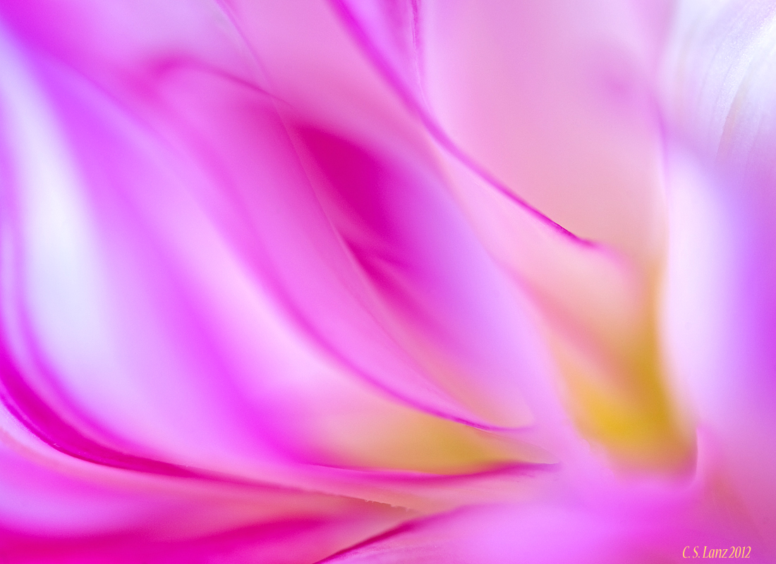
Dahlia Dreams 2 (+ alt.)
‹ PreviousFlora GalleryNext ›

Dahlia Dreams 2 (+ alt.)

by scott lanz

Gallery: FloraPosted October 11, 2012218 views16 comments
Thank you for commenting on "On Fire 2 and 3." Here's another dahlia abstract on the softer side. Taken at Fellows Riverside Gardens on 9/23/12 in morning natural light with Nikon D700, 180 macro, ext tube, tripod at f4, 1/500 sec (it was windy) and iso 400. Comments, questions, and suggestions welcome.

Comments

16 comments
Comment posted by Gary Yeoh on October 11, 2012 at 7:58 AM
Scott
Wow ! Another beautiful dahlia abstract. Lovely wash of color. I know there is no right way up for this image but viewing this on the iPad I like it more when rotated cw. :toast: :toast: :toast:
Registered on September 1, 2009, 588 Posts, 8184 Comments
Comment posted by scott lanz on October 11, 2012 at 8:08 AM
Thanks, Gary. Actually,rotated cw to vertical, as shown here, is the way it was shot. I forgot to mention that I rotated it ccw to horiz. I liked it better horiz, not sure why, but here it is vertical as shot.
Registered on November 14, 2003, 840 Posts, 12902 Comments
Comment posted by Howard Cheek on October 11, 2012 at 9:12 AM
A real treat for the eyes, lovely wash of colors as Gary says.
This is one that works in either orientation, to hard to call it :smile:
Registered on July 24, 2008, 1201 Posts, 10758 Comments
Comment posted by Joana Roncero on October 11, 2012 at 9:44 AM
Great picture. The abstract appearance is wonderful. Congrats
Registered on August 27, 2012, 17 Posts, 70 Comments
Comment posted by Brad Strong on October 11, 2012 at 10:48 AM
It looks good both ways. Very colorful and pretty without causing eye strain. I'd probably go for a little more depth of field if it were me.
Registered on October 1, 2012, 43 Posts, 302 Comments
Comment posted by Philip Hodgkins on October 11, 2012 at 11:19 AM
Count me happy with the horizontal, because of the flow of color. More natural in the horizontal. :toast:
Registered on July 24, 2006, 2741 Posts, 12349 Comments
Comment posted by William Gillis on October 11, 2012 at 3:07 PM
Scott,

Breathtaking abstract. I like the horizontal. :toast: :toast: :toast: :toast:

William Gillis
Registered on November 28, 2011, 17 Posts, 204 Comments
Comment posted by Ramamohan Pai on October 11, 2012 at 4:29 PM
Scott - I seem to like the flow much better in the horizontal (original version). I like the balance between the melted areas and the in focus area. There is just enough in focus for the eye to follow the flow.
Registered on November 1, 2003, 550 Posts, 9037 Comments
Comment posted by Albert Darmo on October 11, 2012 at 10:52 PM
Hi Scott :wavey: After looking at both versions, i like the second[vertical} much better :cool: This is a very pleasing abstract that has sublime lines and color :toast:
Albert Darmo
Registered on November 25, 2008, 1386 Posts, 11978 Comments
Comment posted by Robert Dayton on October 12, 2012 at 9:30 AM
A lovey abstract, Scott! Wonderful colors with an appropriate DOF and well composed.
Registered on November 11, 2008, 281 Posts, 3958 Comments
Comment posted by Ian Wolfenden on October 12, 2012 at 12:26 PM
Very lovely, Scott ! Beautiful rhythms in the lines of the petal edges and a sensuousness that is very appealing.
Registered on May 18, 2007, 1108 Posts, 7647 Comments
Comment posted by Scott Fricke on October 12, 2012 at 1:30 PM
Simply gorgeous lines and colors. I like it horizontal better as well, for some reason the lines seem to flow better, even though they're the same in either rotation.
Registered on January 19, 2007, 133 Posts, 1448 Comments
Comment posted by Yun Gao on October 12, 2012 at 9:46 PM
Both are pretty for me. They look like shining silk. Fabulous!
Registered on September 11, 2012, 267 Posts, 1621 Comments
Comment posted by Morris McClung on October 15, 2012 at 1:28 PM
And, what sweet dreams they are! :biggrin: I like the horizontal slightly better. Great use of line, color, and light. :toast:
Registered on May 7, 2007, 670 Posts, 19650 Comments
Comment posted by Miro Susta on October 16, 2012 at 9:10 AM
Hi Scitt,
Great colorful abstract. I like the fabulous vivid colors and the excellent soft feel. I prfer the horizontal version. Very well done.. :toast:
Registered on August 18, 2006, 719 Posts, 3736 Comments
Comment posted by Larry Lynch on October 23, 2012 at 8:44 AM
Love the lines and color. Beautifully composed and presented.
Registered on September 16, 2006, 773 Posts, 9940 Comments