Nature Photographers Network
This is the preserved archive of the original Nature Photographers Network. The community continues at naturephotographers.network.
Sentinel Flow
‹ PreviousLandscape GalleryNext ›

Sentinel Flow

by Lon Overacker

Gallery: LandscapePosted September 17, 2012539 views34 comments
Or my original title, "Harley's Rock." So, after "Preston's tree, it's pretty clear I can't find my own photographs... :wink: Of course that's not true, but Harley did post a b&w version of this spot last year and I like his better. But I don't feel bad posting because I'm the one that showed him this spot, so I figure I'm entitled to my own version? :biggrin:

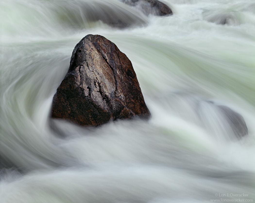
Anyway, another image from our Yosemite trip, way back in May of this year. I'm posting two versions and would like your feedback and/or preference on which one you prefer. this one here is a 1s exposure. The second version is actually a blend. It's a blend of a 1s exposure and a 1/4s exposure. Note the pattern and flow of the water to the left of the rock, they are the same in both. But for those who don't like the real silky water, perhaps the more texture in the 2nd post will suit you better.

Your feedback and honest comments and critique are always welcome.

4x5 300mm Nikkor, Astia 100F, f/64 @ 1s
Tony Kuyper's stuff

Thanks!
Lon

Comments

34 comments
Comment posted by Lon Overacker on September 17, 2012 at 3:36 AM
Here's the blended version.
Registered on November 24, 2006, 521 Posts, 19147 Comments
Comment posted by Peter Gordon on September 17, 2012 at 7:22 AM
The first works best for me Lon. Beautiful image. Im ok with silky. I would probably remove the rock at the top.
Registered on May 31, 2007, 224 Posts, 1490 Comments
Comment posted by John&Patty Benway on September 17, 2012 at 9:24 AM
First post Lon, again as with your last post, I really like the glow you captured in the rock .Beautifully seen and presented.
John
Registered on May 12, 2006, 626 Posts, 8700 Comments
Comment posted by Rick Turner on September 17, 2012 at 10:30 AM
As a rock hound myself, I love this capture. Great vision Lon :toast:
Registered on February 18, 2012, 534 Posts, 2755 Comments
Comment posted by Doug Koepsel on September 17, 2012 at 11:29 AM
Lon, I like the first as the softer water puts more attention to the rock. You processing gives the rock a nice golden sheen.
Registered on April 1, 2010, 196 Posts, 1592 Comments
Comment posted by Tom Roper on September 17, 2012 at 11:37 AM
Lon, I prefer the first version, a fan of silky water. I like the highlights and color of the rock you were able to capture.
Registered on January 19, 2012, 5 Posts, 46 Comments
Comment posted by Jimmy Gekas on September 17, 2012 at 12:02 PM
Killer! I like the first one, Lon. :toast:
Registered on July 26, 2007, 244 Posts, 2807 Comments
Comment posted by Daniel Rappaport on September 17, 2012 at 12:07 PM
Well composed either way, but I find the tension between the moving water and the rock to be more dynamic in #2.
Registered on September 9, 2009, 294 Posts, 2006 Comments
Comment posted by Nancy Lea Sandy on September 17, 2012 at 12:14 PM
I like the first image. The contrast between rock and water textures is sublime. I love the flow of the water.
Registered on January 24, 2011, 576 Posts, 6942 Comments
Comment posted by Joseph Campisi on September 17, 2012 at 12:24 PM
Both very nice Lon, but I too vote for the first image. I agree with John, the glow on the rock looks great! I wouldn't change a thing.
Registered on November 24, 2008, 304 Posts, 3211 Comments
Comment posted by Youssef Ismail on September 17, 2012 at 12:36 PM
I am not sure which version I like best Lon. To be honest though, like you, I think Harley's did come out better. I think what I am having trouble with in this photo is how dark the rock is on the left and right sides, especially in the second version. Overall it feels like both are somewhat underexposed as well. Composition is wonderful and although the above rocks do detract a bit, cropping them out would not give the main rock enough room. I should shadow you guys more often. :wink:
Registered on November 1, 2003, 474 Posts, 5555 Comments
Comment posted by Peter Richter on September 17, 2012 at 12:38 PM
Lon, I am always drawn to pictures that show steadyness and motion complementing each other. So I really enjoy this a lot, and the first version shows the dynamics of the flow even better to me. Furthermore the smaller rock at the is not as prominent as in the second version, that helps me to concentrate on the main areas of interest.

Peter
Registered on November 10, 2010, 218 Posts, 2723 Comments
Comment posted by Vincent Grafhorst on September 17, 2012 at 1:19 PM
I like all three :smile:
Of your two I do think your blend looks more 'natural', if that is the right word.Great work both of you. :toast:
Registered on February 24, 2006, 504 Posts, 7203 Comments
Comment posted by Bill Chambers on September 17, 2012 at 1:41 PM
That's a tough call Lon. Both look beautiful, but I think I prefer the original version, which is unusual for me since I'm not a huge fan of silky. In this case though, both are still silky and I think the first looks a little nicer. Gorgeous capture.
Registered on April 10, 2005, 753 Posts, 21216 Comments
Comment posted by Dietrich Gloger on September 17, 2012 at 1:58 PM
Ha, I wanted to suggest some more structure and contrast in the water, but there you go. So my preference is clear, and this time it was really clear cut. But that's just the water texture. The composition has a beautiful balance and elegance to it.
And I like that rock, particularly the surface texture - the wet reflecting surface provides a nice contrast to the water. In fact I think that rock brings this to life in so many regards, not only due to the nice sheen, but the shape, color and the strong presence add a lot.
Very beautiful work Lon!
Registered on January 26, 2007, 360 Posts, 9876 Comments
Comment posted by John Fan on September 17, 2012 at 2:58 PM
I vote for the 1st version. It is more silky but still retains texture in the water.
Registered on August 24, 2010, 135 Posts, 489 Comments
Comment posted by Paul Breitkreuz on September 17, 2012 at 3:14 PM
WOW, tough choice all the way around, Lon.... :confused:
Part of that can be comp related too. For example; Harley's shot the rock is isolated by water alone, while your versions include other rock formations and adjacent water swirls or cascades.... :wink:
I think Harley's shot makes the rock the clear cut subject whereas yours leaves us wandering a bit and taking other items in for inspection, so to speak.
Well, to simplify things I'm going to stick with my first impression impact and say your first image here as the better of the color versions of this scene. :biggrin:
Registered on February 25, 2006, 525 Posts, 8448 Comments
Comment posted by Nick Bristol on September 17, 2012 at 3:46 PM
Beautiful with a wonderful feel. I really like the motion of water surrounding the steadfast rock. The color, texture and detail in the rock looks great against the silky water. I prefer the original version but a pretty close call as both look wonderful.

Nick Bristol
Lone Rock, WI
Registered on February 1, 2004, 752 Posts, 14140 Comments
Comment posted by Karsten Wrobel on September 17, 2012 at 3:50 PM
Lon, my answer would be a blend of the two... I prefer the water texture in #2, but I really like the glow of the rock in #1
don't think you can get rid of the bg rock w/o sacrificing the comp, but maybe you can tone it down a bit
Registered on November 1, 2008, 117 Posts, 851 Comments
Comment posted by Stan Rose on September 17, 2012 at 4:14 PM
Nice, smooth...reminds me of Guinness... :cool:
Registered on September 15, 2005, 836 Posts, 17099 Comments
Comment posted by Dean Sauskojus on September 17, 2012 at 4:28 PM
The first one for me. BTW thanks for your kind comments on my recent post. I actually did something similar in my image. By that I mean a stationary object with long exposure movement around that object or objects. Very effective flowing and beautiful image. Nice texture on the rock and the water also. Awesome job Lon!
Registered on September 29, 2009, 137 Posts, 2659 Comments
Comment posted by Robert Dayton on September 17, 2012 at 5:28 PM
I don't have a preference; I equally like them both. I like your shutter speed choice for the water.
A very good eye to have discovered this.
Registered on November 11, 2008, 281 Posts, 3958 Comments
Comment posted by Eva McDermott on September 17, 2012 at 6:10 PM
Definitely the first for me Lon. Wonderfully smooth motion with subtle color and contrast.
Registered on January 4, 2009, 1015 Posts, 13229 Comments
Comment posted by Lon Overacker on September 17, 2012 at 6:18 PM
Thanks for the comments and response folks! I appreciate it. I guess the votes are in! I'm glad to hear about the comments of the rock too, I spent some time in processing to get this to look it's best. This included varying amounts of TK's saturation adj layers as well as his Dark's Triple play which is essential in bringing out just enough detail on the shady side of the rock. Also, I think most might do this, but maybe some don't and should, but this is an example when one gets to the sharpening and web output stage where sharpening is NOT applied globally. There's not need to sharpen "soft" water, but the rock needed sharpening for the web. With the use of simple masking, I basically only sharpened the rock itself for web presentation. Something to consider, especially for all those who have lots of blue sky in their images!

Thanks again everyone.

Lon
Registered on November 24, 2006, 521 Posts, 19147 Comments
Comment posted by Harley Goldman on September 17, 2012 at 6:25 PM
Real nice, Lon. I am liking the first version a bit better. I like the water effect more. Very well done.

I think Harley's version is by far the best one (hahahahahaha). It is really interesting the different impacts of color vs. B&W. Both work but in very different ways.
Registered on November 19, 2003, 586 Posts, 11271 Comments
Comment posted by Brian Schrayer on September 17, 2012 at 9:37 PM
I like the contrasting texture between the smooth water and the coarse texture of the rock. The light on the rocks is also very nice and I like the flow of the water throughout the image as well.
Registered on May 28, 2004, 114 Posts, 2890 Comments
Comment posted by Mark Seaver on September 18, 2012 at 7:15 AM
I like them both, but do find the added detail in the water more interesting in the second version.
Registered on January 23, 2011, 1103 Posts, 17270 Comments
Comment posted by Marsel van Oosten on September 18, 2012 at 12:37 PM
Great shot Lon - love the light and the texture on that rock. My vote goes to #1.
Registered on March 9, 2004, 285 Posts, 2277 Comments
Comment posted by Enrique Vizcarra on September 18, 2012 at 7:15 PM
Very nice !!!! :toast:
Registered on September 10, 2009, 223 Posts, 393 Comments
Comment posted by Marc Ward on September 18, 2012 at 8:55 PM
Lon,... another vote for the 1st. I find the contrast in the water a bit more appealing. Wonderful energy and motion to this.
Registered on February 26, 2009, 304 Posts, 1365 Comments
Comment posted by David Edwards on September 19, 2012 at 3:49 AM
Wow Lon, this is just a stunning rock and water portrait. The shape and texture of the water action wrapping around the rock is beautifully captured. I also love Harley's b&w, but the colors and textures in yours are just so well captured. I prefer the first version. Love it!
Registered on December 6, 2008, 142 Posts, 2623 Comments
Comment posted by Gary McGhee on September 20, 2012 at 12:38 PM
Bang on placement of the rock in your framing Lon, definitely the first upload for me. Softer water for me every time.

Gary.
Registered on April 15, 2010, 142 Posts, 2416 Comments
Comment posted by Wayne Willison on September 20, 2012 at 1:13 PM
Wonderful work, Lon.
If you had posted only one I'd love it. But of the two the 2nd one says power out loud. Although I like the contrast of the first, its the 2nd that rivets my attention.
Registered on April 10, 2009, 292 Posts, 3967 Comments
Comment posted by Adam Smith on January 1, 2013 at 3:53 PM
Nice image, very nice. I like the use of motion in this image Lon.
Registered on November 21, 2012, 16 Posts, 107 Comments