Nature Photographers Network
This is the preserved archive of the original Nature Photographers Network. The community continues at naturephotographers.network.
Reality/Infinity - Fixed
‹ PreviousMan & Nature GalleryNext ›

Reality/Infinity - Fixed

by Wayne Jones

Gallery: Man & NaturePosted September 3, 2012281 views14 comments
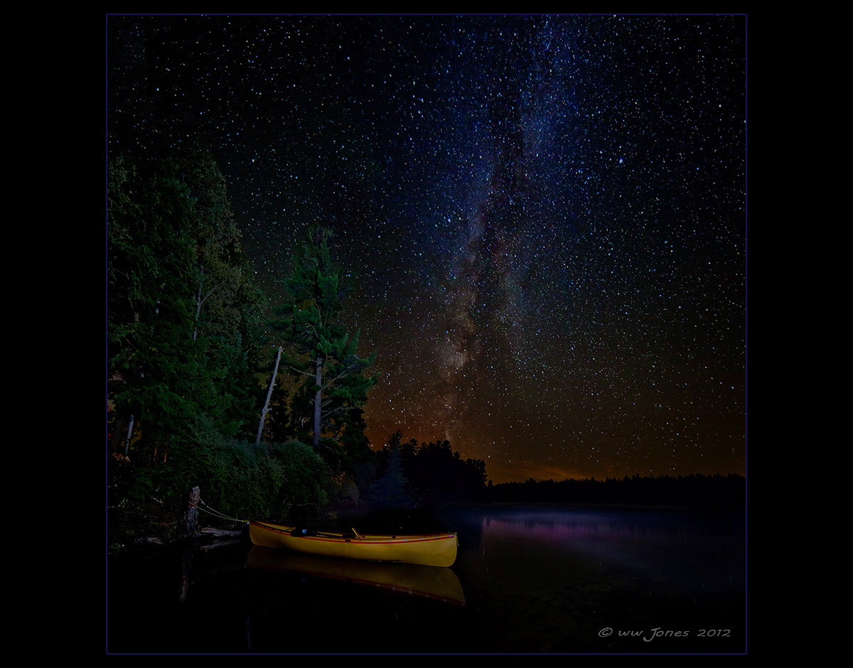
Thanks to everyone who commented on the original post of this scene last week. I took your advice about improvements, and I did some experimentation to find a solution to the problem that I asked about -- namely stars apparently growing as I shrunk the image for the Web. THE FIX? I believe I have a found a viable solution to that problem; To keep the stars from apparently growing as the image shrinks, I merely reduced contrast by bringing down the mid-level tones with a curves adjustment.

My first attempt was a global adjustment which reduced contrast overall, and I am OK with that for this image, but if you want to retain contrast in areas other than the stars, it's easy enough to apply the curves adjustment to only the sky.

Please compare this to my first attempt, and tell me if you think this is an improvement.

As I learn more about night photography, I always appreciate any help. However, I still am trying to reproduce images of real night scenes, more than creating one of those beautiful and popular combinations of day and night images that don't occur at the same time in reality. (I like those, too, but that's not what I'm shooting for here. The light painting is a compromise for the sake of composition, trying to simulate how headlamp or campfire light might illuminate nearby objects.)

P.S. It helps to view these in a dark or very dim room. I guess my next job is to try to fix that problem! :confused:

Canon 5DII; 14mm.
30 sec. @ f/2.8; ISO 1600
Tripod in knee-deep water, "painting" light with an LED headlamp.
2 vertical frames stitched by hand in CS5

Comments

14 comments
Comment posted by Lon Sharp on September 3, 2012 at 8:42 PM
I would love to see this up close, printed large! Two thumbs, way up.
Registered on December 9, 2007, 258 Posts, 9892 Comments
Comment posted by Ed Cordes on September 3, 2012 at 8:53 PM
Yes, this is an improvement. I like the way the very bright area in the Milky Way toward the bottom is toned down and less distracting. The less contrasty sky no longer detracts from the beautiful canoe. Great job.
Registered on November 1, 2003, 451 Posts, 3366 Comments
Comment posted by Kah Kit Yoong on September 4, 2012 at 4:16 AM
Great adjustment Wayne. Looks just about right.
Registered on September 27, 2006, 636 Posts, 10682 Comments
Comment posted by John&Patty Benway on September 4, 2012 at 7:56 AM
Wayne, I liked the first one you posted very much, and yes, you made this one even better, it's a pretty amazing shot. Beautifully done.
John & Patty
Registered on May 12, 2006, 626 Posts, 8700 Comments
Comment posted by Catherine Reilly on September 4, 2012 at 10:19 PM
Holy cow!!
Registered on August 16, 2006, 603 Posts, 9192 Comments
Comment posted by Andrey Antov on September 4, 2012 at 10:53 PM
I love this image. What a great shot.
Registered on March 18, 2008, 292 Posts, 341 Comments
Comment posted by Allen Brooks on September 4, 2012 at 11:15 PM
Absolutely wonderful shot. :toast:
Registered on July 27, 2011, 262 Posts, 2597 Comments
Comment posted by Eirini Pajak on September 5, 2012 at 9:49 AM
Super nice! Looks great!
Registered on December 13, 2011, 216 Posts, 1671 Comments
Comment posted by Eva McDermott on September 5, 2012 at 6:53 PM
This is spectacular Wayne. This version looks more natural. Your lighting of the canoe works well.
Registered on January 4, 2009, 1015 Posts, 13229 Comments
Comment posted by Jim Hansen on September 5, 2012 at 6:55 PM
Both images are exquisite, but can't decide which I like best. Very nice job.
Registered on May 5, 2011, 161 Posts, 908 Comments
Comment posted by Bill Chambers on September 6, 2012 at 2:33 PM
Absolutely gorgeous Wayne!! I like this much more than those day/night combo shots you mentioned. This actually looks like night; the way it should. Perfect painting of the canoe too; didn't overdo it. This really makes me want to be there!!
Registered on April 10, 2005, 753 Posts, 21216 Comments
Comment posted by Basil Greber on September 6, 2012 at 3:35 PM
Methinks the original is better. It gives the stars some more emphasis. Some photographers intentionally defocus the stars to make them look a bit bigger, so I guess most people don't mind slightly enlarged stars. :smile:
Registered on November 8, 2005, 219 Posts, 1340 Comments
Comment posted by Rick Turner on September 11, 2012 at 9:46 AM
I like this style Wayne very much. :toast:
Registered on February 18, 2012, 534 Posts, 2755 Comments
Comment posted by Brad Strong on October 12, 2012 at 11:51 AM
Wayne, I love this one too. I am wondering about the reflection of the sky off the end of the canoe. The sky is orange, and the reflection is purple. Is this a natural phenomenon or from processing?
Registered on October 1, 2012, 43 Posts, 302 Comments