Gallery: LandscapePosted August 24, 2012372 views15 comments
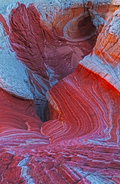
White Pocket D300 18-200 tripod just after sunrise
Comments
15 comments
Comment posted by R.Bill Moser on August 24, 2012 at 12:37 PM
I like your idea of this comp. Nice lines, colors and textures. What distracts me here a bit is the out of focus foreground.
Registered on January 29, 2010, 285 Posts, 4281 Comments
Comment posted by Nancy Lea Sandy on August 24, 2012 at 12:41 PM
Terrific color and lines. Lots of energy in this abstract
Registered on January 24, 2011, 576 Posts, 6942 Comments
Comment posted by Rick Everstine on August 24, 2012 at 12:58 PM
The foreground is a bit OOF. Maybe crop a little?
Registered on July 23, 2012, 29 Posts, 91 Comments
Comment posted by Richard Teller on August 24, 2012 at 1:37 PM
I agree with all of the comments already made. My only wish is to have the color pop just a bit more.
Registered on August 23, 2010, 1162 Posts, 6692 Comments
Comment posted by Rick Everstine on August 24, 2012 at 1:52 PM
What would you do to make the color pop more? Sat, Contr, ?? My PS skills are not honed to a razor's edge.
Registered on July 23, 2012, 29 Posts, 91 Comments
Comment posted by Morris McClung on August 24, 2012 at 4:59 PM
A great comp, ditto on the oof foreground.
Registered on May 7, 2007, 670 Posts, 19650 Comments
Comment posted by Richard Teller on August 24, 2012 at 6:58 PM
I would try playing with the contrast or the saturation. Also try levels to brighten it a bit.
Registered on August 23, 2010, 1162 Posts, 6692 Comments
Comment posted by Mark Seaver on August 24, 2012 at 7:59 PM
What an amazing place. I think you can crop the oof foreground without losing the swirling energy. I wouldn't touch the colors, they're great as presented.
Registered on January 23, 2011, 1103 Posts, 17270 Comments
Comment posted by John Mumaw on August 24, 2012 at 10:30 PM
"What would you do to make the color pop more?"
Try this little trick called 'Image Polish':
Open up the Unsharp Mask filter.
Set the following--
Amount-20
Radius-50
Threshold-0
This won't sharpen the image at all, but instead provides a 'local contrast enhancement' that will help make it pop.
Registered on September 9, 2005, 62 Posts, 2289 Comments
Comment posted by Andreas Resch on August 25, 2012 at 4:38 AM
Crazy rocks - almost looks like flesh. I like the curves in here and the vivid colors. The foreground seems to be OOF a little bit. You could also try my web sharpening script for Photoshop to get a more crisp web version of the image - http://www.andreasresch.at/upload/WebSharpener.zip
Registered on November 14, 2007, 322 Posts, 6101 Comments
Comment posted by Joseph Campisi on August 25, 2012 at 1:08 PM
To bad about the OOF foreground Rick. Otherwise, pretty cool. Very Kuyperesque...
Registered on November 24, 2008, 304 Posts, 3211 Comments
Comment posted by Lon Overacker on August 25, 2012 at 6:08 PM
Rick,
A very deceptive abstract, I like this and it keeps me engaged just trying to figure things out; it's got a couple swirling vortex things going on. very cool.
I think the color/saturation is pretty close to spot on and wouldn't mess with that. I could see some contrast adjustment such as John's suggestion, but really you're well within a personal choice category and so at this point it's a matter of choice and opinion and how you want to present this. I would agree with the others not only about the oof foreground, but it appears to be soft in general; not sure if that's just a sharpen-for-the-web thing, or whether the original is sharp enough, or perhaps lacks dof.Hard to say.
A nice take away from the area for sure.
Lon
Registered on November 24, 2006, 521 Posts, 19147 Comments
Comment posted by Tony Kuyper on August 25, 2012 at 11:14 PM
Good eye to spot this one, Rick. Fascinating for sure.
Registered on November 1, 2003, 364 Posts, 22328 Comments
Comment posted by Scott Smorra on August 25, 2012 at 11:51 PM
Stunning colors rick. I really like how you used the lines in the rock to lead the eye through the scene. The bottom 20% of the image appears a bit out of focus, but otherwise this is excellent.
Registered on November 2, 2009, 161 Posts, 2143 Comments
Comment posted by Mark Metternich on August 26, 2012 at 5:08 PM
I really like what you did with this spot/location.
Registered on June 19, 2009, 276 Posts, 6240 Comments

Comments
15 commentsOpen up the Unsharp Mask filter.
Set the following--
Amount-20
Radius-50
Threshold-0
This won't sharpen the image at all, but instead provides a 'local contrast enhancement' that will help make it pop.
A very deceptive abstract, I like this and it keeps me engaged just trying to figure things out; it's got a couple swirling vortex things going on. very cool.
I think the color/saturation is pretty close to spot on and wouldn't mess with that. I could see some contrast adjustment such as John's suggestion, but really you're well within a personal choice category and so at this point it's a matter of choice and opinion and how you want to present this. I would agree with the others not only about the oof foreground, but it appears to be soft in general; not sure if that's just a sharpen-for-the-web thing, or whether the original is sharp enough, or perhaps lacks dof.Hard to say.
A nice take away from the area for sure.
Lon