Nature Photographers Network
This is the preserved archive of the original Nature Photographers Network. The community continues at naturephotographers.network.
Gladiola  and repost
‹ PreviousFlora GalleryNext ›

Gladiola and repost

by Allen Brooks

Gallery: FloraPosted August 10, 201295 views11 comments
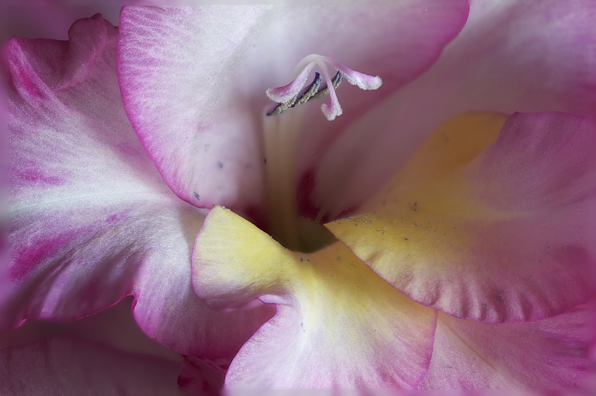
I was drawn particularly to the curves in the petals. For floral work is the pollen on the petals considered a distraction or is it okay?

Canon 7D
100 mm macro
f6.3, 1/6 second
-1/3 EV
ISO 100
11 stack image in Helicon Focus
PS5

thanks for looking and comments.

Comments

11 comments
Comment posted by Eirini Pajak on August 11, 2012 at 11:18 AM
Excellent stacking job. I think it could use a little more light on the right but that is just my opinion. It really depends about the pollen. In this case the pollen is a bit dirty looking...I don't think I have ever seen dark blue pollen like this!
Registered on December 13, 2011, 216 Posts, 1671 Comments
Comment posted by Mark Windom on August 11, 2012 at 7:05 PM
Agree with Eirini re: brightening up the right just a bit. Having said that I do like the directional quality of the light. The tight composition works well also.
Registered on November 1, 2003, 176 Posts, 2302 Comments
Comment posted by Lorna Taylor on August 11, 2012 at 9:36 PM
Beautiful work, lovely colour and detail. Love the center ! :toast:
Registered on November 12, 2010, 254 Posts, 3083 Comments
Comment posted by scott lanz on August 11, 2012 at 11:04 PM
Well done, Allen. In response to your question, yes, I don't care for the pollen. I realize it's natural, but IMO it does distract from the beautiful, pristine flower. Great job with the stack.
Registered on November 14, 2003, 840 Posts, 12902 Comments
Comment posted by Bob&Charly Nelson on August 12, 2012 at 7:58 AM
I'm with Scott on this Allen. I'd get rid of the pollen in this case (not always). Well done in my opinion.
Bob :wavey:
Registered on October 27, 2005, 289 Posts, 4202 Comments
Comment posted by Ian Wolfenden on August 12, 2012 at 9:38 AM
Beautifully composed, Allen, great stack and perfect lighting for me - a lovely image all round. I love pollen, fallen or not. The two spots at 7 o'clock from the stamens look more like stains on the petal - I might possibly have removed them.
Registered on May 18, 2007, 1108 Posts, 7647 Comments
Comment posted by Allen Brooks on August 12, 2012 at 11:39 AM
Thanks for the comments. I went back and spot-healed the pollen. I think it looks a lot better.
Registered on July 27, 2011, 262 Posts, 2597 Comments
Comment posted by scott lanz on August 12, 2012 at 2:49 PM
Yes, Allen, I agree. This is a beautiful image and was certainly worth the extra time.
Registered on November 14, 2003, 840 Posts, 12902 Comments
Comment posted by Eirini Pajak on August 12, 2012 at 4:10 PM
I like your re-post much better, but it seems like you toned down the color as well...I rather liked the saturation level of the first!
Registered on December 13, 2011, 216 Posts, 1671 Comments
Comment posted by Albert Darmo on August 12, 2012 at 9:18 PM
Hi Allen :wavey: In this case, i like the pollen removed. the repost is better. The curves of the petals, and the color and light on them is very alluring :cool: :smile:
Albert Darmo
Registered on November 25, 2008, 1386 Posts, 11978 Comments
Comment posted by Gary Yeoh on August 13, 2012 at 8:00 PM
Allen:
A very nice image. The repost is much stronger without the distracting dirty pollen stain. You might want to consider brightening the image a tad as the petals of gladiola are quite naturally luminous and better shown with more light.
Registered on September 1, 2009, 588 Posts, 8184 Comments