Nature Photographers Network
This is the preserved archive of the original Nature Photographers Network. The community continues at naturephotographers.network.
Fjord
‹ PreviousLandscape GalleryNext ›

Fjord

by Richie Graham

Gallery: LandscapePosted July 28, 2012177 views8 comments
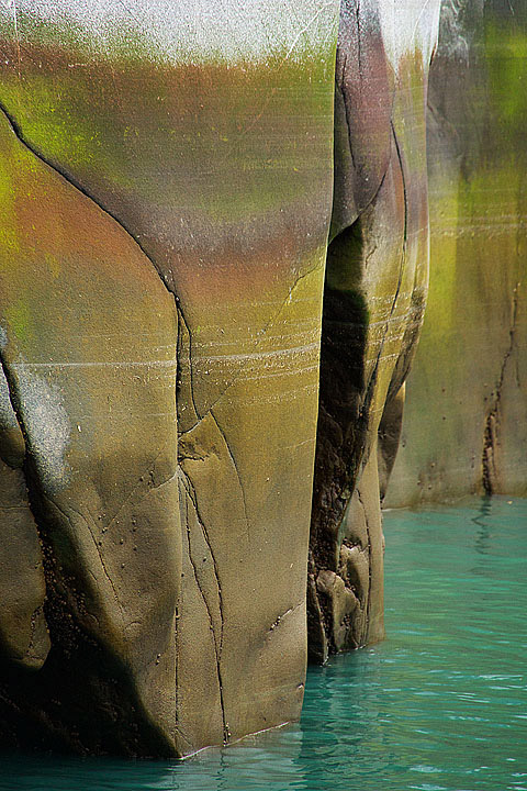
Not sure if this one works, curious what others think. I was really attracted to the colors of the fjord walls and glacial blue water. This was taken handheld off a boat in Tracy Arn fjord (south of Juneau, Alaska). The fjord walls drop hundreds of feet deep in some locations. As the tide lowers, beautiful colors appear on the fjord walls. The blue glacial water contains tiny bits of rock and minerals called "rock flour." Those rock particles refract the sun's light so it appears a mirky blue. (Nex 7, 200mm, F6.3, 1/320, ISO 800).

Comments

8 comments
Comment posted by Mark Pelton on July 28, 2012 at 3:22 PM
Beautiful colors Richie, and I like the comp you chose to give the walls context.
Registered on November 25, 2003, 380 Posts, 4647 Comments
Comment posted by Mark Seaver on July 28, 2012 at 5:44 PM
The colors are very attractive and the vertical walls pretty amazing. I'm less sure about the comp. I like the dark channel left of center and the depth from , but find the dark area lower left attracting too much attention. I could see a crop of that area, except that it leaves such a thin image. I've also played with cropping from the right (about half of the distant wall) and that feels reasonably balanced and retains the depth.
Registered on January 23, 2011, 1103 Posts, 17270 Comments
Comment posted by Ian Cameron on July 28, 2012 at 9:01 PM
I really like this .. Love its graphic simplicity and I think the composition latching onto the rock colours and hinting at its verticality makes this a strong and eyecatching shot.
Registered on August 6, 2004, 1125 Posts, 3318 Comments
Comment posted by John Williams on July 28, 2012 at 9:09 PM
Beautiful walls, and I think this comp shows them well. There's a lot of rich color there; it would be interesting to see how these looked with softer light.
Registered on September 6, 2007, 221 Posts, 5985 Comments
Comment posted by Scott Smorra on July 29, 2012 at 12:53 AM
Very nice image Richie. I really like the colors in the water and rock. My only suggestion would be to crop out the white rock at the top of the frame. The lightness there seems to pull my eye away from the beautiful colors below.
Registered on November 2, 2009, 161 Posts, 2143 Comments
Comment posted by Harley Goldman on July 29, 2012 at 10:45 AM
Beautiful patterns and colors. I was thinking the same crop thought that Scott mentioned. I think I would prefer it with the white stripe at the top cropped out. The image works.
Registered on November 19, 2003, 586 Posts, 11271 Comments
Comment posted by John Mumaw on July 29, 2012 at 12:20 PM
Your comments on others' work here would be greatly appreciated. :wink:
Registered on September 9, 2005, 62 Posts, 2289 Comments
Comment posted by Tony Kuyper on July 30, 2012 at 9:42 AM
I think this works great Richie. Wonderful comp, colors, and textures.
Registered on November 1, 2003, 364 Posts, 22328 Comments