Blended Balance
by Tony Kuyper
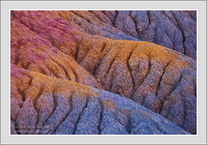
This is a slot-canyon-inspired image. In the slots there is this naturally occurring white balance dissonance that is generally liked. Antelope Canyon, for instance, is carved from reddish brown sandstone, but images from there can contain blue hues from the open sky as well as glowing oranges from reflected light . . . all in one frame. Neither the blue nor the orange is the "natural" white balance for the rock. It's the various and contrasting light of different temperature illuminating the scene that creates this color disparity. But it does work. I think the mixed and unnatural white balance is one of the reasons slot canyon images are so appealing.
The slots are a pretty special lighting situation for sure, but ACR and PS provide a lot of latitude to subjectively set white balance. So what about blending some different white balance settings in one frame to create a slot-canyon-like color mix? In essence, making the warm colors warmer and the cool colors cooler. That's what I'm trying to achieve in this image. There were some naturally warm and cool colors in this scene, but in the shade under a cloudless sky it had a strong blue/cyan tint. I tried to accentuate the blue hues in the cool-colored areas and remove the blue in what would, under different circumstances (like reflected light), be much warmer.
This sort of seems to work, at least for an abstract composition like this. It's not a slot canyon, but the exaggerated warm and cool tones seem reasonable and maybe even natural given what we've come to expect in slot canyons. Would be interested to hear other opinions. I have a few more images on which I'm thinking of trying this approach.
5D2, Tamron 28-300@200mm, f/16, 1/6 sec, ISO 100, focus-blended.

Comments
26 commentsThe composition is what grabbed me first. I found the opposing diagonals of the ridge lines and the cuts into the sides very interesting. The color variations are interesting in how they smoothly blend together.
Nick Bristol
Lone Rock, WI
Cheers, Gary.
Strong composition and great colors (repeating myself ;^)
Best,
Carol
Like some others, I'm also drawn to the composition, lines, form, texture... the colors are just icing on the cake. The warm/cool variation certainly works for me. Can't put my finger on it, but knowing how you like to push the colors beyond reality.... yet it's done with such grace and style that I can only view with amazement and appreciation for what you do, what you create. I'll also say that none of your images would work if you didn't start with outstanding compositions and what you "see" and frame with your images.
Another masterpiece.
Lon
Peter