Gallery: LandscapePosted June 24, 2012203 views11 comments
Canon 5DII, 16-35 L2 @ 16. Vacation shot.
Comments
11 comments
Comment posted by Ben Horne on June 24, 2012 at 1:17 PM
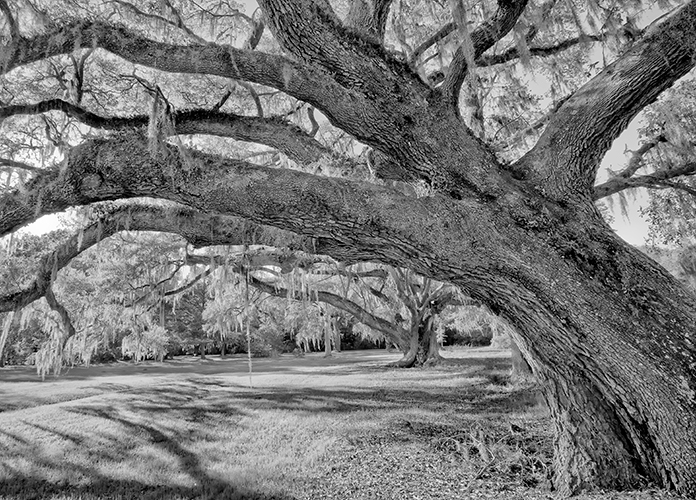
These trees make such wonderful subjects --- especially when draped with Spanish moss. I like the fact that you went with B&W on this one, but I do feel it's too heavy on the mid tones and highlights. There isn't much shadow tone, and the midtones seem too bright. Also, the shadow of the tree in the lower left seems substantially darker than the tree itself, which seems like it would be in shadow. I feel you have worked the tones a bit too far, and tried to recover too much shadow tone.
Registered on August 27, 2009, 51 Posts, 959 Comments
Comment posted by R.Bill Moser on June 24, 2012 at 1:51 PM
I really like how you framed this scene but I also agree with Ben on the midtones and highlights. It looks sort of flat. I'd like to see more dark tones.
Registered on January 29, 2010, 285 Posts, 4281 Comments
Comment posted by Mark Metternich on June 24, 2012 at 5:53 PM
Great graphic look to this image! Love it all the way around.
Registered on June 19, 2009, 276 Posts, 6240 Comments
Comment posted by Chad Merrell on June 24, 2012 at 7:17 PM
Nice subject and great composition. Great choice for B&W but I thought it was a winter scene at first. But then I never see the moss in this country so my mind does not think along those lines easily.
Registered on July 8, 2010, 91 Posts, 304 Comments
Comment posted by Dennis Harding on June 24, 2012 at 8:27 PM
Great image Bunn. I love tree and moss. Move the shadows curve across to the right to increase the blacks and you will have a winner.
Registered on January 19, 2011, 33 Posts, 408 Comments
Comment posted by Youssef Ismail on June 24, 2012 at 8:33 PM
Another strong tree composition. I like the high key effect and it almost looks like an IR photo.
Registered on November 1, 2003, 474 Posts, 5555 Comments
Comment posted by Tony Kuyper on June 24, 2012 at 9:41 PM
Registered on November 1, 2003, 364 Posts, 22328 Comments
Comment posted by Tom Kualii on June 25, 2012 at 1:44 AM
So much details...I like it
Registered on November 24, 2010, 53 Posts, 139 Comments
Comment posted by Floris van Breugel on June 26, 2012 at 1:09 AM
I'll echo Ben's thoughts exactly. I think some more midtone contrast will really help this shot stand out.
Registered on December 19, 2008, 306 Posts, 4840 Comments
Comment posted by Nancy Wolfe on June 26, 2012 at 8:29 AM
The first thing I notice in this picture is that it seems a little too bright and light. I feel it needs to be a little darker. Possibly it has been a little overprocessed.
Registered on April 7, 2012, 42 Posts, 103 Comments
Comment posted by Catherine Gagne on September 27, 2012 at 8:59 PM
Great picture.
Registered on July 29, 2012, 33 Posts, 114 Comments

Comments
11 comments