Nature Photographers Network
This is the preserved archive of the original Nature Photographers Network. The community continues at naturephotographers.network.
Headwaters--8741
‹ PreviousLandscape GalleryNext ›

Headwaters--8741

by Nancy Lea Sandy

Gallery: LandscapePosted May 29, 201280 views6 comments
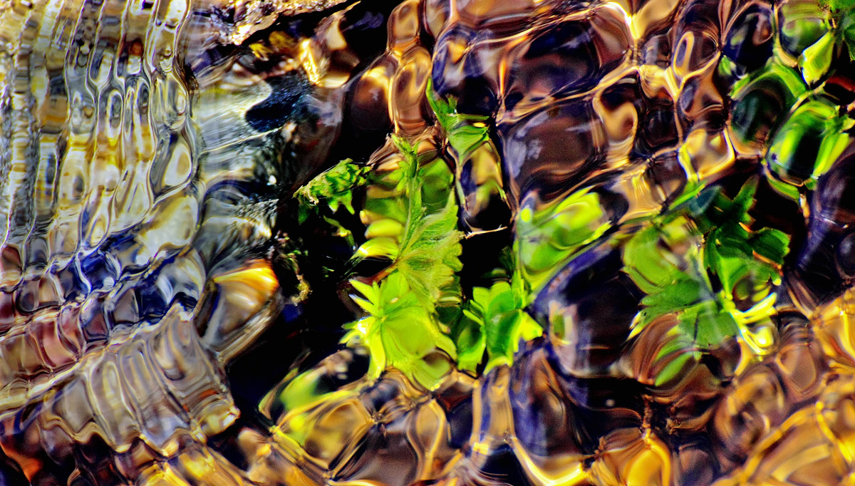
(I'll think of a title at some point) I pretty much zeroed out the shadows in this image, pushing the contrast up but it felt right to me. I hope you will let me know if I went too far. Your comments are always appreciated. Thanks for looking.


Canon T1i
1/400sec f/9.0 259mm

Comments

6 comments
Comment posted by Todd Liotine on May 29, 2012 at 5:51 PM
Great abstract, wonderful colors, and I think the comp holds interest.
Registered on July 1, 2008, 131 Posts, 671 Comments
Comment posted by Mark Windom on May 29, 2012 at 6:48 PM
This is very well seen....abstract photography is my favorite and this certainly fits that category. Nice stuff! I think your processing works just here.
Registered on November 1, 2003, 176 Posts, 2302 Comments
Comment posted by Paul Duval on May 29, 2012 at 6:52 PM
I've seen some shallow water reflection distortion images before, but never one quite so wild nice capture.

Paul
Registered on June 30, 2009, 508 Posts, 1907 Comments
Comment posted by Vance Gese on May 29, 2012 at 11:25 PM
Wonderful abstract. Love the shapes of the 'cells' and the amazing array of color. Beautiful.
Registered on November 13, 2008, 298 Posts, 6629 Comments
Comment posted by Stan Rose on May 31, 2012 at 3:16 AM
This series is so mind-bending, and this may be one of the best yet--almost looks like jewels, and such a great range of hues! I think the biggest challenge with these sort of abstracts is keeping them fresh; you haven't reached the point where the comps are starting to look 'the same' but i don't envy your task. One idea might be to really start mixing up the aspects--for example, in this case i really love a super long pano, cropping the top 1/3 and bottom 1/3 here--that way you maintain all the essential subject here (since theyre lined up vertically) but you introduce something that's less traditional--like i could totally see a nice wall sized pano of this hanging above my favorite bar stool! :biggrin:
Registered on September 15, 2005, 836 Posts, 17099 Comments
Comment posted by Karsten Wrobel on June 2, 2012 at 10:54 AM
wow, this is pretty cool... I like how the vibrant green leaves in the center are slightly more recognizable / less abstract than the rest... the transparent lhs sort of counterbalances the more colourful rest of the image... very refreshing + unique!
Registered on November 1, 2008, 117 Posts, 851 Comments