Nature Photographers Network
This is the preserved archive of the original Nature Photographers Network. The community continues at naturephotographers.network.
Devil's Golf Course
‹ PreviousLandscape GalleryNext ›

Devil's Golf Course

by Rodney Ninow

Gallery: LandscapePosted April 8, 2012307 views12 comments
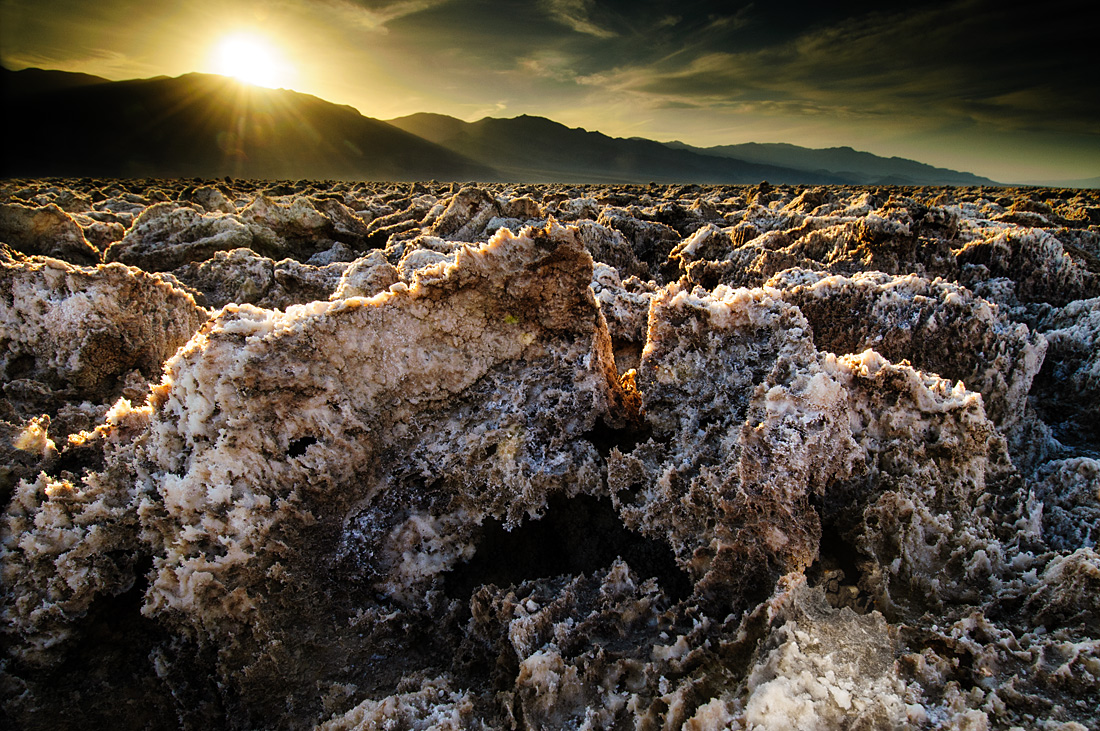
Spent 4 days in DV last week. Was the first trip for a friend of mine, so my main goal was to get us to some really good shooting locations and one that I know usually pays off is the Devil's Golf Course. We were there for sunset and shooting into the sun is a bit outside my comfort zone, but I wanted to give it a try. I think the location is also typically known for best light at sunrise, so again, this was something different.

Haven't posted here in a while, all comments welcome! Thanks for looking.

Nikon D300, Nikkor 12-24@14mm, 1/40 @ f11, 2 stop and 3 stop ND Grads

Comments

12 comments
Comment posted by Catherine Reilly on April 9, 2012 at 12:29 AM
Yep, the Devil would be that mean to make a golf course like this! I like the strong backlight and the sun cresting the hills. The sky looks a little heavy, though; too much gnd? Otherwise, nice stretch out of the comfort zone! Lots of points for that. :cool:
Registered on August 16, 2006, 603 Posts, 9192 Comments
Comment posted by Vlad Sadovsky on April 9, 2012 at 2:32 AM
True to the name, foreground is quite telling. Nice details. I like the sun on the mountains the most, wondering if you could organize the objects in the foreground to set leading lines toward the sun.

Registered on November 12, 2010, 48 Posts, 358 Comments
Comment posted by Rodney Ninow on April 9, 2012 at 8:24 AM
Thanks for the comments, I will see if I can open up the sky a bit in the corner, especially.
Registered on January 11, 2009, 7 Posts, 123 Comments
Comment posted by Morkel Erasmus on April 9, 2012 at 8:29 AM
A very stark image. Something different, and it works well IMHO.
:biggrin:
Registered on March 22, 2011, 385 Posts, 2068 Comments
Comment posted by Rick Turner on April 9, 2012 at 8:48 AM
Nice interpretation of the elements.
Registered on February 18, 2012, 534 Posts, 2755 Comments
Comment posted by Jorne de Bruin on April 9, 2012 at 9:14 AM
Seems like it paid off getting out of your comfort zone Rodney! I really like how you've handeld the sun and the backlighting looks great on this landscape. Besides the sky the only tip I could offer is to experiment with a very slight crop of the bottom, while the lowest part of the image is very nice, I do feel it is slightly to prominent. Just personal preference though! :smile: :wavey:
Registered on June 26, 2008, 178 Posts, 2136 Comments
Comment posted by Michael Westerbeck on April 9, 2012 at 10:30 AM
Wow, to think I am really bad at golf to begin with :smile: I do like the dark feel to this and the details in the rocks a lot. Nice use of back light. Good for you to get out of your comfort zone!! I do agree with the dark sky and I did notice that the horizon line is a bit off, but not a major issue really..
Registered on March 21, 2012, 32 Posts, 111 Comments
Comment posted by Tonia Graves on April 9, 2012 at 11:21 AM
I think you did really well with shooting into the sun on this! The rim lighting on the ground features is nice and contrasts against the dark sky. Nice work!
Registered on October 29, 2011, 92 Posts, 1035 Comments
Comment posted by Tony Kuyper on April 9, 2012 at 9:35 PM
Very unique take on this place, Rodney. The difference is very engaging.
Registered on November 1, 2003, 364 Posts, 22328 Comments
Comment posted by John Launstein on April 9, 2012 at 11:56 PM
Outstanding, Rodney! You've created a very powerful image here through the use of excellent composition, dramatic visual elements and textures, and strong lighting. This one is definitely an image to be proud of. Great processing, too, IMO.

Just looked at it again...man I like this image! :biggrin:
Registered on April 5, 2011, 223 Posts, 1193 Comments
Comment posted by Kory Lidstrom on April 10, 2012 at 1:08 AM
I really like the top half of this image -- the light dancing on the rocks is sweet. The bottom half, however, doesn't add much and only serves to pull my eye away from the candy-coated top half. I think if you crop the entire bottom half out and go with a pano, you've really got something here.
Registered on November 19, 2008, 49 Posts, 1035 Comments
Comment posted by Rodney Ninow on April 10, 2012 at 7:02 PM
Thank you everyone for taking the time to critique and offer suggestions! I really appreciate it.
Registered on January 11, 2009, 7 Posts, 123 Comments