Gallery: FloraPosted March 22, 201273 views11 comments
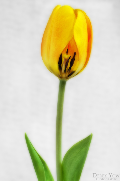
Sorry, another tulip shot, but something a little different for me.
Decided to change things up and shoot on a white background!
Pentax K-7; f/13, 2s, ISO 200; Tamron 90mm
Thanks for looking,
Derek
Comments
11 comments
Comment posted by Nathan Buck on March 23, 2012 at 1:06 AM
Very pretty Derek. I really like the look at the center of the flower. Nice treatment of the shot too. I like it a lot.
Nathan
Registered on November 1, 2003, 1101 Posts, 13589 Comments
Comment posted by Brigitte Lorenz on March 23, 2012 at 6:00 AM
very nice tulip image...
Brigitte
Registered on January 10, 2009, 187 Posts, 1507 Comments
Comment posted by scott lanz on March 23, 2012 at 8:15 AM
Excellent tulip portrait, Derek. Love the processing. Very artistic overall presentation. I'm not a big fan of removing petals, but it works quite well here. I like the way the side petals fold over the exposed center. Only suggestion: maybe a pinch more room at the top.
Registered on November 14, 2003, 840 Posts, 12902 Comments
Comment posted by Lorna Taylor on March 23, 2012 at 9:36 AM
Beautiful work Derek ,I agree with Scott on a touch more room at the top but the com and colours are just lovely.
Registered on November 12, 2010, 254 Posts, 3083 Comments
Comment posted by Carolyn Derstine on March 23, 2012 at 10:42 AM
Beautiful, soft image of a tulip, Derek! The inner view of the center is interesting and adds variety and texture. Great job on the processing; agree about some more room at the top.
Registered on February 16, 2011, 610 Posts, 3684 Comments
Comment posted by David W. Kelly on March 23, 2012 at 1:48 PM
I love the soft glow. Beautiful image.
Registered on October 7, 2005, 883 Posts, 6590 Comments
Comment posted by Derek Yow on March 23, 2012 at 9:05 PM
Thanks for the suggestions, I actually wondered about whether or not to add canvas up top, so I really appreciate the feedback on that. Here's a repost with some extra space. Does it look clean enough?
Registered on May 18, 2010, 26 Posts, 655 Comments
Comment posted by Wayne Jones on March 23, 2012 at 10:15 PM
Lovely softness and BG. Adding canvas to the top was a good idea.
Registered on April 18, 2007, 953 Posts, 6435 Comments
Comment posted by Albert Darmo on March 23, 2012 at 10:48 PM
Hi Derek Very creatively composed The lines and color are exquisite the repost is even better
Albert Darmo
Registered on November 25, 2008, 1386 Posts, 11978 Comments
Comment posted by Bob&Charly Nelson on March 24, 2012 at 5:47 PM
Wonderful stately capture Derek. A little more room at the top, as already mentioned, and this is a wall hanger.
Bob
Registered on October 27, 2005, 289 Posts, 4202 Comments
Comment posted by Ian Wolfenden on March 25, 2012 at 8:52 AM
The repost is just a touch better, I feel, Derek, with that extra space. The glimpse of the leaves at the base is just right for grounding the comp - lovely colours too.
Registered on May 18, 2007, 1108 Posts, 7647 Comments

Comments
11 commentsNathan
Brigitte
Albert Darmo
Bob