Gallery: LandscapePosted March 19, 2012138 views8 comments
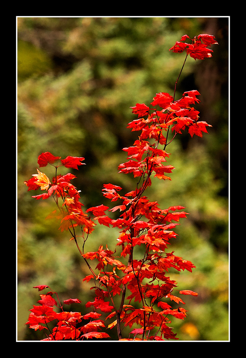
5DMK2, 70-200L, CPL, Hand held, slight Topaz Simplify filter. Thanks for looking
Comments
8 comments
Comment posted by Avi Hirschfield on March 19, 2012 at 8:05 AM
`Lovely colours
With the greens OOF
The reds pop
Registered on November 1, 2003, 518 Posts, 2114 Comments
Comment posted by Jeremy Calow on March 19, 2012 at 8:44 AM
Love this one. Crisp red leaves and contrasting lines from the in focus branches and the oof branches in the background. Nice work Danny.
Registered on November 8, 2007, 39 Posts, 363 Comments
Comment posted by Carol Hyman on March 19, 2012 at 2:13 PM
Danny, When I saw the thumbnail, I thought this was a carpet of red leaves lying on the ground.
I think you exposed very well for the orange/reds and I like your DOF.
Regards,
Carol
Registered on January 18, 2007, 597 Posts, 8062 Comments
Comment posted by Brian Schrayer on March 19, 2012 at 8:29 PM
Beautiful composition, Danny. I like the contrasting color.
Registered on May 28, 2004, 114 Posts, 2890 Comments
Comment posted by Tony Kuyper on March 19, 2012 at 9:28 PM
Nice comp with the OOF greens as a frame t the reds. Could see going a bit further on the bg blur. It looks a bit "razzy" for lack of a better word.
Registered on November 1, 2003, 364 Posts, 22328 Comments
Comment posted by Chris Chamberlain on March 19, 2012 at 11:27 PM
This is lovely with beautiful color contrasts. I think if you could soften the background some more it would be better still!
Chris
Registered on March 13, 2007, 500 Posts, 8365 Comments
Comment posted by Mark Seaver on March 20, 2012 at 2:21 AM
Great collection of maple leaves. They flow so nicely through the frame and are set off by the soft green background.
Registered on January 23, 2011, 1103 Posts, 17270 Comments
Comment posted by Kah Kit Yoong on March 20, 2012 at 5:59 AM
Heaps nicer than the thumbnail suggests. I'm digging the vibrance and DOF of this. I wonder whether selectively bringing down the darker tones which will affect the background more might make this pop even more.
Registered on September 27, 2006, 636 Posts, 10682 Comments

Comments
8 commentsWith the greens OOF
The reds pop
I think you exposed very well for the orange/reds and I like your DOF.
Regards,
Carol
Chris