Light Painted/ With Edits
by Chris Chamberlain
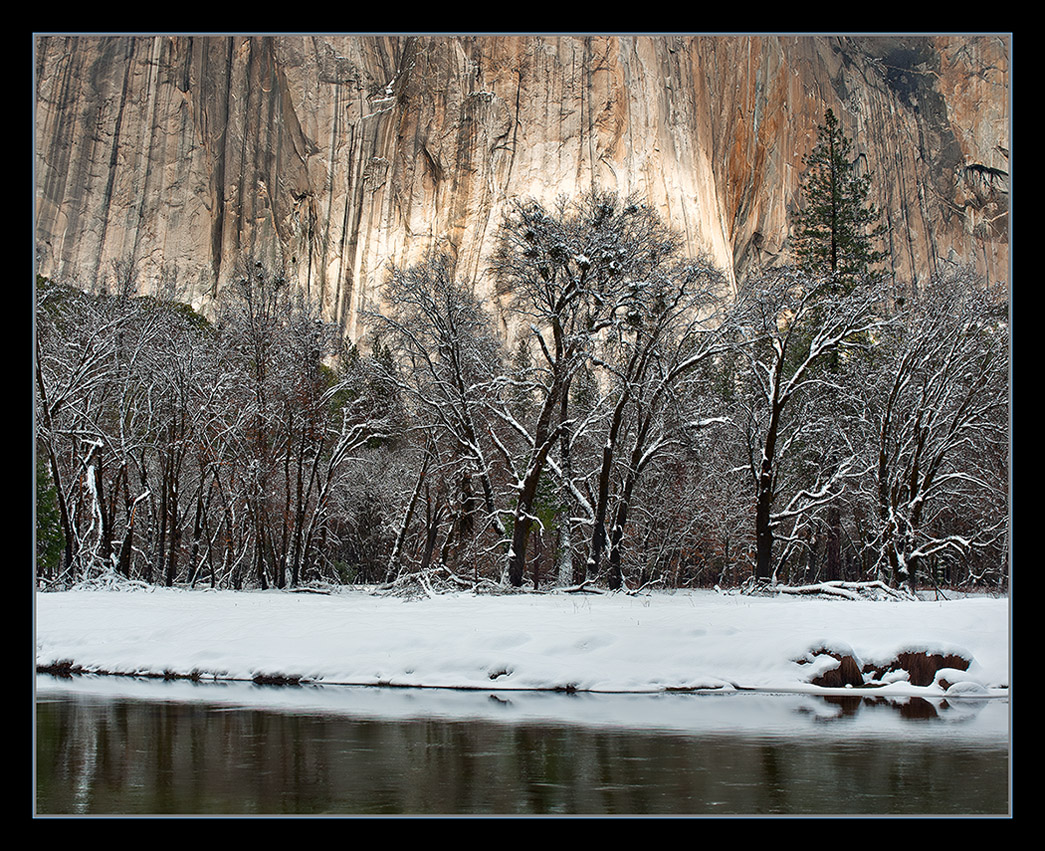
This is one from last winter that i never got around to posting. While Lon and I were shooting Taft Point from the banks of the Merced River, we happened to notice this little spot of light on the wall of El Capitan. Large view included.
D200,
18-70,
1/80sec, F/9.5
Chris

Comments
26 commentsI gotta find a good excuse to get back there. Visited Yosemite in the early 90's when our oldest son (now 22) was in his "waterfall phase" (probably six at the time). Combined the trip with a visit and family trip with my sister and her family who live in the east bay area. There ya go! Found my excuse....... visit my sister and go to Yosemite with some real camera equipment.....
Peter
Gary.
Nick Bristol
Lone Rock, WI
What I find very, very interesting now knowing that I stood there and watched this, is that this presentation isn't necessarily registering with my memory. Not quite sure how to explain this and I'm really curious now to understand if it has to do with the idea that two (or more) photographers can witness the same thing and come away with not only different images, but different impressions?
Don't get me wrong Chris, I love the image and think this is beautiful. If I was to comment/critique something as it relates to what I'm thinking, is the light on El Cap seems too bright, to "hard;" almost like it's the rock coloration rather than light? Maybe the light hitting the wall is too white and not warm enough? Like I said I can't quite put my finger on it. I think this would be a great candidate for TK's Lights Triple Play to tone down the brightness on the wall.
Then again, it all could just be in my own mind....
Lon
ps. Chris, drop me a note if you want to see my interpretation.
Really hope, Chris, that you have your name on the wait list at B&H (or somewhere) for a D800. You need to get one. No, you have to get one.
Lon,
I think you are seeing it right. But, It's not that the light on the granite is too bright necessarily. It might be a bit brighter than it was at the time. But more so, I think the surrounding areas in the frame were a little darker. I passed on processing this one until now because it just didn't grab me enough to go to the trouble. It just seemed sort of flat. So When I was culling old un processed raws the other night, I came across it and decided to see what I could do with it. In the end, the brightness and contrast were boosted, and then some selective burning here and there to try and optimize the depth in the scene. I think it might be bordering on too contrasty, but????? I do think you are also right about two people standing in the same place watching the same thing and coming away with different images and or impressions. I think this whole scene was just somewhat more subtle than this presentaion is. I would love to see you take on it. You can post it here if you'd like, or send me an e-mail.
Vance,
Thanks! not on a waiting list yet, but I'm keeping an eye out for some more information with user reviews. I'm not so sure it sounds like the camera for me. I like the big resolution, but not sure how the IQ at higher iso will be with all thos little pixels crammed onto that sensor. It does look very nice and fills all but one of my criteria for an upgrade. Just don't want to end up unhappy because it's too much for me to handle. I also here all that resolution is going to expose any weakness in technique and quality of glass!!!! The price sure seems to be pretty good considering the improvements from the D700. In the end, I think I'd go for the D3X, or D4, if price was no consideration of course! 20-24 MP full frame with higher iso capability and a faster frame rate with dual card slots good video and sensor cleaning, 100% viewfinder and virtual horizon with the in camera dynamic range blending all for around 3 grand and I'd be a happy camper!!!
Thanks for taking my comments in stride. There really is a LOT to be said about individuals witnessing the same thing and coming away with different impressions and renditions. I think that's something to pursue for those who are interested.
....anyway, here's my rendition. Of course I'm not starting with the original pixels, so ignore any sharpening or quality issues. But the bright area is considerably toned down and also a bit warmer. I can't say that even this version depicts the moment, only that it depicts my interpretation after the fact. The bottom line is that this is a beautiful "moment," classically Yosemite and I think very worthy of maximizing the potential of this image.
BTW, I used TK's Light's Triple Play and an additional "Bright Lights" luminosity mask as well as a hue/sat adj layer to tweak things to my personal taste. I ended up masking out the trees and snow since that looked good to start with so I didn't want to mess with that.
Lon
Thanks. I think what you have done is better. I think it looks slightly less bright overall as well, and that looks good too. While I like the contrast/range of difference between the bright spot and it's surroundings in my version. I like the color and texture in yours. I think the raw file is a little brighter than yours, but less than mine. As my eyes adjust to it, there is still plenty of difference in the light to stand out nicely. So, in the end, I'll make an adjustment in the direction you went.
I didn't actually dodge that area. I made my adjustments using curves in ACR, and a second time once opened in photoshop.
Yeah, there is a lot to be said about individual takes on things we witness and photograph. We pretty much have to go by memory when the processing starts. Or, just go with what resonates as "normal" to our mind's eye. But beyond that, I think with at least some images if not all of them, it's about how we see what it can potentially be as a final processed image. I think that is where a lot of differences in personal taste and artistic vision come into the process. Also, workflow and processing skill are a big factor. I don't very often try and take a dull or uninteresting image and say to myself I can make it good/pretty in photoshop. I started out thinking this image needed a little extra something, but your rendition shows me that it really doesn't. I do think a little spice is good for just about every image. Sometimes a lot if you are a garlic lover!!!!!!!
Chris
I had a few images submitted for that winter photo essay. I was in high hopes that at least one of them would be selected. The cover was a huge suprise! A copy of the edition was sitting on the christmas tree when I arrived home after being out of town for work that week. A very nice surprise for sure.
For those of you that may not know. What we are referring to is the February edition of Sierra Heritage Magazine. I have the cover, and three images included in the winter photo essay, along side a few other photogs, some of whom the names should be familiar! I'm very excited about it as it is my first publication.
Chris