Nature Photographers Network
This is the preserved archive of the original Nature Photographers Network. The community continues at naturephotographers.network.
Silent night
‹ PreviousLandscape GalleryNext ›

Silent night

by Peter Coskun

Gallery: LandscapePosted January 20, 2012288 views24 comments
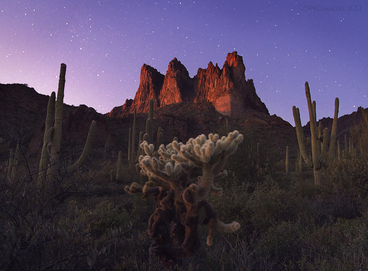
Ok, so the last two posts are from this location, but this is what I was looking for and I think I finally got it somewhat. This is a blend of two exposures. One taken at sunset, and the other about an hour or so after. I've wanted to try an image like this for quite some time, and just never had the time or decent enough location to do it. I would definitely like to get some feedback on this, as I'd like to be able to do more images like this. Comments and critiques are greatly appreciated. (please forgive me if I should have put this in the "photo art" section)

Canon 7d
Canon 17-40mm @17mm
two image blend (sunset image 1/13 sec ISO 100 f/9, stars 30 sec ISO 3200 f/4)
tripod mounted
remote release

Comments

24 comments
Comment posted by Zack Clothier on January 20, 2012 at 2:13 AM
The warm sunset light on the rocks combined with the stars is throwing me off here, Peter. I also think it is a bit on the bright side for a nighttime image, of course unless that was what you were going for. Other than that the blend looks very clean at this size. These star shots can be tricky, this is a decent first attempt though!
Registered on January 28, 2010, 343 Posts, 2257 Comments
Comment posted by Tony Kuyper on January 20, 2012 at 9:20 AM
Wouldn't have guessed this from the thumb. The stars a nice surprise. Bottom quarter of the image doesn't have a lot of interest compositionally other than to include the trunk of the cholla. I'm not sure if cropping it would be any better, but my eyes are glued to the stuff above it.
Registered on November 1, 2003, 364 Posts, 22328 Comments
Comment posted by Harry Lichtman on January 20, 2012 at 9:25 AM
Peter - I think the image is very good technically. The only thing that throws me off is seeing sunset colors with the stars out. If it were the moon or aurora that was the light source, it might be a bit more plausible. But then again, you wouldn't have the nice reds of the rock face. A fine shot overall and a good job with the blend. :toast:
Registered on September 17, 2010, 304 Posts, 3507 Comments
Comment posted by Bill Chambers on January 20, 2012 at 9:50 AM
As mentioned the sunset light is a bit "out of place" with the stars but, for me, that's pretty minor. IMO this is a very nice image, especially for non'technical photogs (ie, the general public). Excellent blend too.
Registered on April 10, 2005, 753 Posts, 21216 Comments
Comment posted by Chris Chamberlain on January 20, 2012 at 9:59 AM
If it looks natural/normal isn't really concerning me. I think it looks very good. Since you are going for an other than realistic presentation here, maybe a little more light on the foreground cholla might be good as well? This is excellent in my book!

Chris
Registered on March 13, 2007, 500 Posts, 8365 Comments
Comment posted by John Williams on January 20, 2012 at 10:31 AM
I love the idea here Peter, fun to look at and really attractive. I'm wondering if you cooled the sunset shot more, as apposed to warming the sky, it it would look a bit more natural. The stars tend to stick my mind in a nighttime paradigm. I love the peaks and cholla, but would prefer them a little less lined up.
Registered on September 6, 2007, 221 Posts, 5985 Comments
Comment posted by Jason Miles Kirk on January 20, 2012 at 11:40 AM
Hi Peter,

This image has some excellent potential! First I really dig the blend of stars with the sunset - though it is quite obvious to many here that this the result of the blend. I say who cares - it is stunning!

Also - what is distracting to me here is the horizontal format. Personally I find the most interesting detail smack in the middle of this comp. Maybe presenting this as a vertical image focusing on the single cholla and leading through the mountains to the sky. I like this exposure - on my monitor the shadows are dark enough to give this a nighttime feel.

Great work here!
Registered on January 9, 2007, 7 Posts, 55 Comments
Comment posted by Peter Coskun on January 20, 2012 at 12:00 PM
Thanks for the feedback everyone. The one thing I was a little concerned with was the obvious sunset light on the peaks. I can definitely cool it down quite a bit and make it feel more like a night image. I thought it looked interesting, but I really wouldn't want to throw people a curveball and try to figure out whats going on here. I do have a few vertical comps, but the main issue was the saguaros on the side would either intrude too much or not enough. This was the first attempt at the blend, so I have some time to work with it and make it more natural.
Registered on October 31, 2011, 170 Posts, 1240 Comments
Comment posted by Phil Pogledich on January 20, 2012 at 12:04 PM
I quite like every aspect of this, even the warm glow on the cliffs. It looks much more natural than virtually any of the "light painting" shots which are often well-received despite their obviously unnatural appearance. The composition works well for me too, though the lone cholla perhaps distracts my attention from the cliffs a bit more than would be ideal.
Registered on August 24, 2009, 123 Posts, 3099 Comments
Comment posted by Peter Coskun on January 20, 2012 at 12:11 PM
Thanks Phil. I did think of doing a light painting, but I figured this would be the easiest way and the light would be even. Although a scene like this would be hard to come by with the naked eye. I find it quite unique. As far as the comp, this wasn't ideally what I had in mind. I was having a tough time trying to put a comp together, and wanted to do a near far comp with the cholla cacti and blend for DOF as well. Though, my lens wasn't wide enough to include a lot of sky, and some of the arms of the saguaros would intrude into the frame. There's always next time though.
Registered on October 31, 2011, 170 Posts, 1240 Comments
Comment posted by Peter Coskun on January 20, 2012 at 1:18 PM
Here is a repost with some things I did differently. This one is a three image blend using one from sunset, the stars at ISO 3200 for 30 sec and another star image at ISO 100 for 30 sec. Instead of blending the stars into the sunset image, I blended the sunset image with the stars and made that a layer mask. Painted over the sky at 100% opacity to show the night sky, and then painted over the mountain and foreground at various lower opacities. This should have a more natural feel and more noticeable as a night shot. Let me know what you think.
Registered on October 31, 2011, 170 Posts, 1240 Comments
Comment posted by Craig Myers on January 20, 2012 at 1:29 PM
Seems to me that I've seen many very long exposures with similar lighting-some that seem more daylight than night that also include star trails. I like this better because your blending strategy eliminates the star trails. This has a nice twilight feel about it and seems more natural to me than many of the light-painting images I've seen. Well-done.
Registered on September 1, 2008, 85 Posts, 757 Comments
Comment posted by Chris Chamberlain on January 20, 2012 at 3:55 PM
Yeah, this does look more "normal" realistic for a night shot. I wouldn't say it's better or worse. For what it's worth, I prefer your first version and vision!!!!!!!

Chris
Registered on March 13, 2007, 500 Posts, 8365 Comments
Comment posted by Peter Coskun on January 20, 2012 at 4:17 PM
Thanks Chris. I liked the first version myself, but wanted to show a different blend for those wanting to see more of a night shot.
Registered on October 31, 2011, 170 Posts, 1240 Comments
Comment posted by Nick Bristol on January 20, 2012 at 7:42 PM
Peter, I think this is pretty cool looking. Kind of neat seeing these colors and the stars. It is an interesting look, and I like it. Your second version is probably more realistic and does have a nice feel, but I prefer the first one! Nice work.

Nick Bristol
Lone Rock, WI
Registered on February 1, 2004, 752 Posts, 14140 Comments
Comment posted by David Edwards on January 20, 2012 at 8:10 PM
A beautiful image, Peter. I do like the original post over the darker reworked repost, and I like John's idea of cooling the landscape a little. The idea of the sun on the peaks and a night sky is a little unusual, but probably only to photog's who like to analyze the image. There's lots to enjoy from an artistic pov. Nice work.
Registered on December 6, 2008, 142 Posts, 2623 Comments
Comment posted by Peter Coskun on January 20, 2012 at 10:28 PM
Thanks Nick and David. I'm sure it wouldn't appeal to everyone, but it beats hauling some lighting source out there (did that once and was quite the task).
Registered on October 31, 2011, 170 Posts, 1240 Comments
Comment posted by Vance Gese on January 20, 2012 at 11:50 PM
The light on the peaks is really nice as well as the subtle light on the foreground. Really like your composition. Nicely done.
Registered on November 13, 2008, 298 Posts, 6629 Comments
Comment posted by Lon Overacker on January 21, 2012 at 1:33 AM
Peter,

First let me say I think your original image is a beautiful one. I like the color, the composition and I like the fact that we can see detail in the landscape. That's my non-partisan view and I think this would be well received in a public venue.

Gotta agree with David though when he said, "...but probably only to photog's who like to analyze the image." We all fall in to this, me included. From a togs point of view and also a mod, this more closely defines a composite simply because of the time difference and that under normal circumstances you can't see sunlight and stars at the same time. But I don't want to belabor that because I think you did a great job in technique and crafting of this image. The second one is less appealing to me for two reasons. One, the color balance is a little weird, both in the landscape and the purple "sunset" light on the peaks. Second, with the landscape taking up a good half of the real estate, the darkness throws off the overall balance and comp - at least for me.

In the end, as a creative, well composed and beautifully crafted image I really like it.

Lon
Registered on November 24, 2006, 521 Posts, 19147 Comments
Comment posted by Peter Coskun on January 21, 2012 at 8:27 AM
Thanks Vance and Lon. It's true that probably only photogs would find this scene strange at first, even myself, but then again, I would rather market it to the general public than photogs anyways.
Registered on October 31, 2011, 170 Posts, 1240 Comments
Comment posted by Phillip Noll on January 21, 2012 at 11:52 AM
Awesome! Really captures the feeling of spending the night in the desert! Nice work!!
Registered on November 17, 2003, 207 Posts, 1083 Comments
Comment posted by Peter Coskun on January 21, 2012 at 1:37 PM
Thanks Phillip! It is a whole other world during the night, and when your flashlight dies halfway back to the car it makes it all the more exciting!
Registered on October 31, 2011, 170 Posts, 1240 Comments
Comment posted by Vlad Sadovsky on January 21, 2012 at 4:34 PM
Nicely shown , the balance between light in the sky, hightlight on the rocks and cacti is the most impressive part for me. For me slightly darker sky with just a hint of light would work better, telling the story about stars, if it was possible to keep the light on the rocks.

Well done.
Registered on November 12, 2010, 48 Posts, 358 Comments
Comment posted by Kah Kit Yoong on January 21, 2012 at 5:18 PM
I like very much what you've done in the first post. The glow is really beautiful. The sky seems overly bright for the amount of stars on view however, I would take it down a stop.
Registered on September 27, 2006, 636 Posts, 10682 Comments