Gallery: LandscapePosted January 15, 2012130 views10 comments
I don't know very much about landscapes so any advice, criticisms are welcome!
Please see repost below. I don't mind brutal honesty!
ISO 250, f13, 1/250
17-40 @17mm
5D2 (no tripod)
Comments
10 comments
Comment posted by Nancy Lea Sandy on January 15, 2012 at 4:50 PM
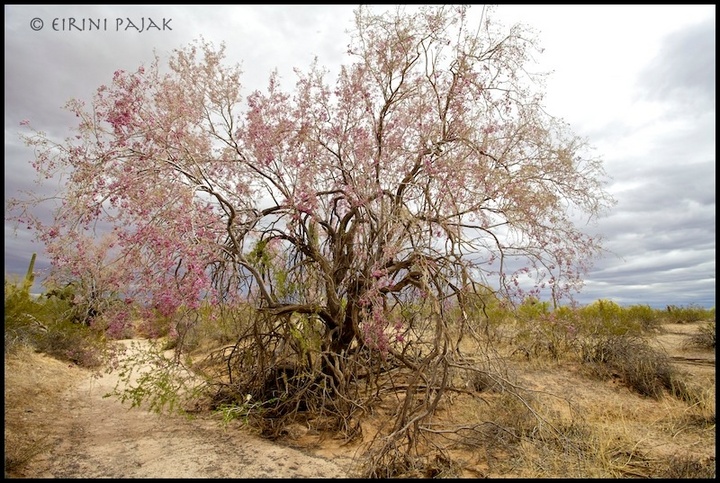
My only wish would be for a little more room all the way around. I'd love to see a bit more of the layered clouds in the bg and some breathing room so the top and left hand branches weren't touching the frame. Beautiful colors. the pink blossoms go particularly well with the soft grey sky. A very nice image.
Registered on January 24, 2011, 576 Posts, 6942 Comments
Comment posted by Rick Goldwasser on January 15, 2012 at 6:24 PM
I like all the gnarly shapes and the subtle colors of the bloom in the tree, I think you captured that well. I agree that the image could use a bit more space and it would have been nice if those darker clouds had been above the tree - the washed out white is a bit distacting.
Registered on May 10, 2009, 127 Posts, 970 Comments
Comment posted by Tony Kuyper on January 15, 2012 at 7:52 PM
The subject is interesting and I like how you composed it. I find the light in the upper right pulls me out of the frame though. I'd work to see if that could be darkened down some. Not sure what's on the RAW file that might be recoverable. Also, I could see adding some saturation to the reds to make the blossoms a stronger focal point.
Registered on November 1, 2003, 364 Posts, 22328 Comments
Comment posted by Scott Fricke on January 15, 2012 at 9:33 PM
Very nice Eirini, I like the subtle pink color with the muted landscape. The blown highlights in the URC are distracting, I think I would be tempted to crop off the right 1/4 of the image so the eye focuses on the tree and the road.
Registered on January 19, 2007, 133 Posts, 1448 Comments
Comment posted by Eirini Pajak on January 16, 2012 at 11:15 AM
I was able to recover the highlights, not sure if that helps or not!
Registered on December 13, 2011, 216 Posts, 1671 Comments
Comment posted by Eirini Pajak on January 16, 2012 at 11:17 AM
Here is a cropped version. BTW, it is not a road but a wash! I am not sure why, but when I post photographs on this site in general the colors go flat.
Registered on December 13, 2011, 216 Posts, 1671 Comments
Comment posted by R.Bill Moser on January 16, 2012 at 11:44 AM
I like the subject and how you composed it. The blown highlights in the upper corner are a bit distracting to me. The repost (2nd version) is an imrovment.
Registered on January 29, 2010, 285 Posts, 4281 Comments
Comment posted by Harley Goldman on January 16, 2012 at 12:52 PM
The first repost is a big improvement. Looks nice!
I guess you know more about landscapes than you think.
Registered on November 19, 2003, 586 Posts, 11271 Comments
Comment posted by Lon Overacker on January 16, 2012 at 4:50 PM
Eirini,
I think this last repost is the winner. The first is nice, but a bit static and kind of ordinary - What I mean is more documentary. The last version is with purpose, if that makes sense. I know what the photograph is about more in the cropped version. I like the subtle colors too. Thanks for the repost.
Lon
Registered on November 24, 2006, 521 Posts, 19147 Comments
Comment posted by Tony Kuyper on January 17, 2012 at 7:31 AM
First repost has my vote. The a significant recovery.
Registered on November 1, 2003, 364 Posts, 22328 Comments

Comments
10 commentsI guess you know more about landscapes than you think.
I think this last repost is the winner. The first is nice, but a bit static and kind of ordinary - What I mean is more documentary. The last version is with purpose, if that makes sense. I know what the photograph is about more in the cropped version. I like the subtle colors too. Thanks for the repost.
Lon