Nature Photographers Network
This is the preserved archive of the original Nature Photographers Network. The community continues at naturephotographers.network.
Me & My Shadow-w repost
‹ PreviousLandscape GalleryNext ›

Me & My Shadow-w repost

by Angela Classen

Gallery: LandscapePosted January 11, 2012744 views11 comments
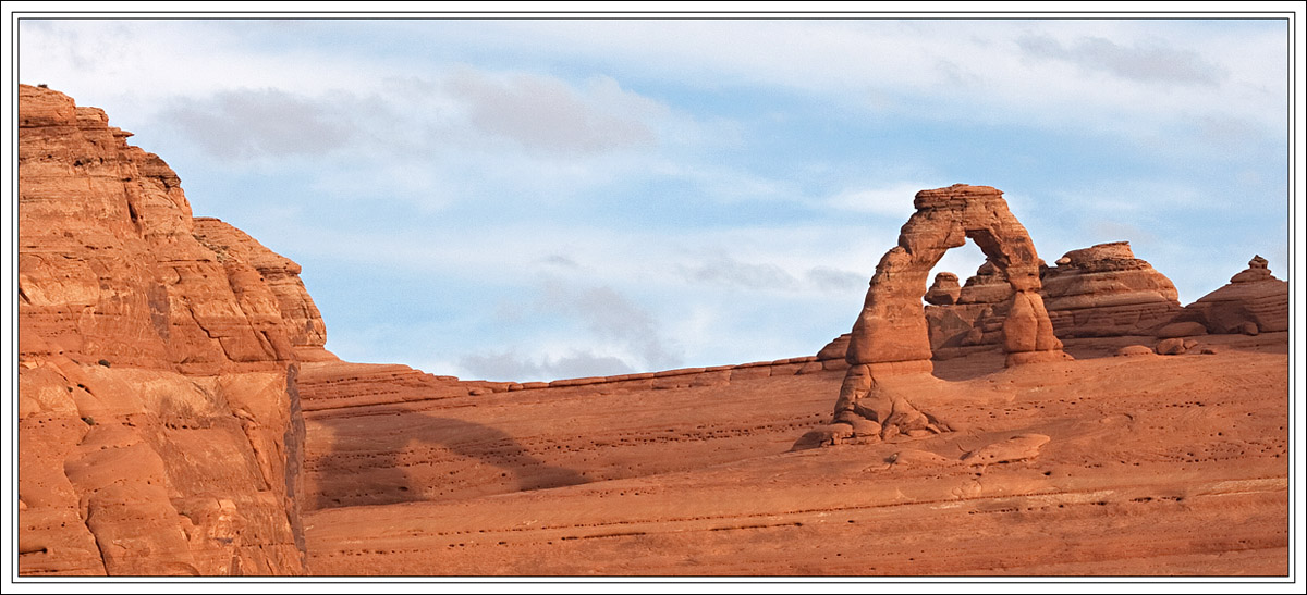
Shot this from across the canyon from the world's most recognizable arch. I had a lot of fun just traversing this rim, looking for different viewpoints. The sun was playing peek a boo with the clouds, and I caught this when it was out for a short moment.

Canon Rebel XTI, tripod
35-80 mm lens
ISO 100, F16 @ 1/60

Comments

11 comments
Comment posted by Marc Adamus on January 11, 2012 at 10:47 PM
The comp seems to split the image up too much to my eye and the light looks rather flat. That said, the sky works OK and I'm glad you're looking for new perspectives. The areas of interest in the landscape just don't really lead me through it. Would suggest focusing on the arch a bit more and getting some stronger lighting.
Registered on September 17, 2005, 780 Posts, 8091 Comments
Comment posted by Raymond Klassen on January 11, 2012 at 11:03 PM
Cool scene, but the shadow really gives this some interesting depth. Nice comp and I like the wide format.
Registered on November 30, 2008, 114 Posts, 790 Comments
Comment posted by Richard Teller on January 11, 2012 at 11:29 PM
I have shot images from this same angle at delicate. I think Marc made some very valid observations on the image.
Registered on August 23, 2010, 1162 Posts, 6692 Comments
Comment posted by Phil Pogledich on January 12, 2012 at 12:50 PM
Nice shot, Angela. I don't really disagree with any of Marc's observations but, that said, I feel it's a very nice and different take on Delicate Arch. Amazing to me that there aren't any people here or there in the image. I've been there twice and each time it was crawling with folks of all ages.
Registered on August 24, 2009, 123 Posts, 3099 Comments
Comment posted by Lon Overacker on January 12, 2012 at 7:49 PM
Angela,

Are my eyes deceiving me or was this briefly posted recently and you took it down? Could have sworn I saw this earlier. But then I haven't taken my medications today, so maybe I'm off. :wink:

I really like the viewpoint here and also the narrow format. I like the idea and the setup, but I think perhaps a couple of small tweaks could make this work better. The trouble I see stems from the lack of light here and consequently the shadow isn't standing out very well and almost gets missed - except that title calls it out. I'm wondering if you bumped the overall contrast a tad and selective darkened the arches shadow to give it more attention? Also, a very slight increase in saturation to help give the impression of some warmer light. Other than that, I really like how you crafted this one. And I understand the light was what it was when you were there and we never have control over that.

Lon
Registered on November 24, 2006, 521 Posts, 19147 Comments
Comment posted by John Tobias on January 12, 2012 at 9:40 PM
Angela, I like the photo, but would like to see the shadow stand out more, as it is IMHO it is too light to make an inpact.

TFS.
Registered on September 12, 2009, 2120 Posts, 6455 Comments
Comment posted by Angela Classen on January 12, 2012 at 11:01 PM
I appreciate the comments and suggestions. I've reworked this one a bit, increasing overall contrast & saturation, and burning the arch's shadow darker. How is this effort?
Registered on June 13, 2007, 434 Posts, 2742 Comments
Comment posted by Jim Greenwood on January 12, 2012 at 11:45 PM
Your reworked version is an improvement. I'd also suggest cropping some off the left, to focus more attention on the key elements (i.e. - the arch and the shadow :smile: ).
Registered on November 9, 2003, 229 Posts, 1523 Comments
Comment posted by Lon Overacker on January 13, 2012 at 1:08 AM
Angela,

Excellent job with the repost - just what I had in mind. You made some adjustments, but it doesn't look like you did. does that make sense? It all looks natural. thanks for taking the time - the effort, well worth it!

Lon
Registered on November 24, 2006, 521 Posts, 19147 Comments
Comment posted by Tony Kuyper on January 13, 2012 at 11:22 PM
The sky helps this a lot, Angela, as does the soft light. Could maybe see cropping off about half the rock on the left to make it a less dominant element. Repost is a definite improvement.
Registered on November 1, 2003, 364 Posts, 22328 Comments
Comment posted by John Kerr on January 15, 2012 at 7:45 AM
Wonderful image of a great American icon. I think it looks good other than maybe a slight saturation adjustment could boost the orange rocky landscape abit. Could be my monitor. I like the overall comp and cropping.
Registered on October 28, 2009, 111 Posts, 1070 Comments