Nature Photographers Network
This is the preserved archive of the original Nature Photographers Network. The community continues at naturephotographers.network.
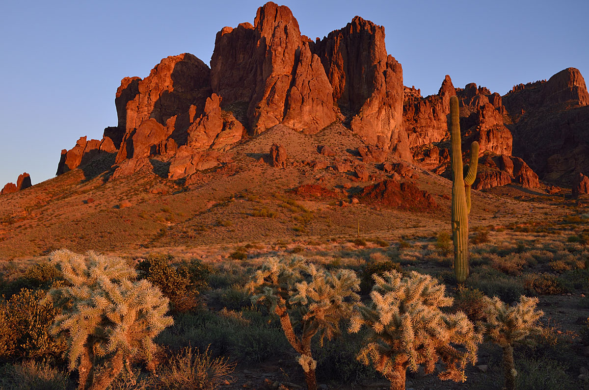
Sunset on the Superstiti
‹ PreviousLandscape GalleryNext ›

Sunset on the Superstiti

by Walt Sterneman

Gallery: LandscapePosted January 5, 2012142 views10 comments
We are on a trek in the west. Stopped by the Superstition Mountains near Phoenix and managed to catch a typical desert sunset. This is three images for focal length put together in Helicon Focus. It is the first time I have tried this.

D7000, 26mm, f/8, 1/30sec., and I had one of those chollas attack me with about ten of their needle pods! You would have laughed to see me getting the shot when the light was right with those damn things sticking out all over me! Comments and suggestion are welcomed.

Comments

10 comments
Comment posted by Peter Coskun on January 5, 2012 at 9:25 PM
Good thing you stopped by this place. I like the rich colors here. The composition is okay, but I might have stepped more to the left to have more space on the right of the flatiron and possibly shot a little lower angle to have space up top. The only other thing that I would mention is the saguaro, to me it protrudes too much into the mountain, but I am aware that this comp had little flexibility with that and is just more personal preference. The blend looks nice, though from the perspective I think you could have done one shot around f/16 for depth of field. Hope you make it back under cloudy skies, that's when the real magic happens.
Registered on October 31, 2011, 170 Posts, 1240 Comments
Comment posted by Chris Chamberlain on January 5, 2012 at 10:40 PM
This is a nice scene, and nice light. My big issue with the comp is the lack of space above the peak of the rock formation. It really needs a little breathing room.

Chris
Registered on March 13, 2007, 500 Posts, 8365 Comments
Comment posted by Doug Roane on January 6, 2012 at 3:04 AM
Amazing light, Walt! The comp is good with a good sense of depth created by the foreground. My biggest concern is that the crop is too tight. I would like to see more space above the cliffs and also see the bottoms of at least a few of those fg cacti!
Registered on December 12, 2008, 213 Posts, 2226 Comments
Comment posted by Nancy Lea Sandy on January 6, 2012 at 11:23 AM
Beautiful light, richly saturated colors. The tightness of the composition has already been mentioned, so my only suggestion is to wear chaps (they're not just for rodeos any more) Very nice job on this image.
Registered on January 24, 2011, 576 Posts, 6942 Comments
Comment posted by Vance Gese on January 6, 2012 at 8:42 PM
Beautiful warm light that really brings out the details in the rock. I really like tight compositions but do have to agree with others that a little space above the mountains would give these peaks a little breathing room. Just a thought of course. Sounds like those chollas can be mean.
Registered on November 13, 2008, 298 Posts, 6629 Comments
Comment posted by Lon Overacker on January 7, 2012 at 2:36 PM
Walt,

Other than the very tight squeeze up top that has been mentioned, I'm really liking the quality of light and rich color presented. Might have wished for a more stately saguaro, but can't complain about the cholla. ;-)

I think you should be able to add some sky up top fairly easily since all the color is uniform. You might consider that if you ever print or display this somewhere.

Lon
Registered on November 24, 2006, 521 Posts, 19147 Comments
Comment posted by Walt Sterneman on January 7, 2012 at 4:14 PM
Thanks for the input everyone. I see what you mean by the tightness at the top. I couldn't get to the right any more as there was a big bush in the way. I will work on adding a little sky.
Registered on March 24, 2010, 73 Posts, 1268 Comments
Comment posted by Tony Kuyper on January 7, 2012 at 7:15 PM
Neat scene and light. Just needs a bit more space at the top.
Registered on November 1, 2003, 364 Posts, 22328 Comments
Comment posted by David Edwards on January 7, 2012 at 8:43 PM
Beautiful color. The red rocks look fabulous against the blue sky. I agree the comp needs a bit more space to breathe. Sorry to hear about the spiking.. ouch!
Registered on December 6, 2008, 142 Posts, 2623 Comments
Comment posted by Rick Turner on June 26, 2012 at 8:23 AM
Cropping is off at top. Good shot otherwise. I suggest Rule of Thirds fyi.
Registered on February 18, 2012, 534 Posts, 2755 Comments