Nature Photographers Network
This is the preserved archive of the original Nature Photographers Network. The community continues at naturephotographers.network.
Heading Home [+edit]
‹ PreviousLandscape GalleryNext ›

Heading Home [+edit]

by John Williams

Gallery: LandscapePosted December 13, 2011419 views20 comments
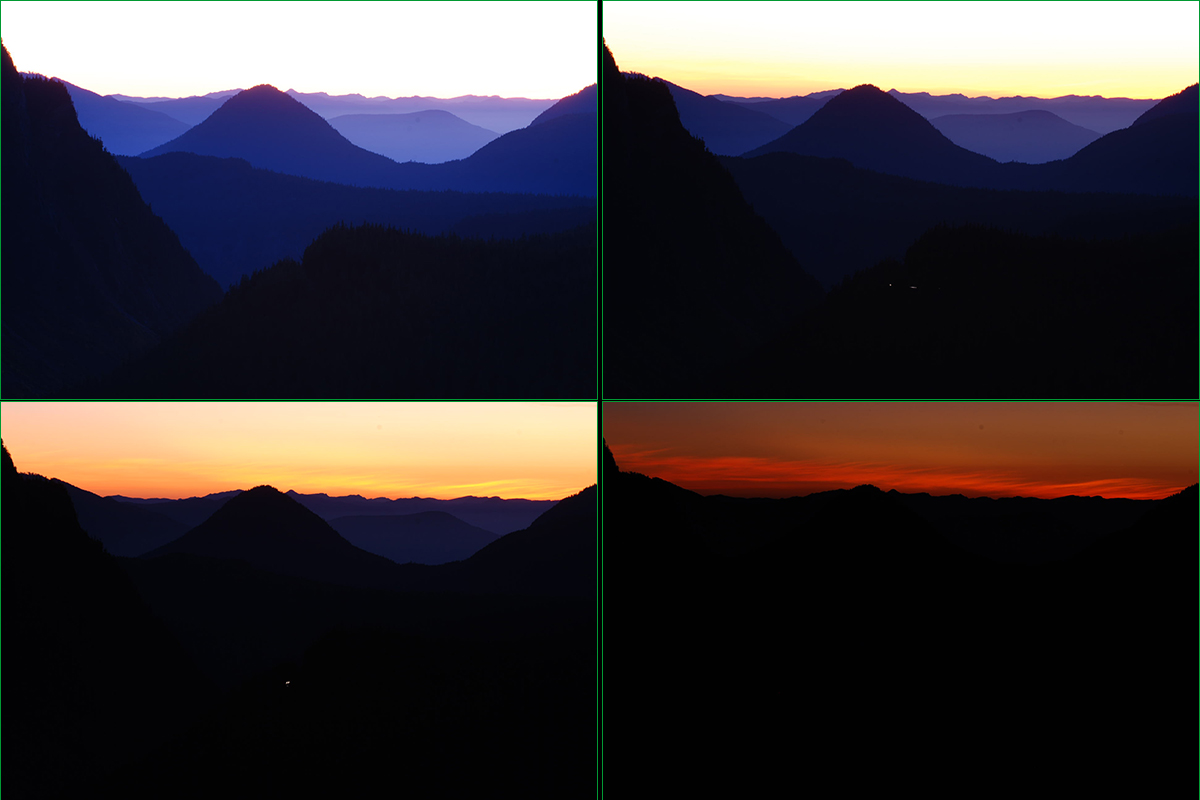
Instead of a larger version of this photo, I'm loading a collage of the photos I used to blend this. (I used the RAW files for this photo, but the ones in the collage are from the JPGs the camera recorded at the same time.) If you have a moment, compare those images to this final version; I'd love some feedback on the color balance.

When I took this image, it was a bit after sunset and the sky color was very rich and the foreground quite dark. It was hard to keep detail in the sky, even in that darkest photo the red channel has some areas that are blown when converting to sRGB.

The sky looks pretty close to what I think I saw with my eye (maybe a tad brighter than what I was seeing), but in the foreground the camera saw a lot more blue than I did. In this final version, I warmed the foreground some to better match the sky. Combining the cool color the camera saw in the land with the warm the camera saw in the sky looked odd to my eye.

Do you think this compromise of warming the shadows some works, or does it still look a bit too wild? Thanks for any thoughts and suggestions you may have!!

This is looking west from one of the pullouts just south of Paradise on Mt. Rainier.

Nikon D80
Nikon 70.0-300.0 mm f/4.5-5.6 at 300mm
0.3, 3, 8, and 20 sec at f/16 and ISO 100

Comments

20 comments
Comment posted by Kurt Budliger on December 13, 2011 at 11:54 AM
Wow, really well done, you've definitely managed to bring in the best of every frame. Shadows look nicely balanced to me. :toast:
Registered on June 11, 2006, 113 Posts, 2116 Comments
Comment posted by Joseph Campisi on December 13, 2011 at 1:00 PM
Thought I recognized that spot John...

IMO, the shadows are nicely balanced, and the image as a whole looks pretty natural. Nice work!
Registered on November 24, 2008, 304 Posts, 3211 Comments
Comment posted by Nathan Apodaca on December 13, 2011 at 1:22 PM
Looks good to me. Maybe the hills farthest back are a bit too magenta? Anyways, I like the image a lot. It's especially interesting to see the individual photos before the blend. IMO, It not only helps me comment, but gives me, an amateur, an idea what goes on to produce these images... BTW, that is one incredible pullout...
Registered on November 16, 2011, 67 Posts, 1127 Comments
Comment posted by R.Bill Moser on December 13, 2011 at 2:06 PM
John I like this a lot. I'm not quiet sure about the magenta in the hills in the distant. The blending looks good. Nice mood and I especially like the layers here.
Registered on January 29, 2010, 285 Posts, 4281 Comments
Comment posted by Dorin Bofan on December 13, 2011 at 2:11 PM
I like how the sky came out, but I think there is a bit too much magenta in the mountains. I like it like that too, although my memories of similar scenes tell me the colour isn't completely natural.
Registered on April 30, 2007, 122 Posts, 3086 Comments
Comment posted by Nick Bristol on December 13, 2011 at 2:16 PM
Beautifil image John. I really like this comp and love all the layers. I think the colors are really pretty, but like Nathan and Bill I'm not quite sure about the magenta in the distance. Maybe a little more blue? Well, its beautiful anyways!, and I love it.

Nick Bristol
Lone Rock, WI
Registered on February 1, 2004, 752 Posts, 14140 Comments
Comment posted by Vance Gese on December 13, 2011 at 3:16 PM
While I am quite ignorant about blending images, your resultant image looks fantastic to me. The receding layers of the ridges with just a touch of detail look superb. Love the colors. Gorgeous image.
Registered on November 13, 2008, 298 Posts, 6629 Comments
Comment posted by Aaron Feinberg on December 13, 2011 at 3:35 PM
Looks pretty good to me. The colors would definitely be there. And lovely they are :)

aF
Registered on October 26, 2009, 399 Posts, 2789 Comments
Comment posted by Bill Chambers on December 13, 2011 at 3:55 PM
Oooh, this is so pretty. Love the layers of color in the mountains and how it contrasts with the sky.
Registered on April 10, 2005, 753 Posts, 21216 Comments
Comment posted by Stan Rose on December 13, 2011 at 4:03 PM
The combo looks funky to me, John. did you match the colors between the exposures, so the WB was the same? I know you said it was going a bit blue on you, but i think blue is the main thing the last mountain layer needs, and less magenta/purple. Might try a bit more yellow in the sky, but i think the blue is the important thing here. Pretty shot, definitely worth a bit of pain processing it :wink:
Registered on September 15, 2005, 836 Posts, 17099 Comments
Comment posted by Thomas Young on December 13, 2011 at 5:28 PM
I quite like the magenta, it really contrasts with the sunset to make the scene pop.
Registered on February 10, 2011, 7 Posts, 55 Comments
Comment posted by Harley Goldman on December 13, 2011 at 6:03 PM
Real nice scene. I would agree with Stan getting rid of the magenta and making those shadow areas more blue.
Registered on November 19, 2003, 586 Posts, 11271 Comments
Comment posted by Eva McDermott on December 13, 2011 at 7:50 PM
Depends what effect you are going for John. My first impression was this is wonderful. After looking at the larger collage, I would take the two images on the left and work with them but that is me and not you. I also would have probably just used a grad. I don't like to spend a lot of time in PS.
Registered on January 4, 2009, 1015 Posts, 13229 Comments
Comment posted by Lon Overacker on December 13, 2011 at 8:46 PM
John,

I'd say you did a great job with the blend. I would be in the camp though that says the purple in the bg mountains is a bit strong. More towards blue, less purple as I think Stan mentioned and less saturation. The sky maybe too, but certainly I see no WB issues in the foreground mountains. You did well there. Love the layers here, tweak the color and saturation in the upper half and you'll be good. Certainly a scene worth tweaking.

Lon
Registered on November 24, 2006, 521 Posts, 19147 Comments
Comment posted by Ben Horne on December 13, 2011 at 10:13 PM
I agree with Eva that you should just work with the two images on the left. So much emphasis these days is placed on having complete tonality through a scene -- perhaps this is our way of over-correcting for past limitations with slide film and very narrow exposure latitude. For this image to read naturally to the viewer, the sky does need to be much brighter than the foreground. Otherwise, it takes on a cut and paste feel. The upper left photo has a very ideal sky, in my opinion. It's bright, but not overexposed. The Lower left photo has a great looking foreground with natural color. With the blend as presented, the distant mountains are very similar in tone to the upper parts of the sky. When viewing a scene like this in person, the sky would be several stops brighter than the mountains. I've be curious to see a blend of the two photos on the left.
Registered on August 27, 2009, 51 Posts, 959 Comments
Comment posted by Danny Laureys on December 13, 2011 at 10:13 PM
Excellent!!!!!! :toast: :toast: :toast:
Registered on January 5, 2008, 590 Posts, 1261 Comments
Comment posted by John Williams on December 14, 2011 at 12:57 AM
Thanks so much for all the suggestion, exactly what I was hoping for. Here's an edit playing with some of your thoughts. I've tried to pull back on the magenta and saturation for the land, added a little blue, and let the shadows stay a little darker. (I'm adding a black background this time; the white would drown out the darker shadows too much.) Based on what I remember seeing with my eyes at the time, the bottom right was by far the more realistic sky, and the shadows somewhere between the two middle toned photos.
Registered on September 6, 2007, 221 Posts, 5985 Comments
Comment posted by Stuart Williams on December 14, 2011 at 12:57 AM
looks a touch wild to me, john. would have preferred slightly cooler. fun though!

EDIT - just seen re-post - looks better!
Registered on December 7, 2007, 247 Posts, 4792 Comments
Comment posted by Phil Pogledich on December 14, 2011 at 4:14 PM
I think the repost looks perfect. Like many of the others, in first viewing the image I thought the shadows (particularly near the horizon) were too purplish/magenta. You've addressed that and I'd say you can call this one done. Very nice shot.
Registered on August 24, 2009, 123 Posts, 3099 Comments
Comment posted by Barry Vangrov on December 14, 2011 at 8:20 PM
Re-post is much better and looks more realistic. Great work.
Registered on September 1, 2009, 148 Posts, 749 Comments