Nature Photographers Network
This is the preserved archive of the original Nature Photographers Network. The community continues at naturephotographers.network.
REPOST - Critique please.
‹ PreviousFlora GalleryNext ›

REPOST - Critique please.

by Charlie Baugh

Gallery: FloraPosted November 24, 2011114 views13 comments
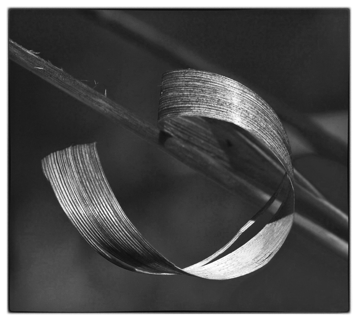
This image of a curled reed has been posted before in color. Very limited experience has me wondering about exposure and conversion to B&W. On another image I was advised that there should be definite black and white. All comments, advice and critique can help me considerably.

Thanks,

Charlie

Comments

13 comments
Comment posted by Barbara Graham on November 24, 2011 at 5:28 PM
Charlie, I just wanted you to know that if I could give you a critique I would, but for me with B&W I'm still at a point where I have to try everything to see what seems right for any given image, so I can't even begin to tell just by looking at it. I really do like this image of this curled reed, though.
Registered on July 27, 2010, 1310 Posts, 5035 Comments
Comment posted by Charlie Baugh on November 24, 2011 at 6:10 PM
Thanks Barbara. We are at nearly the same point on B&W. I'm hoping some of the B&W experienced will give me some idea if I'm getting any progress.

Charlie
Registered on April 18, 2011, 329 Posts, 1985 Comments
Comment posted by Carol Hyman on November 24, 2011 at 7:47 PM
Very nice, Charlie. I never saw the colored version but I do think the B/W rendering. Nice light and good composition.

Regards,

Carol
Registered on January 18, 2007, 597 Posts, 8062 Comments
Comment posted by Bill Fach on November 24, 2011 at 8:41 PM
Charlie: Looks pretty good to me. I like the contrast range and the comp. Well done.>=))>
Registered on November 1, 2003, 1805 Posts, 26981 Comments
Comment posted by Buck Ward on November 24, 2011 at 10:19 PM
Hi Charlie.

I love black and white and I do it whenever I can. My experience is that a photo works in color or it works in black and white but probably not in both. I didn't see the color version of this one. The black and whites I like best have lots of contrast - black blacks and white whites. This is what I'm talking about: http://www.naturephotographers.net/imagecritique/bbs.cgi?a=vm&mr=67069&CGISESSID=127779a87200d7536631985c5c4bcf50&u=23600

For me, this photo's appeal is in the shape of the curled reed, not in its black-and-whiteness. There are a lot of mid-tones, some highlights, but no real blacks.
Registered on December 8, 2003, 96 Posts, 1917 Comments
Comment posted by Gary Yeoh on November 25, 2011 at 3:34 AM
Charlie:
I like the composition here with the curled reed.

B&W is quite different and challenging in its own right. I am still exploring and learning more with B&W with my radiography images. Wish to see more tonal range and contrast here.
Registered on September 1, 2009, 588 Posts, 8184 Comments
Comment posted by Charlie Baugh on November 25, 2011 at 12:29 PM
Thanks all for responses. Buck and Gary I see that my contrast and overall processing needs work.

This past few days has been hectic and I'll try to get a repost sent soon.

Regards,

Charlie
Registered on April 18, 2011, 329 Posts, 1985 Comments
Comment posted by Charlie Baugh on November 25, 2011 at 1:36 PM
Here is my latest try at B&W processing. Don't let me down now. Keep giving me the thoughts you have about anything that in your opinion should be better. Thanks.
Registered on April 18, 2011, 329 Posts, 1985 Comments
Comment posted by Albert Darmo on November 25, 2011 at 8:39 PM
Hi Charlie :wavey: I dont think it's your processing, its the subject., like Buck and Gary said, you need a subject with more contrast, Love the flowing lines and detail :cool: :smile:
Albert Darmo
Canada
Registered on November 25, 2008, 1386 Posts, 11978 Comments
Comment posted by Barbara Graham on November 26, 2011 at 2:38 AM
Charlie, I think the repost is a big improvement.
Registered on July 27, 2010, 1310 Posts, 5035 Comments
Comment posted by Ian Wolfenden on November 26, 2011 at 12:21 PM
A strangely sculptural quality to the image, Charlie, which I like a lot. To my eye the repost has slightly greater clarity and sharpness, though the variety of tones in both seem to work extremely well. I'm not over familiar with converting but I would say this is pretty darned good !
Registered on May 18, 2007, 1108 Posts, 7647 Comments
Comment posted by Charlie Baugh on November 26, 2011 at 12:57 PM
Thought I'd post a color version so you can see what this originally looked like. I have so little experiance with B&W and have been looking for images that might be worthwhile converting. All your suggestions and critiques help enormously in me beginning to understand what this is about.

Thanks.

Charlie
Registered on April 18, 2011, 329 Posts, 1985 Comments
Comment posted by Monica Siri on November 27, 2011 at 2:02 PM
Charlie,
I think the b&w repost works better, but I prefer just a bit the color version because IMO it seems to have more 3-dimensionality. Beautiful lines and textures. :toast: :wavey:
Registered on September 20, 2009, 132 Posts, 3764 Comments