Nature Photographers Network
This is the preserved archive of the original Nature Photographers Network. The community continues at naturephotographers.network.
Intimate Iris + Repost
‹ PreviousFlora GalleryNext ›

Intimate Iris + Repost

by Bob&Charly Nelson

Gallery: FloraPosted November 20, 2011124 views16 comments
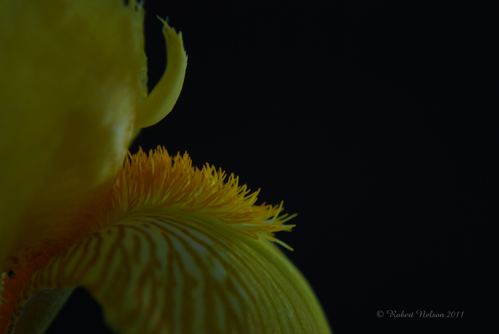
I know this is not going to appeal to most, but I like the empty space. I kinda thought it would look ok made into 4 large sections and hung on a white wall. I'll also post a cropped version.
Comments and critique always sought.
D80, 18-55 @ 55, ISO 100, F5.6 @ 1/6
Thanks
Bob :wavey:

Comments

16 comments
Comment posted by Bob&Charly Nelson on November 20, 2011 at 7:20 AM
Here is the cropped version
Registered on October 27, 2005, 289 Posts, 4202 Comments
Comment posted by John Kerr on November 20, 2011 at 7:39 AM
Morning Bob. (Moring where I'm at) I like the first picture over the cropped version. I really like the first pic and while some may think there's too much black I like it like this. I think these two colors have alway been stunning together. My only suggestion would be to bump up the exposure abit to brighten up the flower and bring out it's color even more.
Registered on October 28, 2009, 111 Posts, 1070 Comments
Comment posted by Bob&Charly Nelson on November 20, 2011 at 8:21 AM
I had left it dark thinking of displaying on white, but I do see what you are saying John, and will work one as suggested.
Thanks
Bob :wavey:
Registered on October 27, 2005, 289 Posts, 4202 Comments
Comment posted by Miro Susta on November 20, 2011 at 8:37 AM
Hi Bob, I like the the brighter colors of second version and overal arrangement of the first version. Combination of both would satisfy my taste. Nicely done. :wink:
Registered on August 18, 2006, 719 Posts, 3736 Comments
Comment posted by Philip Schwarz on November 20, 2011 at 8:41 AM
I also like the comp on the first one but you need to brighten the flower.
Registered on November 29, 2006, 236 Posts, 1210 Comments
Comment posted by Bob&Charly Nelson on November 20, 2011 at 12:01 PM
How's this work?
Registered on October 27, 2005, 289 Posts, 4202 Comments
Comment posted by Joseph Campisi on November 20, 2011 at 1:07 PM
Third time's a charm Bob! I think the black works well here to offset those vibrant colors. Nice work!
Registered on November 24, 2008, 304 Posts, 3211 Comments
Comment posted by Giuseppe Guadagno on November 20, 2011 at 2:15 PM
Robert, about composition I like better the first post; about light, may be an half way between the first and the second version.
Anyway, the shape and the dark stark contrast stirs the imagination. I like it.
Registered on February 3, 2007, 827 Posts, 5052 Comments
Comment posted by Bill Fach on November 20, 2011 at 3:05 PM
Bob: Choice 3 is far and away my favorite. I might like a touch less black, say a 5:4 ratio. Well done. >=))>
Registered on November 1, 2003, 1805 Posts, 26981 Comments
Comment posted by John Kerr on November 20, 2011 at 5:17 PM
Your repost looks great Bob, the brighter color really makes this image pop. In my opinion it's ready for mat and frame. :wink:
John
Registered on October 28, 2009, 111 Posts, 1070 Comments
Comment posted by Todd Bielby on November 20, 2011 at 8:09 PM
Robert I like the empty space to but the out of focus foreground is a distraction.
Registered on March 10, 2011, 169 Posts, 392 Comments
Comment posted by Richard Teller on November 20, 2011 at 9:48 PM
i like the third image much better. The colors are much brighter and the sharpness is much better.
Registered on August 23, 2010, 1162 Posts, 6692 Comments
Comment posted by Gary Yeoh on November 21, 2011 at 1:01 AM
Bob:
You are going to get a lot of different views on this. I like the framing of 1&3 and the brightness level of 2.
Registered on September 1, 2009, 588 Posts, 8184 Comments
Comment posted by Miro Susta on November 21, 2011 at 2:54 AM
Without doubt the third one is the best (at least according to my taste). Well done.
Registered on August 18, 2006, 719 Posts, 3736 Comments
Comment posted by Albert Darmo on November 21, 2011 at 11:08 PM
Hi Bob :wavey: The third version has the best combination of form and color. very artistically done :cool: :smile:
Albert Darmo
Canada
Registered on November 25, 2008, 1386 Posts, 11978 Comments
Comment posted by Carol Hyman on November 21, 2011 at 11:20 PM
It's an Iris, Robert, I like the negative space. Had you considered added a curves level to the flower? Also based on the cropped image, I don't think f/5.6 works on stem portion of the flower.

Regards,

Carol
Registered on January 18, 2007, 597 Posts, 8062 Comments