Nature Photographers Network
This is the preserved archive of the original Nature Photographers Network. The community continues at naturephotographers.network.
Atop the Rattlesnakes & Re-Post (Less Distortion)
‹ PreviousLandscape GalleryNext ›

Atop the Rattlesnakes & Re-Post (Less Distortion)

by Harry Lichtman

Gallery: LandscapePosted November 12, 2011404 views19 comments
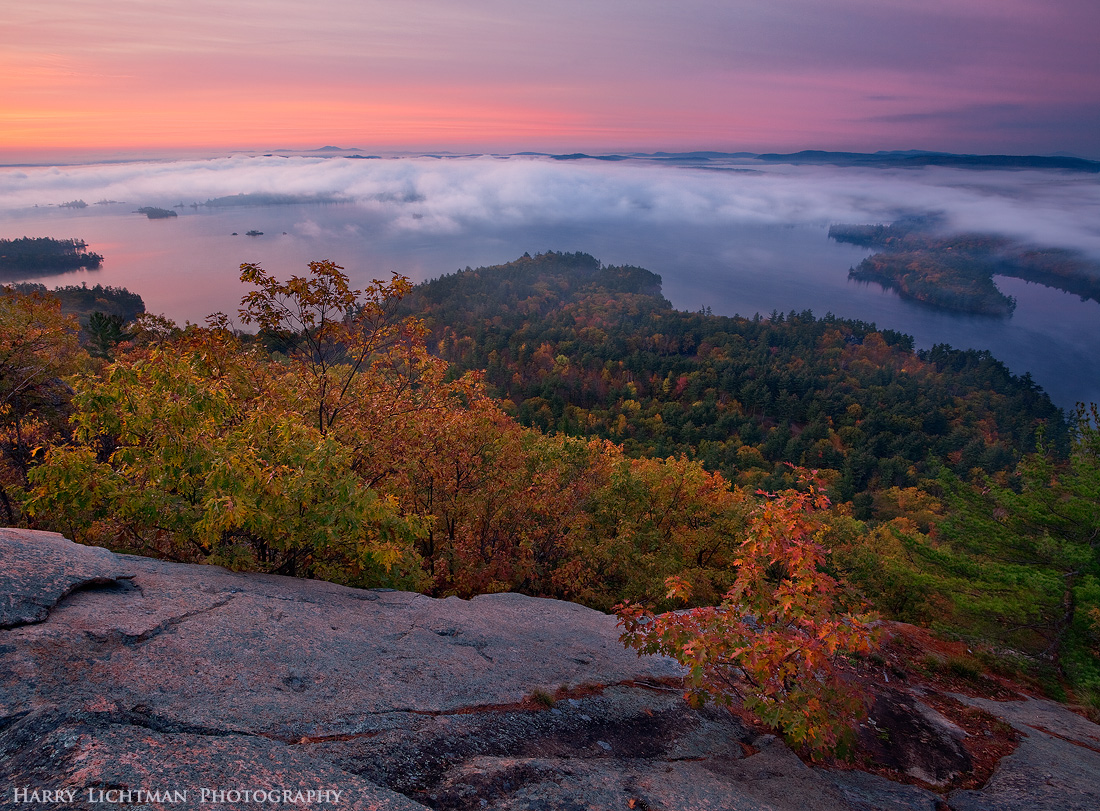
My 2nd visit to the top of West Rattlesnake Mountain in the Lakes Region of NH. My 1st visit was the day before, and 50 people were lounging on the summit, but I saw potential as the oaks still held onto their foliage. I made an early morning drive the next day and did the short hike to the summit ledges for this sunrise view. Some good potential for a winter shot before the lake freezes. The smooth granite was a great reflector of the colorful sky, though maybe too much rock on the left. Was hard to minimize without messing up the rest of the comp.

2 exposures manually blended for dynamic range.
17-40L

After upload, it appears that it could use a slight CCW horizon adjustment.

I decided not to correct or minimize the wide angle lens distortion, as I like d the way the mid-ground cloud layer arched across the image. I'm wondering your thoughts on this aspect in particular. Other feedback welcome.

Comments

19 comments
Comment posted by Nancy Lea Sandy on November 12, 2011 at 9:53 AM
Your self critique seems pretty reasonable. I like the distortion effect in the clouds and agree there might be a bit too much granite. Only thing you seem to have left out is how impressive the scope of this image is. Very nice
Registered on January 24, 2011, 576 Posts, 6942 Comments
Comment posted by Joseph Campisi on November 12, 2011 at 11:49 AM
Great expansive view Harry, with nice light! Too much granite? Maybe just a little. It has nice light and texture though. Maybe enhancing that a bit would work.

Also, I think the slight barrel distortion works well here. It helps amplify the sense of expansiveness by mimicking the curvature of the earth.

Is this Squam Lake?
Registered on November 24, 2008, 304 Posts, 3211 Comments
Comment posted by Abdullaziz Bin Ali on November 12, 2011 at 12:20 PM
Wow Harry, the view is breathtaking
really beautiful
Registered on May 31, 2009, 112 Posts, 1590 Comments
Comment posted by Bruce King on November 12, 2011 at 1:07 PM
Stunning view well captured. As far as "too much rock on the left".....I think you're your own worst critique but we all do that. :wink: I agree the distortion works here and I wouldn't mess with it. Great colors, nice comp....all around excellent. :toast:
Registered on January 14, 2010, 276 Posts, 2212 Comments
Comment posted by Harry Lichtman on November 12, 2011 at 1:34 PM
Joseph, Yes this Squam of On Golden Pond fame, I think.
Registered on September 17, 2010, 304 Posts, 3507 Comments
Comment posted by dean hebert on November 12, 2011 at 2:10 PM
This is a beautiful blend of colours and perspective. No problems with the amount of granite or distortion. :toast:
Registered on August 4, 2010, 70 Posts, 1132 Comments
Comment posted by Harley Goldman on November 12, 2011 at 3:53 PM
Real pretty, Harry. Granite does not bother me a it. Sweet light and colors.
Registered on November 19, 2003, 586 Posts, 11271 Comments
Comment posted by Michael J Greene, on November 12, 2011 at 5:14 PM
The conditions are really pretty and I love that low layer of clouds. The blend looks great and I have no problems with the distortion - it's to be expected. A very well balanced scene.

Michael
Registered on June 18, 2009, 86 Posts, 2317 Comments
Comment posted by Nick Bristol on November 12, 2011 at 7:33 PM
What a fantastic view!, and beautiful scene. This all works great for me, Harry. I actually like the lens distortion here and the foreground granite looks great with the reflected light. Feel like I'm standing right there...wish I was! Excellent work!

Nick Bristol
Lone Rock, WI
Registered on February 1, 2004, 752 Posts, 14140 Comments
Comment posted by Tony Kuyper on November 12, 2011 at 8:44 PM
I look at this and the bottom half seems perfectly grounded and the top half feels like I'm airborne. This is a really nice perspective and you nailed the comp and colors.
Registered on November 1, 2003, 364 Posts, 22328 Comments
Comment posted by Miro Susta on November 12, 2011 at 9:51 PM
Excellent view. I like it very much as it is. Very good work.
Registered on August 18, 2006, 719 Posts, 3736 Comments
Comment posted by Brian Schrayer on November 13, 2011 at 12:09 AM
It's getting late and I'm tired but I just had to comment on this, Harry. This is remarkably beautiful. I like the above the clouds perspective and the fall color is complimented beautifully by the sunrise color. Print it large and enjoy it!!
Registered on May 28, 2004, 114 Posts, 2890 Comments
Comment posted by Nick Palmieri on November 13, 2011 at 8:19 AM
Very nice as presented.
Registered on September 1, 2011, 35 Posts, 748 Comments
Comment posted by David Chauvin on November 13, 2011 at 2:30 PM
Beautiful color and soft muted light, Harry. I'm fine with the rock on the left since it has such nice reflected color. I'm back and forth on the curvature. I'm sure its only other photographers that would take issue. :rolleyes:
Registered on August 5, 2004, 1007 Posts, 5595 Comments
Comment posted by Hamed Musharbak on November 13, 2011 at 3:08 PM
great job Harry

i like it

Hamed
Registered on June 1, 2009, 372 Posts, 2282 Comments
Comment posted by Vance Gese on November 13, 2011 at 8:19 PM
Beautiful, Harry. The colors and that wonderful light, including that subtle light on the FG rock, make this work so very well. The rock and balance looks great to my eye. I will admit being plus/minus on the distortion though. It does accentuate the feeling of expansiveness although I would think that you could still have that expansive feel without the distortion, given the near-far perspective of your image. Either way, a gorgeous image.
Registered on November 13, 2008, 298 Posts, 6629 Comments
Comment posted by Zack Clothier on November 14, 2011 at 12:09 AM
Nice light you've captured here Harry, I don't mind the granite. The leaves of that little tree sticking up above the lake on the left look a little dark compared to the rest of the surrounding trees, but that's very minor. I'm on the fence about the distortion, would be interested in seeing a version without it..Anyway nice work. :toast:
Registered on January 28, 2010, 343 Posts, 2257 Comments
Comment posted by Harry Lichtman on November 14, 2011 at 10:33 AM
Zack - Here's a version with the distortion minimized. It would take a lot of doing to make some of the distant lake edges appear as if they were not going down hill. I am liking the original cloud's curve the more I look at the 2. Thanks for th input.
Registered on September 17, 2010, 304 Posts, 3507 Comments
Comment posted by Gary McGhee on November 14, 2011 at 1:58 PM
Stunning view Harry, beautiful soft light and colour.

Gary.
Registered on April 15, 2010, 142 Posts, 2416 Comments