Gallery: LandscapePosted November 12, 2011333 views22 comments
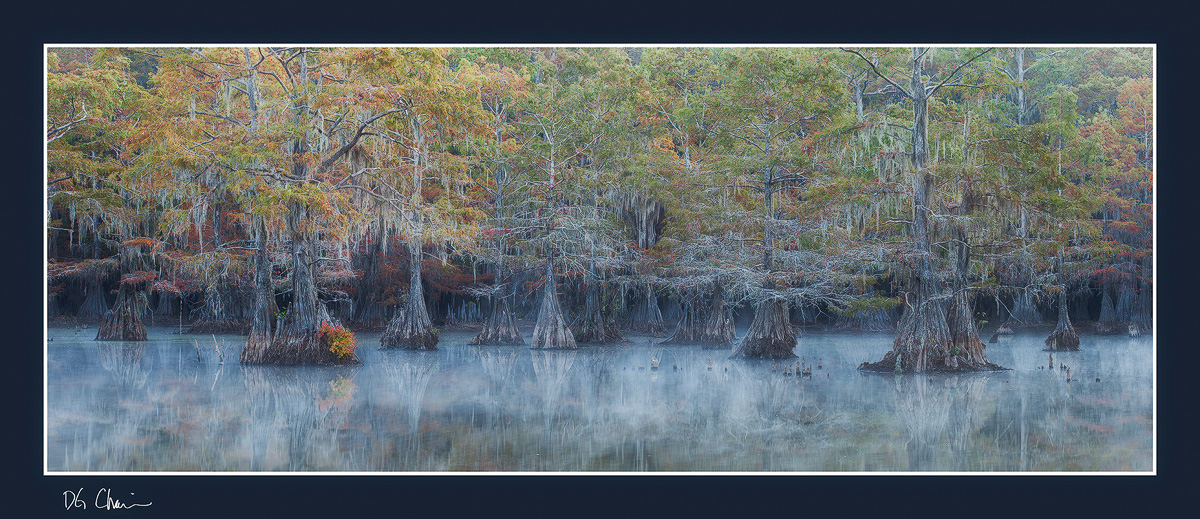
I'm on the fence about this one so any feedback would be appreciated. Does the comp feel unbalanced?
cropped from three image pano stitch
Comments
22 comments
Comment posted by Harry Lichtman on November 12, 2011 at 8:46 AM
David - I have no problem regarding balance - feels balanced to me. The fog is a nice touch that really helps the mood of the image. Web version looks a little oversharpened, maybe due to compression which seems to brighten the image a bit. A slightly darker version, especially the top portion might improve the web view. I'm sure the print would be fantastic, with all of that detail inthe trees. Does it ever get windy in these swamps? You images always look very sharp .
Registered on September 17, 2010, 304 Posts, 3507 Comments
Comment posted by David Chauvin on November 12, 2011 at 8:55 AM
Thanks for the feedback, Harry. Wind is always a factor when shooting around water, especially on the larger lakes. This particular location is called a lake but its more like a large pond and is protected on all sides. I always watch the wind forecasts and try to shoot the protected shorelines since my transportation is a small open kayak. I agree that the top of the frame can be darkened a hair and yes, compression is not helping here.
Registered on August 5, 2004, 1007 Posts, 5595 Comments
Comment posted by Joseph Campisi on November 12, 2011 at 11:56 AM
Gotta view this one large! Love that misty reflection David.
Registered on November 24, 2008, 304 Posts, 3211 Comments
Comment posted by Bill Fach on November 12, 2011 at 1:03 PM
David: The large version completely fried my -meter. Makes me want to go there. Stunning shot.>=))>
Registered on November 1, 2003, 1805 Posts, 26981 Comments
Comment posted by Peter Cross on November 12, 2011 at 1:13 PM
Great image as usual. Love the colors and the detail. While the composition is balanced there is a illusion that the image is low to the right. Trees are straight so that's why it must be an illusion but that may make for a feeling of being unbalanced.
Registered on April 3, 2010, 271 Posts, 1342 Comments
Comment posted by Harley Goldman on November 12, 2011 at 2:02 PM
Comp and image look great to me!! Excellent. You might consider cloning the little black stump (?) on the far left in the water, but very minor. Beauty!
Registered on November 19, 2003, 586 Posts, 11271 Comments
Comment posted by dean hebert on November 12, 2011 at 2:27 PM
Love the subdued lighting and mist on the water. Maybe a crop from the left to remove the tree in the back and a small crop of the right? Even the large version isn't big enough!
Registered on August 4, 2010, 70 Posts, 1132 Comments
Comment posted by Jaymes Dempsey on November 12, 2011 at 4:21 PM
I like this a lot! I love the muted feel and colors...the reflection...
Especially that single cluster of leaves on the trunk of the forefront tree on the left. It adds a lot...
The comp seems fine to me!
Jaymes
Registered on June 28, 2010, 47 Posts, 590 Comments
Comment posted by Dan Baumbach on November 12, 2011 at 4:57 PM
Looks awful nice to me. Beautifully balanced. Sweet color.
- Dan
Registered on November 1, 2003, 473 Posts, 7980 Comments
Comment posted by Bill Chambers on November 12, 2011 at 5:01 PM
Doesn't feel unbalanced to me. Must see this large to fully appreciate though. Love the bit of fog and overall composition. Odd how it's more colorful on the left side than right - doesn't distract or anything, just odd. Gorgeous image David. No doubt about it, you're the master of cypress.
Registered on April 10, 2005, 753 Posts, 21216 Comments
Comment posted by Nick Bristol on November 12, 2011 at 7:24 PM
I agree, you really have to look at this large. Not unbalanced at all for me, David. A beautiful image that I think would make a fantastic large print!!
Nick Bristol
Lone Rock, WI
Registered on February 1, 2004, 752 Posts, 14140 Comments
Comment posted by Danny Laureys on November 12, 2011 at 7:52 PM
Large version really does it for me, Excellent!!!!
Registered on January 5, 2008, 590 Posts, 1261 Comments
Comment posted by Tony Kuyper on November 12, 2011 at 8:38 PM
Your images never cease to amaze me, David. Each one just keeps getting better.
Registered on November 1, 2003, 364 Posts, 22328 Comments
Comment posted by Peter Coskun on November 12, 2011 at 9:10 PM
The comp is just fine, the only thing that bugs me is that I wasn't there photographing these scenes. That fog really tops this one off. I really can't find anything wrong with it or that I could see to improve. This would look beautiful printed big in a nice dark room.
Registered on October 31, 2011, 170 Posts, 1240 Comments
Comment posted by Eva McDermott on November 13, 2011 at 8:29 AM
Love the detail and mood David. This gorgeous work seems balanced to me.
Registered on January 4, 2009, 1015 Posts, 13229 Comments
Comment posted by Jimmy Gekas on November 13, 2011 at 10:48 AM
Love it! The larger view is amazing.
Registered on July 26, 2007, 244 Posts, 2807 Comments
Comment posted by Zack Schnepf on November 13, 2011 at 12:52 PM
This needs to to be viewed large. Beautiful image, I love the details.
Registered on November 1, 2003, 403 Posts, 2528 Comments
Comment posted by Maciej B. Markiewi on November 13, 2011 at 2:17 PM
Great image! The atmosphere of mystery is amazing. The colorful more orange than the others on the left is the strong point but then my eyes move towards the right and these reddish leaves on the right and then I am back on the left ... The big version is great and man that is for sure amazing on a wall as a big print. great work !!
Registered on July 16, 2008, 23 Posts, 77 Comments
Comment posted by Vance Gese on November 13, 2011 at 8:11 PM
Stunning, stunning image, David. Balance looks perfect to my eye. The pano format works so very well and having the mist and that one bush in full autumn color in the lower left couldn't be better. I wouldn't be on the fence about this one at all and only wish I had something even close to this in my portfolio. Incredible.
Registered on November 13, 2008, 298 Posts, 6629 Comments
Comment posted by Zack Clothier on November 14, 2011 at 12:01 AM
Awesome! Definitely does not seem unbalanced to me. This will look great printed large. Very nice work as usual.
Registered on January 28, 2010, 343 Posts, 2257 Comments
Comment posted by Andreas Resch on November 14, 2011 at 7:30 AM
Finally - a pano of the place. Just impressive. Print it, hang it.
Registered on November 14, 2007, 322 Posts, 6101 Comments
Comment posted by Gary McGhee on November 14, 2011 at 2:01 PM
Certainly not unbalanced David, infact it looks the opposite to me, very well balanced. Wonderful fine details.
Gary.
Registered on April 15, 2010, 142 Posts, 2416 Comments

Comments
22 commentsEspecially that single cluster of leaves on the trunk of the forefront tree on the left. It adds a lot...
The comp seems fine to me!
Jaymes
- Dan
Nick Bristol
Lone Rock, WI
Gary.