Nature Photographers Network
This is the preserved archive of the original Nature Photographers Network. The community continues at naturephotographers.network.
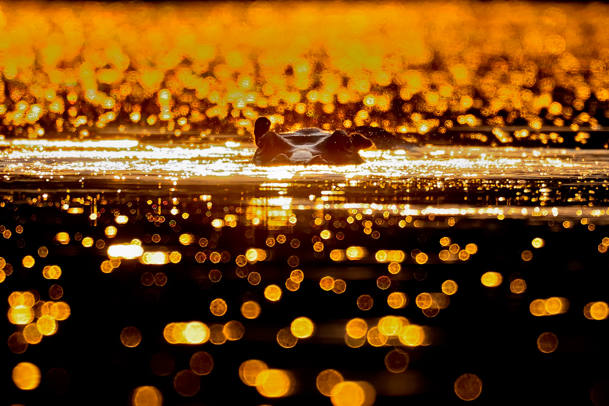
Golden hippo
‹ PreviousWildlife GalleryNext ›

Golden hippo

by Gorazd Golob

Gallery: WildlifePosted November 6, 2011333 views7 comments
Zambia, Kafue national park, Hippo Lodge, this hippo was just in the sun of early morning, so it gave him a great glow background. Yes colors are more saturated but I felt it looks great on him :smile:

Nikon D300, Nikon 500mm AFS, 1/1500sec; f/4,0, ISO 200, image is cca 70% crop from total size.

best regards, Gorazd

Comments

7 comments
Comment posted by Max Waugh on November 6, 2011 at 8:11 PM
The saturation may be a bit overdone for my tastes, but the effect is still very cool!

Max
Registered on September 26, 2008, 428 Posts, 2329 Comments
Comment posted by Gary Gulash on November 6, 2011 at 9:49 PM
I like the effect Gorazd. One of those photos that requires a bold approach, no doing it half way. Might level the horizon with a slight ccw rotation. Very artistic in my opinion. :toast:
Registered on January 28, 2005, 879 Posts, 12098 Comments
Comment posted by Ingrid Vekemans on November 7, 2011 at 2:02 AM
Beautiful and inspiring...I absolutely love the bokeh reflections in the water. Am going there myself shortly...can't wait....thanks for sharing! :wavey:
Registered on August 2, 2010, 138 Posts, 780 Comments
Comment posted by Anand Narayanan on November 7, 2011 at 6:32 AM
Another awesome Hippo image Gorazd. I have to agree that the saturation is a little high, but its just a personal preference.
Registered on October 25, 2009, 110 Posts, 835 Comments
Comment posted by Vincent Grafhorst on November 7, 2011 at 12:08 PM
Great to see something different here Gorazd; meaning to say that your image is very unique and very artistic IMO. :toast:
Registered on February 24, 2006, 504 Posts, 7203 Comments
Comment posted by Morkel Erasmus on November 7, 2011 at 5:12 PM
Fabulous imagery here Gorazd! I love the bokeh and sparkles and the idea here. I might back down a tad on the saturation as it's just a bit overcooked at the top (and I do love my saturation turned up a notch :wink: )
Registered on March 22, 2011, 385 Posts, 2068 Comments
Comment posted by Brad Hill on November 8, 2011 at 8:35 AM
Hi Gorazd,

I like the transition in the amount of black vs. orange from foreground to background, but between the high saturation and blown highlights the image looks a little too unnatural and "photo-art-like" for my personal taste. But others obviously have a different opinion! As Vincent said, it is nice to see something quite different in here though!

Cheers...thanks for sharing this...

Brad
Registered on May 29, 2007, 431 Posts, 6061 Comments