Gallery: LandscapePosted November 5, 2011180 views9 comments
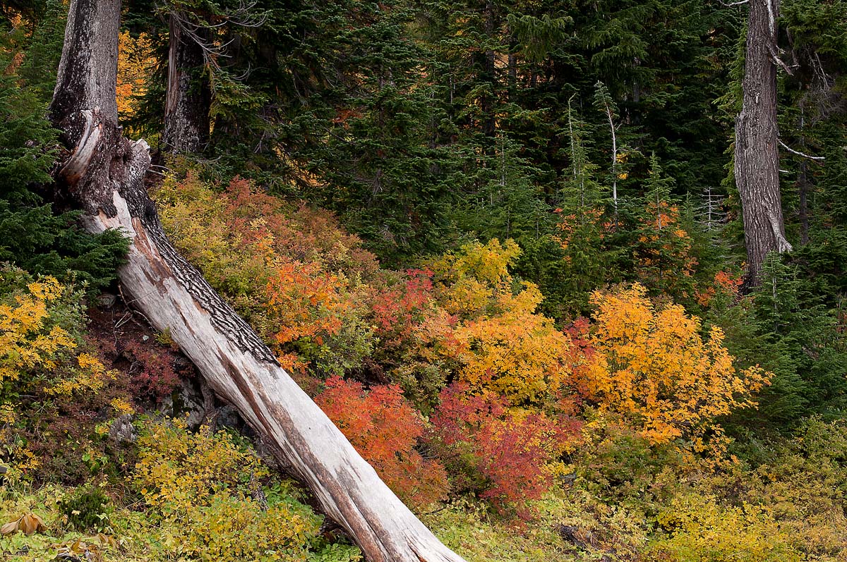
Shot on a recent trip to Chinook Pass....the colors were at their peak. The larger version had to be saved a 50%.
Thanks for looking.
Comments
9 comments
Comment posted by John Williams on November 5, 2011 at 2:58 PM
Good diagonals in the comp, and nice color in those vine maples. Makes me wish I could get out there again before it all passes, but I don't think tha's going to happen this season.
Registered on September 6, 2007, 221 Posts, 5985 Comments
Comment posted by Tony Kuyper on November 5, 2011 at 4:38 PM
Really like the colors. You've got the brightness and saturation just right. Downed tree sort of interrupts the flow through the image.
Registered on November 1, 2003, 364 Posts, 22328 Comments
Comment posted by Peter Richter on November 5, 2011 at 4:40 PM
The strong composition works very well for me, Bruce. The delightful foliage is nicely counteracting the mighty trunks in my opinion.
I think the loss of details in the highlights - at least viewing on my monitor - is due to compression. Your image must be very appealing as a print.
Peter
Registered on November 10, 2010, 218 Posts, 2723 Comments
Comment posted by Morris McClung on November 5, 2011 at 5:58 PM
The large version has great detail coming through that the small size just can't translate. Great color, nice light, and I like the comp. I wonder if you tried any without the bright log? It dominates a bit, but not enough to be a deal breaker. Nice work.
Registered on May 7, 2007, 670 Posts, 19650 Comments
Comment posted by David Chauvin on November 6, 2011 at 10:49 AM
I really like the beautiful color and detail though out the frame, but the brightness of the log as it leaves the bottom edge bugs me a bit.
Registered on August 5, 2004, 1007 Posts, 5595 Comments
Comment posted by Stan Rose on November 6, 2011 at 1:28 PM
I like the log, it just needs to be burned down a bit. Very pretty scene. Here's a tip about the compression--in general its good to oversharpen for web, but in cases like this with tons of detail, you might be better off backing off a bit on the sharpening, cause that will allow you to save at a higher level (less compression)
Registered on September 15, 2005, 836 Posts, 17099 Comments
Comment posted by R.Bill Moser on November 6, 2011 at 2:01 PM
Great colors here.The comp also works well for me. This is a pretty scene.
Registered on January 29, 2010, 285 Posts, 4281 Comments
Comment posted by Vance Gese on November 6, 2011 at 8:32 PM
Lovely fall colors with nice lines to your composition. I might burn the highlights in the log a bit as the brightness pulls the eye from the beautiful color.
Registered on November 13, 2008, 298 Posts, 6629 Comments
Comment posted by Ken Smith on November 7, 2011 at 4:31 AM
Bruce. an eyeful of color and detail. Yes to the larger version. Agree w/comments to mute the whites in the log. Wish it were a tad shorter and could have fit the entire length in the frame. Nicely done!
Registered on September 5, 2008, 449 Posts, 2444 Comments

Comments
9 commentsI think the loss of details in the highlights - at least viewing on my monitor - is due to compression. Your image must be very appealing as a print.
Peter