Nature Photographers Network
This is the preserved archive of the original Nature Photographers Network. The community continues at naturephotographers.network.
Transition
‹ PreviousLandscape GalleryNext ›

Transition

by Tony Kuyper

Gallery: LandscapePosted November 5, 2011455 views32 comments
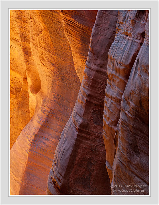
While not intentional, a couple of people have told me the foreground rocks look wet. I think this is maybe from the natural reflectivity of the grains of sandstone and the way they were interacting with the sky-light and the glow-light here. I liked the shapes and forms and the way the "columns" change but also echo each other in the frame.

Your thoughts and recommendations would, as always, be appreciated.

Flipped version below.

5D2, 28-300@109, f/16, 0.4 sec.

Comments

32 comments
Comment posted by Jim Greenwood on November 5, 2011 at 12:33 AM
Wow! Stunning! No recommendations from me ... except to print it large. Well done.
Registered on November 9, 2003, 229 Posts, 1523 Comments
Comment posted by Tony Kuyper on November 5, 2011 at 12:34 AM
Flipped any better?
Registered on November 1, 2003, 364 Posts, 22328 Comments
Comment posted by Jim Greenwood on November 5, 2011 at 12:47 AM
Hmmm ... I prefer the initial version.
Registered on November 9, 2003, 229 Posts, 1523 Comments
Comment posted by Dietrich Gloger on November 5, 2011 at 3:29 AM
Very beautiful work Tony! I like the glow. It is well captured and presented. The colors have a very natural looking vibrance and luminance to it. The flipped version is more abstract, but I prefer the first one.
Registered on January 26, 2007, 360 Posts, 9876 Comments
Comment posted by R.Bill Moser on November 5, 2011 at 5:33 AM
The light and the glow is just stunning. Great comp. I'd prefer the fist version.......but both are excellent. I agree with Dietrich that the second is a bit more abstract. Great work :toast:
Registered on January 29, 2010, 285 Posts, 4281 Comments
Comment posted by Morris McClung on November 5, 2011 at 10:12 AM
I honestly don't know how you see these comps among all the lines and make such order to them!
We do see left to right here in our culture, but honestly, I think the first version makes me engage my brain more to understand it.
Your usual impeccable processing, Tony! Gorgeous work. :toast:
Registered on May 7, 2007, 670 Posts, 19650 Comments
Comment posted by Eva McDermott on November 5, 2011 at 10:13 AM
Wonderful progression of dark to light Tony. Beautiful luminosity and color. My preference is your first post.
Registered on January 4, 2009, 1015 Posts, 13229 Comments
Comment posted by Andreas Resch on November 5, 2011 at 10:48 AM
There's nothing else to say here than "WOW" ... I prefer the first one.
Registered on November 14, 2007, 322 Posts, 6101 Comments
Comment posted by Kyle McDougall on November 5, 2011 at 10:49 AM
Very nice Tony. Awesome detail and tones throughout this image! Very well executed.
Registered on June 10, 2011, 9 Posts, 52 Comments
Comment posted by Nick Bristol on November 5, 2011 at 11:20 AM
Tony, This is fantastic! The depth of this is very impressive. I love the colors and the textures in this are wonderful. Really impressive image...so well done. I will go with the original, but either one works great. :toast: :toast:

Nick Bristol
Lone Rock, WI
Registered on February 1, 2004, 752 Posts, 14140 Comments
Comment posted by Doug Koepsel on November 5, 2011 at 11:47 AM
I'm liking the colors and textures of the near walls. The convex curves of the shaded walls versus the concave of the lit walls work well to play one against the other.
Registered on April 1, 2010, 196 Posts, 1592 Comments
Comment posted by Joe Abounader on November 5, 2011 at 12:05 PM
Great texture and sharpness; lovely transition of light and colour from one side to the other. Good use of the lines across the rock formations.
Registered on June 15, 2011, 14 Posts, 58 Comments
Comment posted by Robert Dayton on November 5, 2011 at 12:09 PM
I never tire of slot canyons, and this is certainly no exception. Great
formations, lines, and colors. You benefitted from excellent lighting.
Thanks for sharing, Guy.
Registered on November 11, 2008, 281 Posts, 3958 Comments
Comment posted by Stan Rose on November 5, 2011 at 12:36 PM
Fascinating textures here--and the 50/50 split is quite striking. It has a 2dish look to it (due to the relatively low contrast, i think) but i like the look that gives the shot. Nice one, Tony! (Guy :confused: )
Registered on September 15, 2005, 836 Posts, 17099 Comments
Comment posted by John Williams on November 5, 2011 at 1:25 PM
Perfect title for an awesome photo. I agree with Morris that your ability to find these is amazing. I like the original, but maybe that's because I saw it first?
Registered on September 6, 2007, 221 Posts, 5985 Comments
Comment posted by Gary McGhee on November 5, 2011 at 2:20 PM
I like the transition in light from front to back Tony. The way you control the light in your shots is second to none. The nearer columns do have a wet look. Excellent comp too.

Gary.
Registered on April 15, 2010, 142 Posts, 2416 Comments
Comment posted by Hillary Younger on November 5, 2011 at 4:38 PM
Love the colors and the glow...I also think I prefer the first version...In like the depth you've achieved with this angle and simple comp...inspiring work.
Registered on October 2, 2011, 17 Posts, 167 Comments
Comment posted by Peter Richter on November 5, 2011 at 4:52 PM
Tony, I especially enjoy these tangible textures which I perceive like a sculpture. Great experience of depth and space to me.

The first version works better for me as there is a kind of flow of the light from left to right, which is very pleasant to my eye.

Peter
Registered on November 10, 2010, 218 Posts, 2723 Comments
Comment posted by Mark Seaver on November 5, 2011 at 6:02 PM
Tony, I love the repetition of forms here. I also think that the shiny blue in the foreground helps it to compete with the warm golds in the distant rocks. In this case the right to left eye movement feels better.
Registered on January 23, 2011, 1103 Posts, 17270 Comments
Comment posted by David Chauvin on November 5, 2011 at 7:23 PM
The texture of the darker stone does give it a wet appearance. Stellar work as usual! :cool: :cool:
Registered on August 5, 2004, 1007 Posts, 5595 Comments
Comment posted by Julian Barkway on November 6, 2011 at 2:14 AM
Beautifully balanced in tone, colour and form. Love it!
Registered on January 18, 2007, 344 Posts, 1961 Comments
Comment posted by Mark Pelton on November 6, 2011 at 8:49 AM
Actually I think this is wonderful use of contrast. Hard foreground, soft background. Dark color, soft color. I love it. Original presentation is fine with me.
Registered on November 25, 2003, 380 Posts, 4647 Comments
Comment posted by Hamed Musharbak on November 6, 2011 at 9:58 AM
the master strikes again & again :toast: :toast:
Registered on June 1, 2009, 372 Posts, 2282 Comments
Comment posted by Mark Metternich on November 6, 2011 at 11:32 AM
Although #1 breaks compositional idealism by going left to right but downward (which tends to encourage the eye being drawn off the page) and #2 meets the ideal (left to right - climbing upward keeping the eye in the scene longer) I am liking the rules to be broken and am going with #1. Just seems a bit more peaceful.

Great light and capture as always. :toast:
Registered on June 19, 2009, 276 Posts, 6240 Comments
Comment posted by Vance Gese on November 6, 2011 at 11:11 PM
Your work is so amazing, Tony, every image a jaw dropper and this is no exception. The play of the two types of light on this rock face and how the difference in color temperature has brought out such distinct tones and textures in each area is astounding. Together with your exquisite composition, focusing on the lines and forms of these "columns", you have made a stunning piece of art. Fantastic. I do prefer the first image as for me the glows seems right on the left.
Registered on November 13, 2008, 298 Posts, 6629 Comments
Comment posted by Matthew Goldsmith on November 7, 2011 at 12:03 AM
I favor the first post. Fantastic textures Tony.
Registered on June 29, 2010, 37 Posts, 286 Comments
Comment posted by Kory Lidstrom on November 7, 2011 at 12:44 AM
Don't know how I missed this one. Gorgeous image, it's so 3-D it feels like I can reach out and touch those interesting textures. Very artistic and almost abstract. You sure know your sandstone, Tony.
Registered on November 19, 2008, 49 Posts, 1035 Comments
Comment posted by Aaron Feinberg on November 7, 2011 at 6:14 AM
Vote for first version but would be interesting to see them side by side. Nice work again :)

aF
Registered on October 26, 2009, 399 Posts, 2789 Comments
Comment posted by Bill Chambers on November 7, 2011 at 1:25 PM
Love the soft light in this and, in particular, love the shadow detail. Nobody can use your actions as good as you, which is only fitting. Beautiful image.
Registered on April 10, 2005, 753 Posts, 21216 Comments
Comment posted by Harry Lichtman on November 8, 2011 at 12:40 PM
Tony - In addition to the fine glow you've captured, I like the way the outer columns on each side of the frame oppose each other-creates some tension in the harmony.
Registered on September 17, 2010, 304 Posts, 3507 Comments
Comment posted by Jimmy Gekas on November 8, 2011 at 9:52 PM
Love the glow and the metallic/wet look! The color combo in the foreground wall really is unique. :toast:
Registered on July 26, 2007, 244 Posts, 2807 Comments
Comment posted by Anil Rao on November 9, 2011 at 4:01 PM
Wow, almost missed this one, Tony. Delicious forms and colors. The wetness aspect of the foreground rocks is really cool. I am also enjoying the contrast between those rocks and the ones in the background.

Fantastic job on the processing too.
Registered on November 15, 2003, 234 Posts, 4923 Comments